
We can use Angular2 Animations to make some animations like fading in/out, zoom in/out, …etc. We will create the following samples,
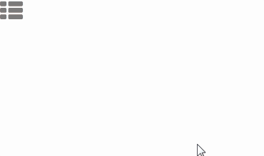
Let's first create a menu button and a right-side menu navigation.
.topMenu {
  background:#000;
  color: #fff;
  position: fixed;
  left: auto;
  top: 0;
  right: 0;
  bottom: 0;
  width: 20%;
  min-width: 250px;
  z-index: 9999;
  font-family: Consolas;
}

.menuBtn {
  z-index: 9999;
  position: absolute;
  opacity: 0.6;
}

ul {
  font-size: 18px;
  line-height: 3;
  font-weight: 400;
  padding-top: 50px;
  list-style: none;
}
<div class="menuBtn"><i class="blue fa fa-th-list fa-2x"></i></div>

<div class="topMenu">
    <ul>
        <li><a class="nav-item nav-link" (click)="goToBirthdayParty()">慶生會簡報</a></li>
        <li><a class="nav-item nav-link" [routerLink]="['/YearEndParty/Index']" (click)="menuState='out'">尾牙問卷</a></li>
        <li><a class="nav-item nav-link" (click)="goToYearEndParty()">尾牙簡報</a></li>
    </ul>
</div>

<router-outlet></router-outlet>
The page should be looked like this,

Jump into the app.component.html, we have to import the following animation-specific functions to enable Angular2 Animations.
import { Component, trigger, state, style, transition, animate } from '@angular/core';
import { Component, trigger, state, style, transition, animate } from '@angular/core';

@Component({
    selector: 'app-root',
    templateUrl: './app.component.html',
    styleUrls: ['./app.component.css'],
    animations: [
      trigger('slideInOut', [
        state('in', style({
            transform: 'translate3d(0, 0, 0)'
        })),
        state('out', style({
            transform: 'translate3d(100%, 0, 0)'
        })),
        transition('in => out', animate('400ms ease-in-out')),
        transition('out => in', animate('400ms ease-in-out'))
      ])

    ]
})
export class AppComponent {
    private menuState: string;

    constructor() {
        this.menuState = "out";
    }

    private toggleMenu() {
        this.menuState = (this.menuState === 'out' ? 'in' : 'out');
    }
}
state('in', style({…}))
This defines the "in" state and what style it should be.
In this sample, we will use the menu button to toggle the state.
transition('in => out', animate(400))
When the state changes from "in" to "out", the transition will be triggered and the transition period is 400 million second.
Furthermore, you could set ease-in, ease-out, ease-out-in or ease-in-out in animation() like this,
transition('in => out', animate('400ms ease-in-out'))
<div class="menuBtn" (click)="toggleMenu()"><i class="blue fa fa-th-list fa-2x"></i></div>

<div class="topMenu" [@slideInOut]="menuState">
    <ul>
        <li><a class="nav-item nav-link" (click)="goToBirthdayParty()">慶生會簡報</a></li>
        <li><a class="nav-item nav-link" [routerLink]="['/YearEndParty/Index']" (click)="menuState='out'">尾牙問卷</a></li>
        <li><a class="nav-item nav-link" (click)="goToYearEndParty()">尾牙簡報</a></li>
    </ul>
</div>

We will create an animation for the menu button as well.
But before implementing it, let us learn the void state.
The special state called void can apply to any animation.
It applies when the element is not attached to a view, perhaps because it has not yet been added or because it has been removed. The void state is useful for defining enter and leave animations.
For example the * => void transition applies when the element leaves the view, regardless of what state it was in before it left.
(Reference: Angular2 Animations)
So when we create an animation trigger, we can set a transition like this,
   transition('void => *', [
          style({…}), //The void's style
          animate(100)
   ])
Void => * means the transition will be fired when the state changes from void to any state.
So this transition will be triggered every time the page reloaded.
Of course you can define the void state if you like.
state('void', style({ transform: 'translateX(-100%)' })),
transition('void => *', animate(900))
Let us finish the flying-in menu button.
trigger('flyIn', [
      transition('void => *', [
        style({ transform: 'translateX(-100%)' }), //The void's style
        animate(900)
])
])
Update the menu button's html.
<div class="menuBtn" [@flyIn]="menuState" (click)="toggleMenu()"><i class="blue fa fa-th-list fa-2x"></i></div>
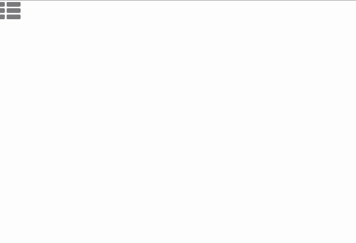
We will create an overlap menu button with flying in and out animation.
The final result should be like this,
Add another trigger: flyInOut.
trigger('flyInOut', [
      state('in', style({ transform: 'translateX(-100%)' })),
      state('out', style({ transform: 'translateX(2000%)', opacity: 0 })),
      transition('void => *', [
        style({ transform: 'translateX(-100%)' }), //The void's style
        animate(700)
      ]),
      transition('* => out', animate(800))
])
Have a look at the states' cycle.
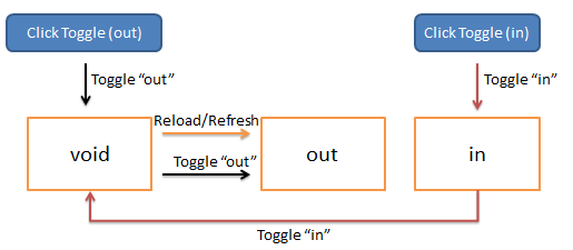
Here you can find that we are making tricks with the void state. When the element is out of view, it turns into the void state.
<div class="menuBtn" [@flyIn]="menuState" (click)="toggleMenu()"><i class="blue fa fa-th-list fa-2x"></i></div>
<div class="menuBtnFake" [@flyInOut]="menuState"><i class="blue fa fa-th-list fa-2x"></i></div>


<div class="topMenu" [@slideInOut]="menuState">
    <span class="text-center">{{title}} (by {{copyright}})</span>

    <ul>
        <li><a class="nav-item nav-link" (click)="goToBirthdayParty()">慶生會簡報</a></li>
        <li><a class="nav-item nav-link" [routerLink]="['/YearEndParty/Index']" (click)="menuState='out'">尾牙問卷</a></li>
        <li><a class="nav-item nav-link" (click)="goToYearEndParty()">尾牙簡報</a></li>
    </ul>
</div>
<router-outlet></router-outlet>
/*skip...*/

.menuBtnFake {
  z-index: 9999;
  position: absolute;
}
Angular2 Animate : creating sliding side navigation


 iThome鐵人賽
 看影片追技術