昨天介紹了2D,今天來介紹3D吧~
其實,3D就是比2D多了一個Z軸指標,所以也就多了perspective(透視)這個屬性。
沒看過昨天的2Dtransform介紹,請看這裡。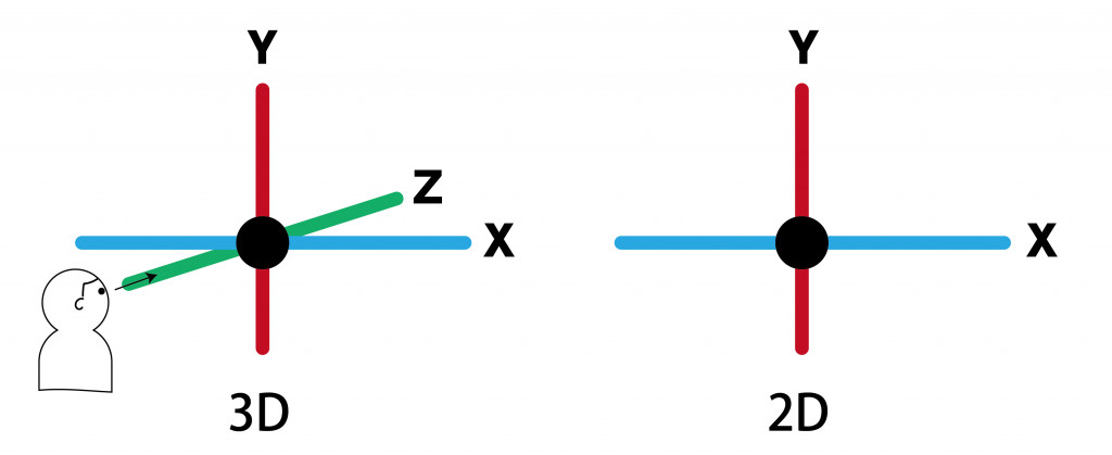
flat(預設2D)和preserve-3d
hidden和visible
backface-visibility: hidden;   /* 隱藏 */
/* 或者是 */
backface-visibility: visible;  /* 顯示 */
以下為transform-function介紹:
translate、scale多了Z軸屬性rotate分為可三軸分別旋轉skew傾斜屬性| 函數 | 說明 |
|---|---|
| translate3d(mx,my,mz) | 位移,元素以參考點為中心,X軸位移mx距離,Y軸位移my距離,Z軸位移mz距離 |
| translateX(m) | 元素以參考點為中心,X軸位移m距離 |
| translateY(m) | 元素以參考點為中心,Y軸位移m距離 |
| translateZ(m) | 元素以參考點為中心,Z軸位移m距離 |
| scale3d(sx,sy,sz) | 縮放,元素以參考點為中心,X軸縮放s倍,Y軸縮放s倍,Z軸縮放s倍 |
| scaleX(s) | 元素以參考點為中心,X軸縮放s倍 |
| scaleY(s) | 元素以參考點為中心,Y軸縮放s倍 |
| scaleZ(s) | 元素以參考點為中心,Z軸縮放s倍 |
| rotate3D(x,y,z,θ) | 從參考點為中心軸旋轉θ度 |
| rotateX(θ) | x軸旋轉,正值=順時針旋轉,負值=逆時針旋轉 |
| rotateY(θ) | y軸旋轉,正值=順時針旋轉,負值=逆時針旋轉 |
| rotateZ(θ) | z軸旋轉,正值=順時針旋轉,負值=逆時針旋轉 |
| matrix3d(n,n,n,n,n,n,n,n,n,n,n,n,n,n,n,n) | 元素以參考點為中心,依變形矩陣的16個參數值產生3D變形,可參考https://www.jianshu.com/p/52e0018e6ce2 |
3D ratate<codepen連結>
參考來源:
[1] https://www.w3schools.com/css/css3_3dtransforms.asp
[2] https://eyesofkids.gitbooks.io/css3/content/contents/transform2d.html


 iThome鐵人賽
 看影片追技術