為元素加上 border 算是CSS新手的問題
border: 10px;
給元素來個半透明的顏色,稍微難一些。可以用 rgba() 或是 hsla(),把hex 色碼丟到換算器裡就能得到對應的值。
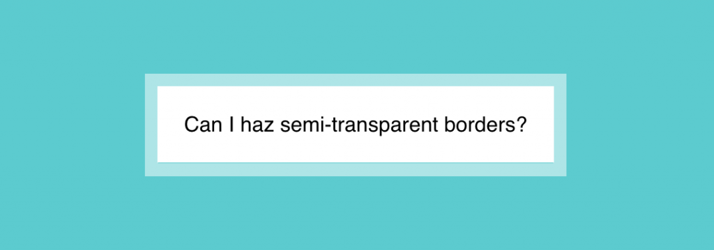
如果今天拿到的設計稿是有半透明的邊界呢?我們第一個想到的就是 border-color: rgba()囉!
如果剛好邊界所在元素背景是白色,設計師又要求白色半透明的邊界,這時不管我們再怎麼設,半透明的邊界都不會出來!
為什麼呢?這是因為 background屬性會延伸到 border 底下,如果把 border 樣式改成 dotted 就能發現。
幸好有 background-clip 這個屬性可以變更其延伸的範圍,預設是 border-box,改成 padding-box就能有我們要的效果了!
<div class="container">
  <div class="content">
    Can I haz semi-transparent borders?
  </div>
</div>
.container {
  background-color: darkturquoise;
  width: 100%;
  height: 100vh;
  display: flex;
  justify-content: center;
  align-items: center;
}

.content {
  background: white;
  padding: 20px;
  border: 10px solid hsla(0, 0%, 100%, .5);
  background-clip: padding-box;
}


 看影片追技術