另外一個GIS資料畫圖的利器是Geoplot,它擴充了cartopy與matplotlib,讓GIS資料的視覺化更方便,當然,他也設計給Geopandas作為其資料的端口。
有關geoplot的安裝,使用annaconda:
conda install geoplot -c conda-forge
首先是geoplot的pointplot模組,先來簡單plot點資料,並以顏色來區分行政區
一樣使用路燈資料,轉到epsg4326
import geopandas as gpd
light=gpd.read_file('output/light.shp',encoding='utf-8')
light=light[light.is_valid]
light=light[light['district']=='永和區']
light.crs = {'init' :'epsg:3826'} # 避免資料沒設,這邊再重新給一次
light=light.to_crs(epsg=4326)
geoplot對GeoDataframe有支援,所以可以直接餵進去
import geoplot as gplt
gplt.pointplot(light, figsize=(16, 8))

在geolot中,可以設定投影(import geoplot.crs)
另外,geoplot.點資料pointplot,可以設定視覺變數,
包含scale、hue都以作為視覺變數
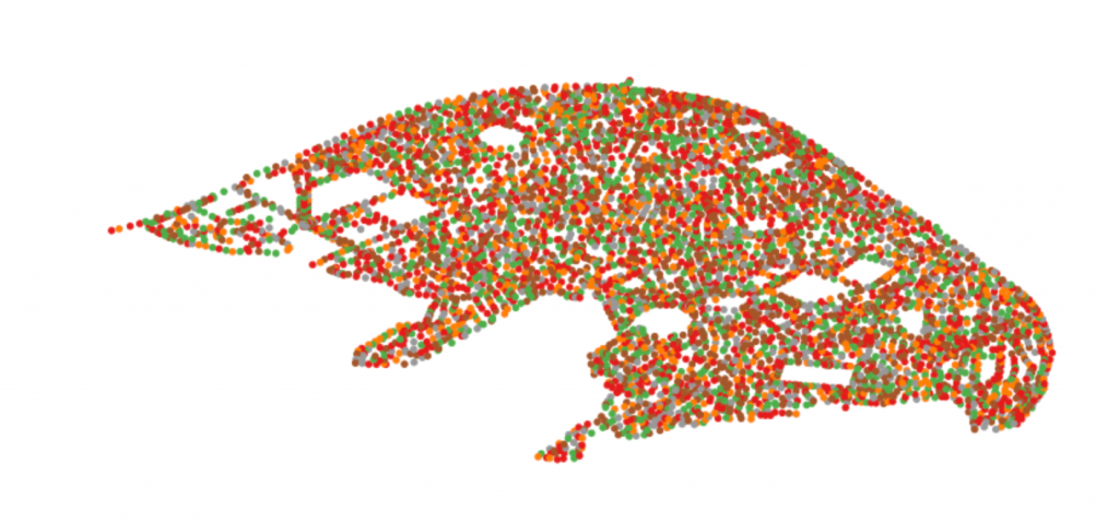
為了測試,我們先用numpy隨機產生一個值year(假設是路燈的使用年數)
import numpy as np
light['year']=np.random.randint(low=0,high=20,size=light.shape[0])
以hue(顏色)繪圖
gplt.pointplot(light, hue='year', figsize=(16, 8))
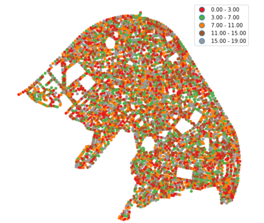
geoplot中也可以改變schema與投影,也可以放上圖例,跟昨天的mapplotib類似
import geoplot.crs as gcrs
gplt.pointplot(light, projection=gcrs.AlbersEqualArea(), hue='year', legend=True, scheme='fisher_jenks', figsize=(16, 8))
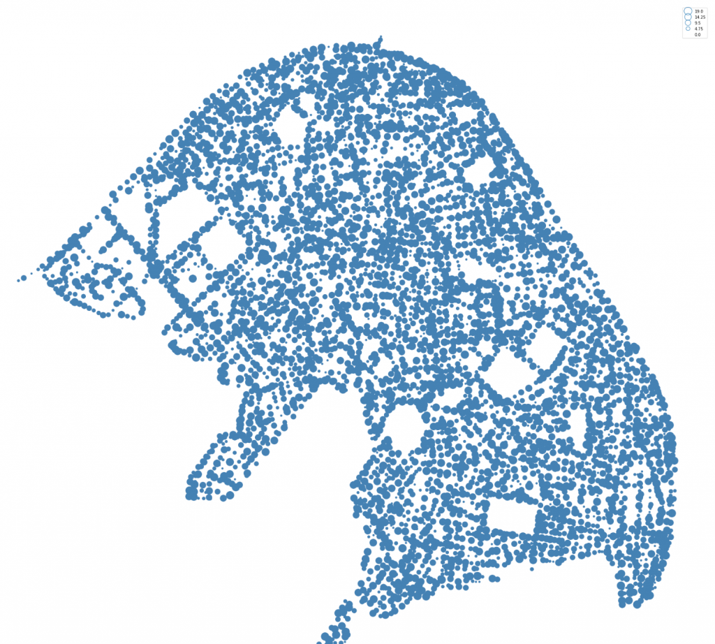
試著以scale作為視覺變數
gplt.pointplot(light, projection=gcrs.AlbersEqualArea(), scale='year', legend=True ,limits=(0, 8), figsize=(16, 8))
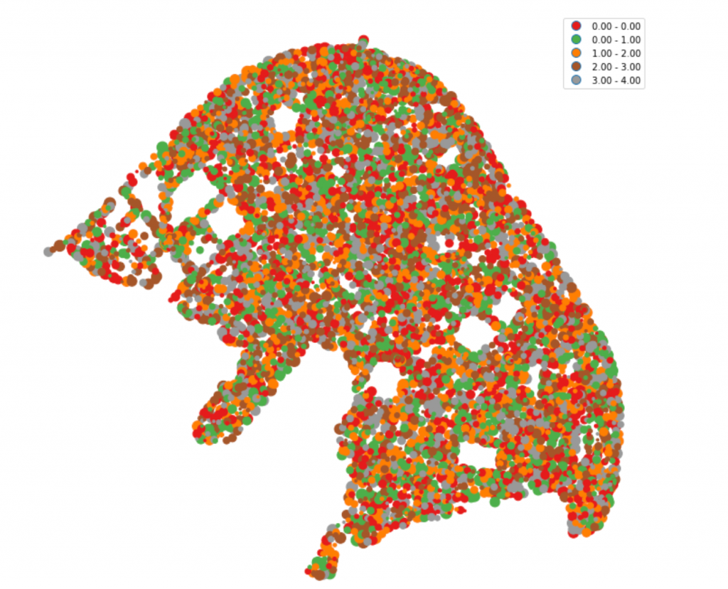
如果想要混和兩種視覺變數也可以,
我們多產生一個size,跟year一起呈現
例如我們以顏色及scale來呈現資料
light['size']=np.random.randint(low=0,high=5,size=light.shape[0])
gplt.pointplot(light, projection=gcrs.AlbersEqualArea(),hue='size', scale='year', legend=True ,limits=(0, 8), figsize=(40, 32))
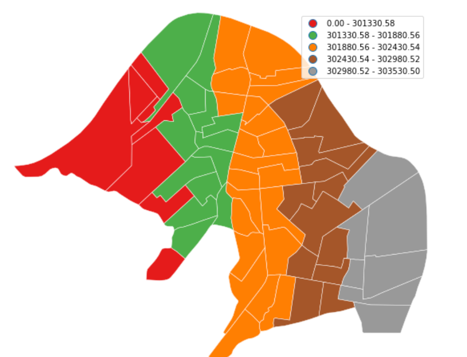
geolpot拿來畫面量圖也是頗方便
我們拿村里圖來測試一下(用x上色= ='')
village=gpd.read_file('data/village/village.shp',encoding='utf-8')
village=village[village.is_valid]
village=village[village['ADMIT']=='永和區']
village.crs = {'init' :'epsg:3826'} # 避免資料沒設,這邊再重新給一次
village=village.to_crs(epsg=4326)
gplt.choropleth(village, hue='X', projection=gcrs.AlbersEqualArea(),
        legend=True, edgecolor='white',   scheme='equal_interval',figsize=(16, 8))
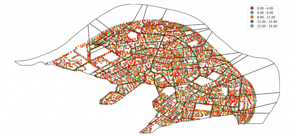
也可以畫累積圖(重現前幾天的圖~)
result=gpd.tools.sjoin(light[['geometry','year','size']], village[['ADMIV','ADMIT','geometry']], op='within',how="right")
result['count']=1
result=result.dissolve(by='ADMIV', aggfunc='sum')
result['year']=result['year']/result['count']
result['size']=result['size']/result['count']
gplt.choropleth(result, hue='count', projection=gcrs.AlbersEqualArea(),
        legend=True, edgecolor='white', linewidth=0.5,  scheme='equal_interval',figsize=(16, 8))
或者是另外一種方式呈現資訊
ax =gplt.polyplot(village,projection=gcrs.AlbersEqualArea(), figsize=(16, 8))
gplt.pointplot(light,ax=ax,projection=gcrs.AlbersEqualArea(),  hue='year', legend=True)
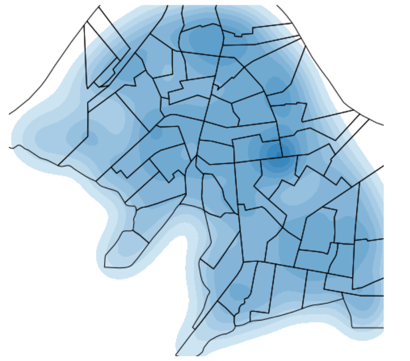
geoplot有heatmap的功能kdeplot
熱區圖計算的是Kernel density,計算核密度
ax =gplt.polyplot(result,projection=gcrs.AlbersEqualArea(), figsize=(16, 8))
ax=gplt.kdeplot(light,ax=ax,shade=True,projection=gcrs.AlbersEqualArea(),shade_lowest=False)
Gallery — geoplot 0.2.0 documentation