續上上篇我們對 Transitions 的學習,我們實現幾個效果試試看吧!
在上篇實作中完成了上方兩個動畫效果,本篇我們繼續實作下方兩個動畫效果吧!
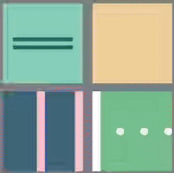
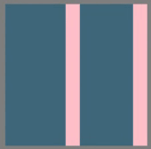
首先是 HTML 架構,如下方程式碼,盒子裡面有一個盒子 box3_box1,兩條會漸變爲圓形的長條方塊 box3_line1 及 box3_line2。
<div class="box box3">
 <div class="box3_box1"></div>
 <div class="box3_line1"></div>
 <div class="box3_line2"></div>
</div>
觀察一下,這裡有什麼動畫發生 1. 綠色方塊逐漸現型並放大 2.長條方塊依序縮小爲圓型並變色。接著我們一樣直接看看程式碼裏面有那些重點。
.box3{
  width: 200px;
  height: 200px;
  margin: 10px;
  background-color: #3E677D;
  display:flex;
  justify-content:space-between;
  align-items:center;
}
.box3_box1{
  width: 10px;
  height: 10px;
  background-color: #3E677D;
  transition: height 800ms ease-in,width 800ms ease-in,background-         color 800ms ease-in;
}
.box3:hover .box3_box1{
  height: 200px;
  width: 100px;
  background-color: #93C9A9;
}
.box3_line1{
  width: 20px;
  height: 200px;
  background-color: pink;
  transition: width 800ms ease-in,height 800ms ease-in,border-radius 800ms ease-in;
}
.box3:hover .box3_line1{
  width: 70px;
  height: 70px;
  border-radius:50%;
  background-color: #F3D1A4;
}
.box3_line2{
  width: 20px;
  height: 200px;
  background-color: pink;
  transition: height 800ms ease-in 500ms,border-radius 800ms ease-in 500ms,background-color 800ms ease-in 500ms;
}
.box3:hover .box3_line2{
  height: 20px;
  border-radius:50%;
  background-color: #93C9A9;
}
首先是 box3_box1 發生寬高及顏色的動畫改變,box3_box1 原寬高皆爲 10px,背景顏色爲 #3E677D,設置動畫 transition: height 800ms ease-in,width 800ms ease-in,background- color 800ms ease-in;,表示動畫效果發生於屬性 height、width、background-color ,發生時間持續 800ms ,動畫過程呈現方式爲 ease-in (開始時以緩速執行)。接著在 box3_box1 被 hover 的時候,觸發動畫效果,改變寬高及背景顏色。
box3_line1 及 box3_line2 改變寬高及顏色,與 box3_box1 設定原理相同。此兩者尚需改變爲圓形,在動畫設置中亦包含 border-radius 800ms ease-in 的動畫設定,box3_line1 及 box3_line2 被 hover 的時候,觸發動畫效果,改變 border-radius 至 50%,漸變爲圓形。
box3_line2 在每一個動畫設定上皆有延遲效果 500ms,使之延遲 500ms 後播放動畫。
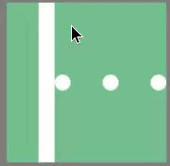
首先是 HTML 架構,如下方程式碼,盒子裡面有一個長條方塊 box4_line,三顆會移動逐漸消失的圓點 box4_circle1、box4_circle2、box4_circle3,共同樣式設置於 box4_circle。
<div class="box box4">
 <div class="box4_line"></div>
 <div class="box4_circle box4_circle1"></div>
 <div class="box4_circle box4_circle2"></div>
 <div class="box4_circle box4_circle3"></div>
</div>
右下動畫,主要是想實現被長條碰到依序消失的效果。觀察一下,這裡有什麼動畫發生 1. 白色長條位移 2.原點位移並逐漸消失。接著我們一樣直接看看程式碼裏面有那些重點。
.box4{
  width: 200px;
  height: 200px;
  margin: 10px;
  background-color: #77C090;
  display: flex;
  align-items:center;
  justify-content:space-between;
  overflow:hidden;
}
.box4_line{
  width: 20px;
  height: 200px;
  background-color: white;
  transition: transform 2.9s ease-in;
}
.box4_circle{
  width: 20px;
  height: 20px;
  border-radius:50%;
  background-color: #fff;
}
.box4_circle1{
  transition: transform 1.3s ease-out 1.4s,opacity 1.3s ease-out 1.4s;
}
.box4_circle2{
  transition: transform 1.3s ease-out 2.1s,opacity 1.3s ease-out 2.1s;
}
.box4_circle3{
  transition: transform 1.3s ease-out 2.7s,opacity 1.3s ease-out 2.7s;
}
.box4:hover .box4_line{
    transform: translateX(200px);
}
.box4:hover .box4_circle1{
    transform:translate(110px,50px);
    opacity: 0;
}
.box4:hover .box4_circle2{
    transform:translate(110px,-50px);
    opacity: 0;
}
.box4:hover .box4_circle3{
    transform:translate(110px,-50px);
    opacity: 0;
}
box4_line 不需要形體改變的動畫,只需位移至右方,設置動畫效果 transition: transform 2.9s ease-in;,表示動畫效果發生於屬性 transform,發生時間持續 2.9s,動畫過程呈現方式爲 ease-in (開始時以緩速執行)。接著在 box4_line 被 hover 的時候,觸發動畫效果,產生位移。
三顆圓點主要是利用延遲動畫時間,來控制圓點依序消失的效果,需考量 box4_line 移動速度及時間,調整延遲時間。圓點緩緩消失,主要是設定 opacity: 0 ,使它逐漸透明化。爲了豐富畫面可以分別設定圓點往不一樣的方向消失,更改 translate 中 Y 軸的數值。以 box4_circle1 爲例,設置動畫效果 transition: transform 1.3s ease-out 1.4s,opacity 1.3s ease-out 1.4s; ,表示動畫效果發生於屬性 transform、opacity ,發生時間持續 1.3s,動畫過程呈現方式爲 ease-in (開始時以緩速執行),並延遲 1.4s。當 box4_circle1 被 hover 的時候,觸發動畫效果,產生水平及垂直位移,並逐漸透明。
以上是這兩天 Transitions 的小小實作,大家可以自行想像幾何圖型的動畫運行並實作看看吧


 看影片追技術