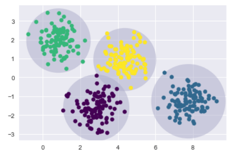
在上一節介紹k-means是以資料數據離中心的距離,來將資料進行聚類,若是資料分布於邊界上,很容易會出現資料分類不正確,今天要來講解高斯混合模型(Gaussian Mixture Models,GMM),它可以被視為k-means的延伸,將資料做更正確的聚類。
%matplotlib inline
import matplotlib.pyplot as plt
import seaborn as sns; sns.set()
import numpy as np
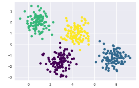
from sklearn.datasets.samples_generator import make_blobs
X, y_true = make_blobs(n_samples=400, centers=4,
                       cluster_std=0.60, random_state=0)
X = X[:, ::-1]

from sklearn.cluster import KMeans
kmeans = KMeans(4, random_state=0)
labels = kmeans.fit(X).predict(X)
plt.scatter(X[:, 0], X[:, 1], c=labels, s=40, cmap='viridis');
from sklearn.cluster import KMeans
from scipy.spatial.distance import cdist

def plot_kmeans(kmeans, X, n_clusters=4, rseed=0, ax=None):
    labels = kmeans.fit_predict(X)

    # plot the input data
    ax = ax or plt.gca()
    ax.axis('equal')
    ax.scatter(X[:, 0], X[:, 1], c=labels, s=40, cmap='viridis', zorder=2)

    # plot the representation of the KMeans model
    centers = kmeans.cluster_centers_
    radii = [cdist(X[labels == i], [center]).max()
             for i, center in enumerate(centers)]
    for c, r in zip(centers, radii):
        ax.add_patch(plt.Circle(c, r, fc='#ACACCA', lw=3, alpha=0.5, zorder=1))


kmeans = KMeans(n_clusters=4, random_state=0)
plot_kmeans(kmeans, X)
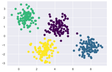
from sklearn.mixture import GMM
gmm = GMM(n_components=4).fit(X)
labels = gmm.predict(X)
plt.scatter(X[:, 0], X[:, 1], c=labels, s=40, cmap='viridis');
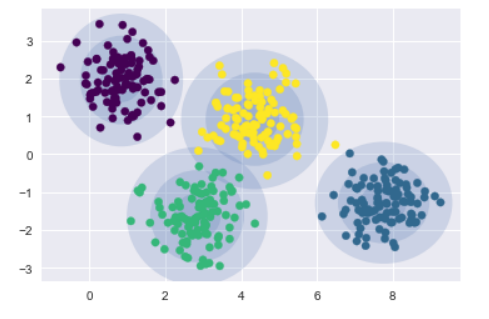
建立一個繪製聚類圓的函數draw_ellipse,來實作聚類最大化(expectation-maximization ,EM),持續實作E-M步驟,重複直到收斂:
from matplotlib.patches import Ellipse

def draw_ellipse(position, covariance, ax=None, **kwargs):
    ax = ax or plt.gca()

    # Convert covariance to principal axes
    if covariance.shape == (2, 2):
        U, s, Vt = np.linalg.svd(covariance)
        angle = np.degrees(np.arctan2(U[1, 0], U[0, 0]))
        width, height = 2 * np.sqrt(s)
    else:
        angle = 0
        width, height = 2 * np.sqrt(covariance)

    # Draw the Ellipse
    for nsig in range(1, 4):
        ax.add_patch(Ellipse(position, nsig * width, nsig * height,
                             angle, **kwargs))

def plot_gmm(gmm, X, label=True, ax=None):
    ax = ax or plt.gca()
    labels = gmm.fit(X).predict(X)
    if label:
        ax.scatter(X[:, 0], X[:, 1], c=labels, s=40, cmap='viridis', zorder=2)
    else:
        ax.scatter(X[:, 0], X[:, 1], s=40, zorder=2)
    ax.axis('equal')

    w_factor = 0.2 / gmm.weights_.max()
    for pos, covar, w in zip(gmm.means_, gmm.covars_, gmm.weights_):
        draw_ellipse(pos, covar, alpha=w * w_factor)


gmm = GMM(n_components=4, random_state=42)
plot_gmm(gmm, X)
最近天氣好差 濕濕冷冷的