這次要來寫的是閃爍霓虹文字的效果
一樣把基本架構寫好
<div class="centered">
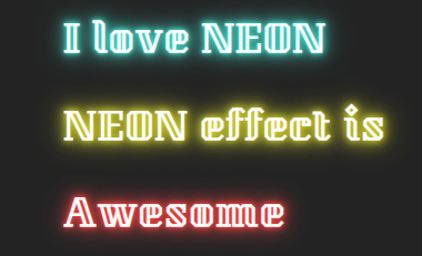
<h1 class="neon-effect">I love NEON</h1>
<h1 class="neon-effect">NEON effect is</h1>
<h1 class="neon-effect">Awesome</h1>
</div>
建議使用外框的字體,霓虹的效果會比較好看
這邊用的是 Kumar One Outline Google Font 的一種外框字
然後設定 css
*{
  font-family: 'Kumar One Outline', cursive;
}

body{background:#232323;}

.centered{
  position:absolute;
  left:50%;
  top:50%;
  transform:translate(-50%,-50%);
}

.neon-effect{
  color:#fff;
  letter-spacing:2px;
}

.neon-effect:nth-of-type(1){
  text-shadow:
    0 0 5px rgba(67,232,216, 1),
    0 0 10px rgba(67,232,216, 1),
    0 0 20px rgba(67,232,216, 1),
    0 0 40px rgba(67,232,216, 1);
  animation:neon-shine 2s linear infinite;

}

.neon-effect:nth-of-type(2){
  text-shadow:
    0 0 5px rgba(247, 245, 41,.1),
    0 0 10px rgba(247, 245, 41,1),
    0 0 20px rgba(247, 245, 41,1),
    0 0 40px rgba(247, 245, 41,1);
   animation:neon-shine 2s 1s linear infinite;
}

.neon-effect:nth-of-type(3){
  text-shadow:
    0 0 5px rgba(255, 65, 65, 1),
    0 0 10px rgba(255, 65, 65, 1),
    0 0 20px rgba(255, 65, 65, 1),
    0 0 40px rgba(255, 65, 65, 1);
  animation:neon-shine 2s linear infinite;
}
最後把動畫效果寫進來
@keyframes neon-shine{
  0%{opacity:1;}
  90%{opacity:0;}
  100%{
  color:#232323;}
}
在 90% 時先將透明度降為 0 ,會比100%才將透明度降低看起來更順暢些
到這邊就完成了
一樣附上本次的 codepen 如下
https://codepen.io/UHU/pen/Lgvdjj

 iThome鐵人賽
 看影片追技術