誠如先前文章所說,Flutter由許多Widgets去組成整個App,從這章節開始會從UI相關的Widgets開始介紹,
順便了解不同Widgets的名稱在Mobile development中的代表的是什麼組件。
在建構一個App,一定會用到的就是Basic widgets,下面會逐一介紹在這個Widget內有哪些類別可以使用。
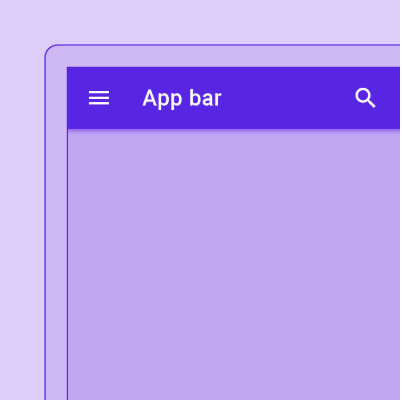
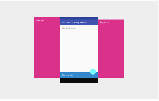
App bar可由Toobar或是其他Widgets組成,像是TabBar和FlexibleSpaceBar,如圖所見,這是一個常駐於螢幕上方的工具列。
App bar最常見被使用在Scaffold.appBar這個屬性。在這個widget內,預設會提供一個固定高度的app bar在螢幕上方的位置。
AppBar包含許多屬性,有leading、title、actions、bottom和flexibleSpace。
在下圖列出AppBar這個Widget每個插槽的相對位置,排列方式是由左至右。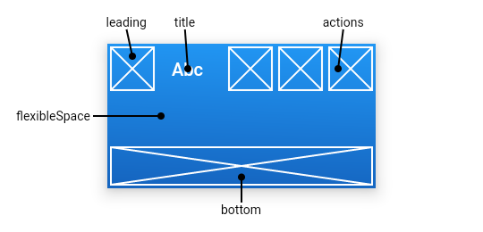

如圖所示,這是用來將子組件排列成垂直方向的widget,若希望它會自動填滿剩餘空間,需要將其包裝在Expanded 內。
另外,column並沒有有捲動(scroll)效果,如果需要能夠捲動,可以考慮使用ListView。
下方範例示範將widgets垂直排列,並擴展最後一個logo。
Column(
  children: <Widget>[
    Text('Deliver features faster'),
    Text('Craft beautiful UIs'),
    Expanded(
      child: FittedBox(
        fit: BoxFit.contain, // otherwise the logo will be tiny
        child: const FlutterLogo(),
      ),
    ),
  ],
)
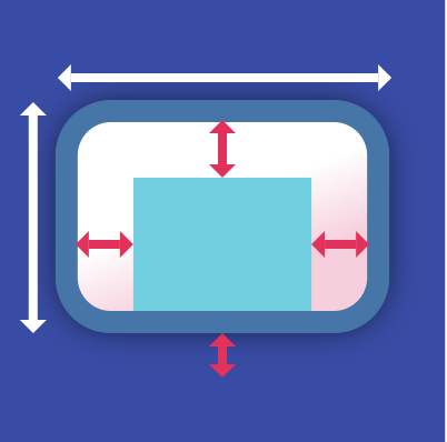
這個widget能組合painting、positioning和sizing這些widget,就是常見的容易概念。
首先,放在這個容器內的子組件會先計算出padding,然後套用其被約束(constraints)的寬高,最後
才是計算margin的大小。
以下範例是在Center這個widget內放入一個container,並且描述它的寬高及margin。
Center(
  child: Container(
    margin: const EdgeInsets.all(10.0),
    color: Colors.amber[600],
    width: 48.0,
    height: 48.0,
  ),
)

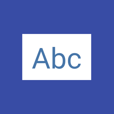
這個Widget有點奇妙,就是召喚一個Flutter logo出來。可以想到的就是在培訓或是作為demo的產品時可以使用。
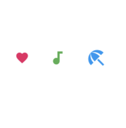
在Flutter內,已經內建豐富的icons可供使用。
用法可以參考如下:
Row(
  mainAxisAlignment: MainAxisAlignment.spaceAround,
  children: const <Widget>[
    Icon(
      Icons.favorite,
      color: Colors.pink,
      size: 24.0,
      semanticLabel: 'Text to announce in accessibility modes',
    ),
    Icon(
      Icons.audiotrack,
      color: Colors.green,
      size: 30.0,
    ),
    Icon(
      Icons.beach_access,
      color: Colors.blue,
      size: 36.0,
    ),
  ],
)
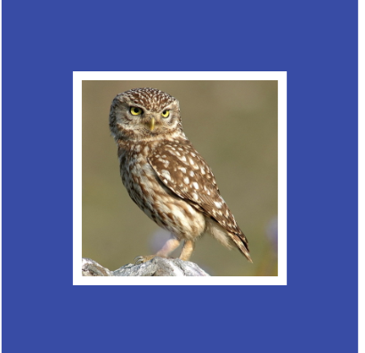
用來顯示圖片的Widget,支援格式有:JPEG、PNG、GIF、Animated GIF、WebP、Animated WebP、BMP和WBMP。
圖片可以被多種方式引入:
以下範例是透過其中一種ImageProvider獲得圖片:
const Image(
  image: NetworkImage('https://flutter.github.io/assets-for-api-docs/assets/widgets/owl.jpg'),
)

這個Widget會繪製一個Box,用來表示這個地方未實作完成,未來有可能放入別的widget在這個位置上。
這是一個基於Material Design的凸起按鈕。
按鈕本身帶有onPressed這個callback,若這個callback為null,即為disabled的效果。
以下範例分別示範disabled RaisedButton、enabled RaisedButton和漸層(gradient)背景色: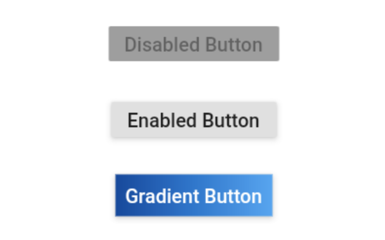
Widget build(BuildContext context) {
  return Center(
    child: Column(
      mainAxisSize: MainAxisSize.min,
      children: <Widget>[
        const RaisedButton(
          onPressed: null,
          child: Text(
            'Disabled Button',
            style: TextStyle(fontSize: 20)
          ),
        ),
        const SizedBox(height: 30),
        RaisedButton(
          onPressed: () {},
          child: const Text(
            'Enabled Button',
            style: TextStyle(fontSize: 20)
          ),
        ),
        const SizedBox(height: 30),
        RaisedButton(
          onPressed: () {},
          textColor: Colors.white,
          padding: const EdgeInsets.all(0.0),
          child: Container(
            decoration: const BoxDecoration(
              gradient: LinearGradient(
                colors: <Color>[
                  Color(0xFF0D47A1),
                  Color(0xFF1976D2),
                  Color(0xFF42A5F5),
                ],
              ),
            ),
            padding: const EdgeInsets.all(10.0),
            child: const Text(
              'Gradient Button',
              style: TextStyle(fontSize: 20)
            ),
          ),
        ),
      ],
    ),
  );
}

相對於column的垂直排列,row就是讓子組件能夠水平排列。
用法也很類似,一樣有個Expanded widget可以填滿水平空間。
同樣row也是不能捲動(scroll),若有捲動需求還是得參考ListView。
下方範例示範水平排列並且填滿可用空間。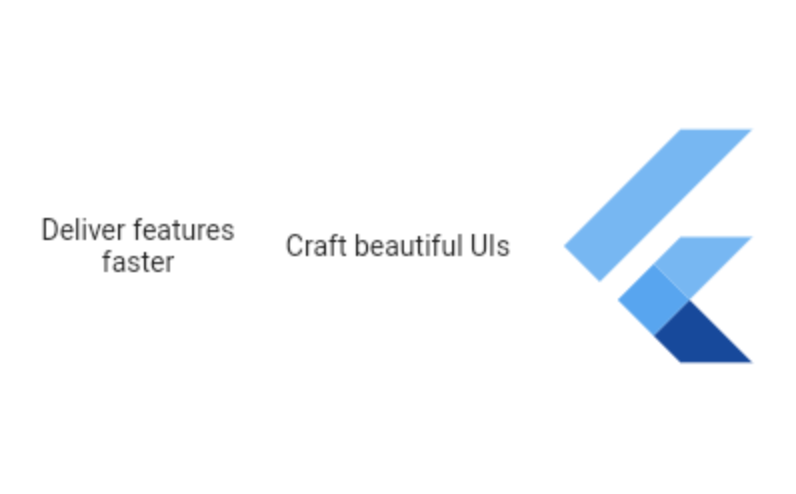
Row(
  children: <Widget>[
    Expanded(
      child: Text('Deliver features faster', textAlign: TextAlign.center),
    ),
    Expanded(
      child: Text('Craft beautiful UIs', textAlign: TextAlign.center),
    ),
    Expanded(
      child: FittedBox(
        fit: BoxFit.contain, // otherwise the logo will be tiny
        child: const FlutterLogo(),
      ),
    ),
  ],
)
在前一天的文章裡有稍微提到這個widget,我的認知這是個比較跟佈局有關的widget。
這個class針對drawers、snack bars和bottom sheets提供了多種APIs。
在這個展示的範例,Scaffold內有body和FloatingActionButton兩個屬性。在Body內有一個Text Widget被包在Center內,然後FloatingActionButton連動一個callback去進行計數的動作。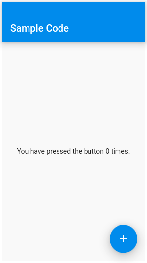
int _count = 0;

Widget build(BuildContext context) {
  return Scaffold(
    appBar: AppBar(
      title: const Text('Sample Code'),
    ),
    body: Center(
      child: Text('You have pressed the button $_count times.')
    ),
    floatingActionButton: FloatingActionButton(
      onPressed: () => setState(() => _count++),
      tooltip: 'Increment Counter',
      child: const Icon(Icons.add),
    ),
  );
}
用來顯示單一樣式的文字,文字斷點的位置取決於佈局的限制。
下方範例針對超過限制的文字,改以...顯示: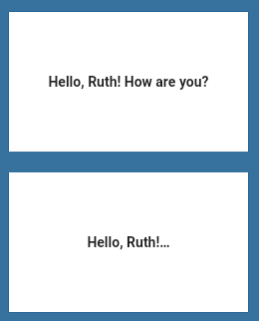
Text(
  'Hello, $_name! How are you?',
  textAlign: TextAlign.center,
  overflow: TextOverflow.ellipsis,
  style: TextStyle(fontWeight: FontWeight.bold),
)
若要顯示一段文字,並且設定為不同樣式時,可以用Text.rich: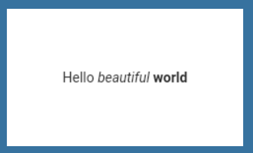
const Text.rich(
  TextSpan(
    text: 'Hello', // default text style
    children: <TextSpan>[
      TextSpan(text: ' beautiful ', style: TextStyle(fontStyle: FontStyle.italic)),
      TextSpan(text: 'world', style: TextStyle(fontWeight: FontWeight.bold)),
    ],
  ),
)
到這裡,應該可以體會Flutter是由很多個Widgets組成,光是basics widget就有這麼多,但熟悉了這些,要套用其他分類的widgets就快很多了。
明天會繼續介紹其他常見的UI Widgets,
https://flutter.dev/docs/development/ui/widgets/basics
第2點 children: <Widget>前面是不是要加上 const?
初學照做,vscode會出現藍波,解決方法加上const後就正常了,
再請大師指點,謝謝。
Column(
  children: const <Widget>[
    Text('Deliver features faster'),
    Text('Craft beautiful UIs'),
    Expanded(
      child: FittedBox(
        fit: BoxFit.contain, // otherwise the logo will be tiny
        child: const FlutterLogo(),
      ),
    ),
  ],
)


 iThome鐵人賽
 看影片追技術