大家早安,我是喵橘,今天我要報告的是 CSS 變形的各種效果。
transform 屬性功能是設定各種幾何的變化,能設定的值如下表所顯示:
| 設定值 | 說明 |
|---|---|
| translateX ( X 軸位移距離 ) | 隨著 X 軸移動,正值向右 ; 負值向左。 |
| translateX ( Y 軸位移距離 ) | 隨著 Y 軸移動,正值向下 ; 負值向上。 |
| translate ( X 軸位移距離 , Y 軸位移距離 ) | 隨著 XY 軸,移動各方向。 |
| scaleX ( X 軸縮放數值) | 隨著 X 軸放大或縮小。 |
| scaleY ( Y 軸縮放數值) | 隨著 Y 軸放大或縮小。 |
| scale ( X 軸縮放數值 , Y 軸縮放數值) | 隨著 XY 軸放大或縮小。 |
| rotate ( 旋轉的角度 ) | 設定角度來進行旋轉,正值順時針旋轉,負值逆時針旋轉。 |
| skewX ( X 軸傾斜角度) | 隨著 X 軸傾斜。 |
| skewY ( Y 軸傾斜角度) | 隨著 Y 軸傾斜。 |
| skew ( X 軸傾斜角度 , Y 軸傾斜角度 ) | 隨著 XY 軸傾斜。 |
CSS
div {
text-align: center;
}
.box1 {
width: 50px;
height: 50px;
background-color: #eac100;
}
.box2 {
width: 50px;
height: 50px;
background-color: #f75000;
}
.box3 {
width: 50px;
height: 50px;
background-color: #408080;
}
.box4 {
width: 50px;
height: 50px;
background-color: #33FFFF;
}
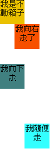
.trans1 {
transform: translate(30px,0);
}
.trans2 {
transform: translate(0,30px);
}
.trans3 {
transform: translate(50px,100px);
}
HTML
	<div class="box1">我是不動箱子</div>
	<div class="box2 trans1">我向右走了</div>
	<div class="box3 trans2">我向下走</div>
    <div class="box4 trans3">我隨便走</div>
範例圖示:
CSS
div {
text-align: center;
}
.box1 {
width: 100px;
height: 100px;
background-color: #eac100;
}
.box2 {
width: 100px;
height: 100px;
background-color: #f75000;
}
.box3 {
width: 100px;
height: 100px;
background-color: #408080;
}
.box4 {
width: 100px;
height: 100px;
background-color: #33FFFF;
}
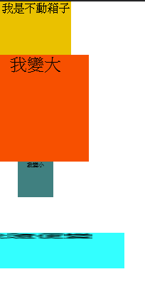
.trans1 {
transform: scale(1.5,1.5);
}
.trans2 {
transform: scale(0.5,0.5);
}
.trans3 {
transform: scale(2.5,0.5);
}
HTML
	<div class="box1">我是不動箱子</div>
	<div class="box2 trans1">我變大</div>
	<div class="box3 trans2">我變小</div>
	<div class="box4 trans3">我隨便變</div>
範例圖示:
CSS
div {
text-align: center;
}
.box1 {
width: 100px;
height: 100px;
background-color: #eac100;
}
.box2 {
width: 100px;
height: 100px;
background-color: #f75000;
}
.box3 {
width: 100px;
height: 100px;
background-color: #408080;
}
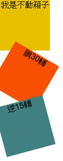
.trans1 {
transform: rotate(30deg);
}
.trans2 {
transform: rotate(-15deg);
}
.trans3 {
transform: rotate(30deg);
}
HTML
	<div class="box1">我是不動箱子</div>
	<div class="box2 trans1">順30轉</div>
	<div class="box3 trans2">逆15轉</div>
範例圖示:
CSS
div {
text-align: center;
}
.box1 {
width: 100px;
height: 100px;
background-color: #eac100;
}
.box2 {
width: 100px;
height: 100px;
background-color: #f75000;
}
.box3 {
width: 100px;
height: 100px;
background-color: #408080;
}
.box4 {
width: 100px;
height: 100px;
background-color: #33FFFF;
}
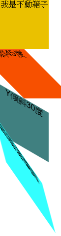
.trans1 {
transform: skew(45deg,0);
}
.trans2 {
transform: skew(0,30deg);
}
.trans3 {
transform: skew(15deg,55deg);
}
HTML
	<div class="box1">我是不動箱子</div>
	<div class="box2 trans1">X傾斜45度</div>
	<div class="box3 trans2">Y傾斜30度</div>
	<div class="box4 trans3">我隨便傾斜</div>
範例圖示:
節省程式碼是最好的方法,就是能寫在同一個設定值內,就會用到 matrix ,設定公式如下:
matrix(scale X, scale Y, skew X, skew Y, translate X , translate Y)
CSS
div {
	text-align: center;
}
.box1 {
	width: 100px;
	height: 100px;
	background-color: #eac100;
}

.box2 {
	width: 100px;
	height: 100px;
	background-color: #f75000;
}


.trans1 {

	transform: matrix( 0.75, 0.5, 0, 1.5, 53, 13 );

}
HTML
    <div class="box1">我是不動箱子</div>
	<div class="box2 trans1">多重變化</div>
範例圖示:

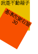
也可以改變變形原點的位置,可以定義 XY 兩個方向,方法如下所顯示:
CSS
div {
	text-align: center;
}
.box1 {
	width: 100px;
	height: 100px;
	background-color: #eac100;
}

.box2 {
	width: 100px;
	height: 100px;
	background-color: #f75000;
}


.trans1 {

		transform-origin: 150px 0;
        transform: rotate(30deg);


}
HTML
    <div class="box1">我是不動箱子</div>
	<div class="box2 trans1">基準改變右旋30</div>
範例圖示:
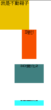
變形不只單單可以改變平面的各種狀況,也能改變成 3D 的狀態。變化的方法如下表所顯示:
| 設定值 | 說明 |
|---|---|
| translateZ( Z 軸位移距離 ) | 隨著 Z 軸移動。 |
| translate3d ( X 軸位移距離 , Y 軸位移距離 , Z 軸位移距離 ) | 隨著 XYZ 軸,移動各方向。 |
| scaleZ ( Z 軸縮放數值) | 隨著 Z 軸放大或縮小。 |
| scaleY ( Y 軸縮放數值) | 隨著 Y 軸放大或縮小。 |
| scale3d ( X 軸縮放數值 , Y 軸縮放數值 , Z 軸縮放數值 ) | 隨著 XYZ 軸放大或縮小。 |
CSS
div {
	text-align: center;
}
.box1 {
	width: 100px;
	height: 100px;
	background-color: #eac100;
}

.box2 {
	width: 100px;
	height: 100px;
	background-color: #f75000;
}

.box3 {
	width: 100px;
	height: 100px;
	background-color: #408080;
}


.box4 {
	width: 100px;
	height: 100px;
	background-color: #33FFFF;
}

.trans1 {

	transform: translate3d(50px,0px,150px) rotateY(60deg);

}

.trans2 {

	transform: translate3d(50px,0px,100px) rotateX(50deg);

}

.trans3 {

	transform: translate3d(50px,0px,50px) rotateX(80deg);

}
HTML
    <div class="box1">我是不動箱子</div>
	<div class="box2 trans1">3D變化1</div>
	<div class="box3 trans2">3D變化2</div>
	<div class="box4 trans3">3D變化3</div>
範例圖示:
今天是講解 CSS 變形設定,明天講解 CSS 動畫部分,感恩大家閱讀。


 看影片追技術