大家好,我是喵橘,今天要報告的是 CSS 版面定位設定,請大家多多指教。
它能隨著圖片進行文繞圖的動作,是屬於浮動元素的一種類型,所以,在定位、排版扮演相當重要的角色。假如是未使用 float 屬性的預設版面,排列方式是由上而下縱向呈現 ; 假如使用 float 屬性版面,就會跳出預設版面的框架,產生浮動的效果。
先從簡單的範例開始:
CSS
div {
    text-align: center;
}

.box1 {
	width: 20%;
	height: 50px;
	background-color: #eac100;
	float: left;
}

.box2 {
	width: 20%;
	height: 50px;
	background-color: #f75000;
	float: left;
}

.box3 {
	width: 20%;
	height: 50px;
	background-color: #408080;
	float: left;
}
HTML
<div class="box1">我是box1</div>
<div class="box2">我是box2</div>
<div class="box3">我是box3</div>
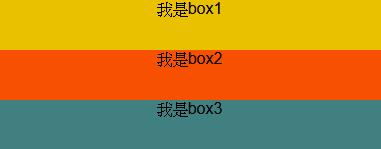
範例圖示:
非 float 屬性
有 float 屬性

在所有區塊元素都有設定 float 屬性 會乖乖的由左向右去做排列,那當不是區塊元素都有設定,會發生什麼狀況呢?
CSS
div {
    text-align: center;
}

.box1 {
	width: 20%;
	height: 50px;
	background-color: #eac100;
	float: left;
}

.box2 {
	width: 20%;
	height: 50px;
	background-color: #f75000;
	float: left;
}

.box3 {
	width: 20%;
	height: 50px;
	background-color: #408080;
	float: left;
}

.box4 {
	background-color: #ffbb77;
}
HTML
<div class="box1">我是box1</div>
<div class="box2">我是box2</div>
<div class="box3">我是box3</div>
<div class="box4">我是box4</div>
範例圖示:

發現問題了?!為何第四個區塊會被壓在最下面,那該怎麼解決呢?
去除浮動元素的方法不只一種,我先舉例最常使用的方法:
CSS
div {
    text-align: center;
}

.box1 {
	width: 20%;
	height: 50px;
	background-color: #eac100;
	float: left;
}

.box2 {
	width: 20%;
	height: 50px;
	background-color: #f75000;
	float: left;
}

.box3 {
	width: 20%;
	height: 50px;
	background-color: #408080;
	float: left;
}

.box4 {
	background-color: #ffbb77;
	clear: both;
}
HTML
<div class="box1">我是box1</div>
<div class="box2">我是box2</div>
<div class="box3">我是box3</div>
<div class="box4">我是box4</div>
範例圖示:

CSS
.wrapper{
  background: #6c6c6c;
}
div {
text-align: center;
}

.box1 {
	width: 30%;
	height: 100px;
	background-color: #eac100;
	float: left;
}

.box2 {
	width: 30%;
	height: 100px;
	background-color: #f75000;
	float: left;
}

.box3 {
	width: 30%;
	height: 100px;
	background-color: #408080;
	float: right;
}

.clearfix:before,
.clearfix:after {
  content: "";
  display: table;
}
.clearfix:after {
  clear: both;
}
.clearfix {
  *zoom: 1; /*For IE 6&7 only*/
}
HTML
<div class="wrapper clearfix">
	<div class="box1">我是box1</div>
	<div class="box2">我是box2</div>
	<div class="box3">我是box3</div>
</div>
範例圖示:

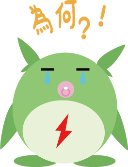
文字與圖片也可以設計成圖繞文的效果,如以下方法所顯示:
CSS
.image-container {
     max-width: 50%;
     margin: 0 20%;
 }


.image {
	width: 20%;
	height: 20%;
	float: right;
}
HTML
<div class="image-container">
	<img class="image" src="./img/Weathering_Logo.png"  alt=""/>
	<p>
		「很想試試在那光芒之中前行!」 高中1年級的夏天,少年帆高離家出走,由小島去到東京。但他生活極之貧困,孤獨度日,終於找到的一份工作,卻只是為一本古怪的「神秘學雜誌」寫稿。跟著連日滂沱大雨,像是來映襯他的失落。 在紛紜雜沓的大都會一角,帆高遇上了一個可愛的少女陽菜。陽菜和弟弟相依為命,個性堅強、開朗,但心中隱藏一個重大祕密── 她擁有一股不可思議的力量,她說:「馬上就會放晴了喔。」 廢棄大樓雜草叢生的屋頂上,在陽菜這句話之後,烏雲散去、陽光灑落,灰色的世界恢復了鮮豔色彩。在氣候異常的時代,被捉弄的少年少女,如何「選擇」自己的生活?
	</p>
</div>
範例圖示:
節錄自維基百科,網址:
https://zh.wikipedia.org/wiki/%E5%A4%A9%E6%B0%94%E4%B9%8B%E5%AD%90
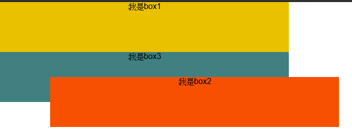
假如想要將元素精準的設定到想要的位置上,就可以使用 position 屬性,常用的設定如下表所顯示:
| 設定 | 說明 |
|---|---|
| static | 預設方法。 |
| absolute | 彈性配置版面。 |
| relative | 相對配置版面。 |
| fixed | 固定配置版面。 |
CSS
div {
	text-align: center;
}
.box1 {
	width: 30%;
	height: 100px;
	background-color: #eac100;
}

.box2 {
	width: 30%;
	height: 100px;
	background-color: #f75000;
	position: relative;
	position:absolute;
	left:100px;
	top:150px;
}

.box3 {
	width: 30%;
	height: 100px;
	background-color: #408080;
}
HTML
	<div class="box1">我是box1</div>
	<div class="box2">我是box2</div>
	<div class="box3">我是box3</div>
範例圖示:
今天是講解 CSS 版面定位設定,明天講解 CSS 變形部分,非常感謝大家的觀看。

 看影片追技術