R語言最強大的一個地方就在於它的繪圖能力,今天要來學習R語言的第一個圖表函數:plot,及基本自訂圖表型態
至於今天只介紹一個函數的原是因為光是plot這個函數好像就有很多東西可以寫,因此今天從這邊先起頭。
plot函數的寫法為:
plot(x = x軸資料, y = y軸資料, type = “一個資料型態(等等會介紹), main = 大標題, sub = 小標題, xlab = x軸標籤, ylab = y軸標籤, asp = y/x軸比例)
type 引數這個格子裡面可以填很多東西,我們先看程式碼:
par(mfrow = c(3,3),mar = c(4,4,2,2))
plot(1:10, type = "p",main = 'plot = "p"',xlab = "1-10")
plot(1:10, type = "l",main = 'plot = "l"',xlab = "1-10")
plot(1:10, type = "b",main = 'plot = "b"',xlab = "1-10")
plot(1:10, type = "c",main = 'plot = "c"',xlab = "1-10")
plot(1:10, type = "o",main = 'plot = "o"',xlab = "1-10")
plot(1:10, type = "h",main = 'plot = "h"',xlab = "1-10")
plot(1:10, type = "s",main = 'plot = "s"',xlab = "1-10")
plot(1:10, type = "S",main = 'plot = "S"',xlab = "1-10")
plot(1:10, type = "n",main = 'plot = "n"',xlab = "1-10")
寫好之後輸出,可以得到下列圖表: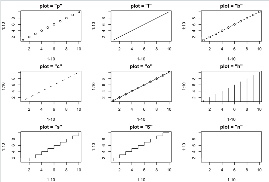
可以看到,每一種字母代表的圖表都不一樣,p代表點狀圖,l代表線狀圖,b代表點虛線圖,c代表虛線圖,o代表點連線圖,h代表直方圖,s及S皆是梯形圖,n則是沒有圖形
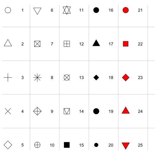
除了圖形的呈現方式之外,在R裡面也可以對圖形做很多種類的自訂,例如:改變點的形式。透過增加pch引數的方式,可以得出不同圖形,以下列表列出不同圖形對應不同pch數字:(21-25的點可為其他顏色)
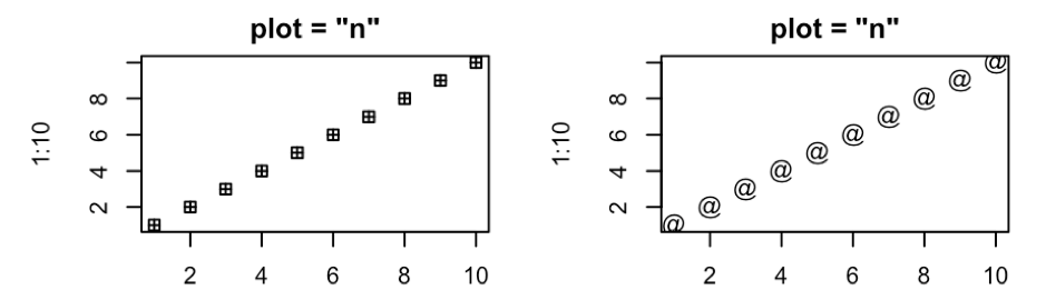
除了以上這些符號,只要在pch引數內打上任何一個符號,R都會把點的圖案帶換成該符號,以下有程式碼的輸出範例:
plot(1:10, pch = 12, type = "p",main = 'plot = "n"',xlab = "")
plot(1:10, pch = "@", type = "p",main = 'plot = "n"',xlab = "")
除了自訂點符號樣式及圖表樣式之外,R的圖表還可以做其他樣式的自訂,這部分我們明天繼續學習 :D
參考資料: