倘若不斷向深處扎根,就能茁壯成長 - RM
今天我們要介紹的是表格,表格本身屬於 table model,本身的結構在 HTML 中分別有對應的標籤(XML 中沒有)主要結構為表格、表格列、表格單元,以下我們可以看到在 HTML 中分別對應 CSS 的標籤,基礎的表格主要為以下的結構生成:
<col>(可以隱性存在)<tr>
<th>、<td>
<table>
簡單的表格可以透過以下元素設置:

<table>
  <tr>
    <td>John</td>
    <td>Doe</td>
  </tr>
  <tr>
    <td>Jane</td>
    <td>Doe</td>
  </tr>
</table>
你也可以寫成以下具有,<col> 的結構,這時候可以透過 <col> 對於行設置某些樣式設定。

<table>
	<col>
	<col>
  <tr>
    <td>John</td>
    <td>Doe</td>
  </tr>
  <tr>
    <td>Jane</td>
    <td>Doe</td>
  </tr>
</table>
<col> 結構不設置 table 能照常生成,此時 <col> 會以隱式的方式存在。columns of this example are specified implicitly
<tr> 的後代元素身份存在,不過我們還是能透過使用 <col> 來對後代的 table-cell 產生影響,可以在我們需要對列設定某些樣式時應用:
<col> 背景色。border-collapse: collapse 設置時,可以設置 col 的 border 各種樣式。col border
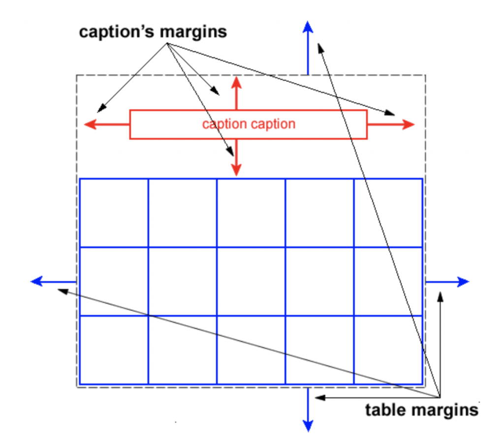
可以看到表格中的 margin 算法,table 會以黑框為基準去計算,表格中的
<caption>會以紅框為基準去計算,至於表格其餘內容(例如行、列) margin 無效。
規範定義:
The element generates a principal table wrapper box that establishes a block formatting context , and which contains an additionally-generated table grid box that establishes a table formatting context
表格本身內部具有兩種格式化上下文,分別為為 table formatting context、block formatting context,而在表格中表格標題 <caption> 會參與 block formatting context、其他表格內容參與在 table formatting context 中,各自遵守不同的格式化上下文。
<caption> 不會與外層 margin collapse,因為位於不同的 block formatting context。<tr>、<th>、<td> 等這些表格內容會參與在 table formatting context 中,生成行列樣貌的表格。<caption> 因為參與 BFC ,本身是 block-level element 所以可以設置 margin。table margin 無效
tr,th,td{
  margin: 15px; /* 無效呦 */
}
剛剛有提到的表格佈局在 table 中分為兩種,分別為 table-layout: auto、table-layout: fixed 分別對於表格寬度會有不同的算法,以下將各自介紹。
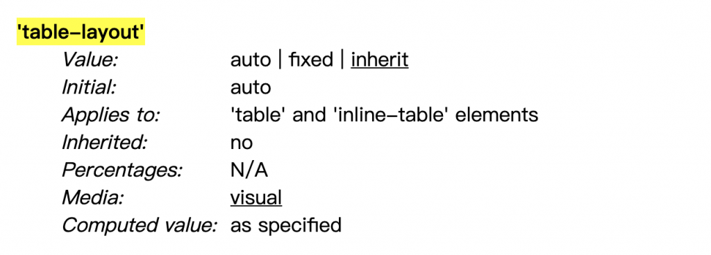
規範定義:The ‘table-layout’ property controls the algorithm used to lay out the table cells, rows, and columns. Values have the following meaning
table-layout: auto規範定義:In this algorithm (which generally requires no more than two passes), the table’s width is given by the width of its columns (and intervening borders ).
在自動寬度表格的計算下,表格每格的寬度取決於表格行的寬度,當表格內容越多越寬,該行越寬。table-layout-auto
table{
  outline: 1px dotted;
  table-layout: auto;
}

我們可以看到表格的寬度在設置 table-layout: auto,表格內容越多,該行佔有的寬度越多,表格本身的寬度會包含所有行的寬度。
table-layout: fixedWith this (fast) algorithm, the horizontal layout of the table does not depend on the contents of the cells; it only depends on the table’s width, the width of the columns, and borders or cell spacing.
在固定寬度算法下的表格,表格寬度會以表格整體寬度去平均計算,不會取決於 table-cell,舉例來說:
auto 的情況下,寬度取決於表格整體平均到每個 table-cell 的寬度。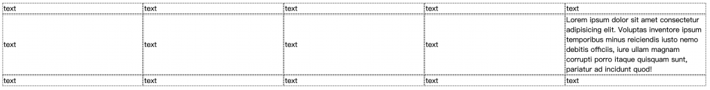
可以看見上圖中的表格行不依照內容去平均寬度,而是以總體寬度平均去計算。table-layout-fixed
table{
  outline: 1px dotted;
  width: 100%;
  table-layout: fixed;
}
以上簡略地介紹了表格,其中 table-layout 提供了兩種不同的表格佈局寬度算法,在不同的時機使用各有優勢,可以在需要透過內容決定表格行寬度時使用 auto,反之需要固定表格寬度則可以用 fixed,我們明天見~
Tables
A Complete Guide to the Table Element | CSS-Tricks
以上的部分有任何錯誤的地方,歡迎指正呦~非常感謝~~XD


 iThome鐵人賽
 看影片追技術