倘若不斷向深處扎根,就能茁壯成長 - RM
現在透過桌機、筆電、手機、平板,輕輕一操作便可以上網,考慮到各種設備的顯示像素以及大小與維護網頁親和性之間的平衡,網頁往往需對不同設備考慮合適的佈局,這個時候便可以透過 Media Query 去根據 Author 想要的設備型態(例如你今天可能考慮設備是手機、平板)或是設備的某個特定特徵(例如螢幕解析度或是大小)來在某種情況下套用合適的 CSS 屬性值。

規範直通車:
Media Query
規範定義:
A media query is a method of testing certain aspects of the user agent or device that the document is being displayed in.
A media query is a logical expression that is either true or false. A media query is true if:
the media type , if specified, matches the media type of the device where the user agent is running, and
the media condition is true.
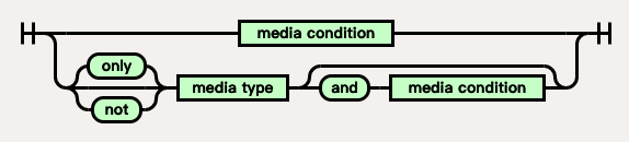
Media Query 是一組邏輯表達式,判斷當前設備是否符合媒體設備條件後再套用樣式,由一個可選可不選的 media type 以及零個至多個的 media feature 所構成,當滿足了以下的條件,Media Query 結果為 true,便會套用該樣式,這一組邏輯表達式如同上圖。
A media query consists of a media type and zero or more expressions that check for the conditions of particular media features.
Media Query 有兩種寫法,也就是綠色上圖的意思是:
A media query may optionally be prefixed by a single media query modifier, which is a single keyword which alters the meaning of the following media query.
Media Query 可以加上單一前綴詞 not、only 來更改整個邏輯表達式含義:
not螢幕 及同時 解析度大於 72dpi 便套用screen and (min-resolution: 72dpi)
加上 not
螢幕 及同時 解析度大於 72dpi 便套用not screen and (min-resolution: 72dpi)
以上面範例來說,原先符合顯示設備為 螢幕 以及 解析度大於 72dpi 狀態下會套用,不過加上 not 後會將整個結果變為 false,也就是除了顯示設備為 螢幕 以及 解析度大於 72dpi 狀態都會套用樣式。
以範例來說,當我們今天要套用某個樣式到除了 螢幕 以及同時是 解析度大於 72dpi 以外的所有設備,可以這樣設定,這樣 螢幕 及同時是 解析度大於 72dpi 便不會被套用。
onlyThe concept of media queries originates from HTML4 [HTML401] . That specification only defined media types , but had a forward-compatible syntax that accommodated the addition of future concepts like media features : it would consume the characters of a media query up to the first non-alphanumeric character, and interpret that as a media type , ignoring the rest. For example, the media query screen and (color)would be truncated to just screen .
由於部分舊瀏覽器中只支援 media type,今天輸入 screen and (min-resolution: 72dpi) 時,舊瀏覽器讀到的是 screen 在這樣的情況下會照成非預期的套用,於是 only 便出現了,當設定的 only 舊瀏覽器會當作沒有這個 media type 而忽略。
only screen and (min-resolution: 72dpi)
只有當符合 screen and (min-resolution: 72dpi) 才會套用。
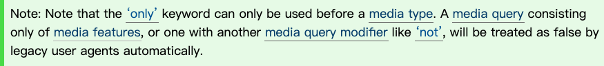
only 只能被用在 media type 前,不可以直接加在 media feature 前。
如下我們針對不同種的情況寫出了不同的範例。
example
@media (min-resolution: 50dpi) and (max-resolution: 600dpi){
  .one{
    color: red;
  }
}
當符合 (min-resolution: 50dpi) and (max-resolution: 600dpi) 結果便是 true。
@media all and screen{
  .two{
    color: red;
  }
}
有多組 media type 而錯誤不會套用。
@media not screen and (max-width: 1000px){
  .three{
    color: red;
  }
}
當不符合 screen and (max-width: 1000px) 結果便是 true
今天會先介紹 Media Queries 中的 Media Query Modifiers,之後兩天將接續介紹其他部分,我們明天見~

Media Queries Level 4
Media Queries
前端新手村 Media Query - iT 邦幫忙
CSS Media Queries 詳細介紹 - OXXO.STUDIO
css - What is the difference between “screen” and “only screen” in media queries? - Stack Overflow
Bootstrap 4 繁體中文手冊 六角學院譯
以上的部分有任何錯誤的地方,歡迎指正呦~非常感謝~~XD

 看影片追技術