倘若不斷向深處扎根,就能茁壯成長 - RM
規範定義:This module defines a set of CSS properties that affect the visual rendering of elements to which those properties are applied; these effects are applied after elements have been sized and positioned according to the visual formatting model from [CSS2].
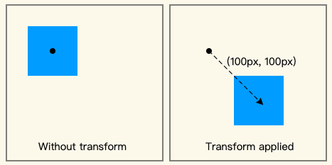
這一篇文章中我們會來看 transform,藉由這一個屬性我們能夠修改 box 的視覺空間維度,根據原本的 box 依據去縮放、旋轉、偏移,變換後的 box 不會影響到原先圍繞該元素的其他 box,規範寫到是類似於 position: relative 的情況。
規範:
CSS Transforms Module Level 1
規範定義:
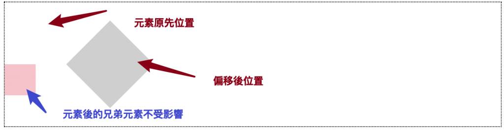
For elements whose layout is governed by the CSS box model, the transform property does not affect the flow of the content surrounding the transformed element. However, the extent of the overflow area takes into account transformed elements. This behavior is similar to what happens when elements are offset via relative positioning.
我們可以看到藉由 <transform> 屬性設置 旋轉、偏移 的 box 不會影響到其他本身在其周圍的元素。Codepen:transform 不影響其後 flow 元素
transform: translate(120px, 50%) rotate(45deg);
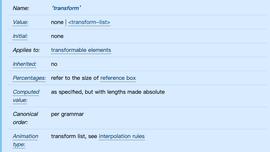
transform 屬性可能被指定為關鍵字值 none 或著一或多個 <transform-function> 值。
To serialize the
<transform-function>s, serialize as per their individual grammars, in the order the grammars are written in, avoiding<calc()>expressions where possible, avoiding<calc()>transformations, omitting components when possible without changing the meaning, joining space-separated tokens with a single space, and following each serialized comma with a single space.
<transform-function> :可使用一個或多個 CSS transform functions ,複合多個值時會由左至右的順序來套用。<transform-function> 例如為: <translate()>、<translateX()>、<translateY()>、<scale()>、<scaleX()> 、<scaleY()>、<rotate()>等等,更多詳規範。舉例來說,今天我對一個 <div> 元素設置旋轉 45 度、旋轉 10 度、位移 120px 50% ,按照上面的規則來看最後會偏移幾度呢?是 45 度還是 10 度?
transform: translate(120px, 50%) rotate(45deg) rotate(10deg);
答案是 10 度。
會因為由左至右讀取而導致元素最後旋轉的角度為 10deg
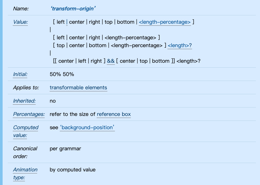
除了寫進 transform 中 transform-function 外,transform-origin 這個屬性可以制定 rotate 旋轉時的中心點,預設值為 box 中心。

範例:transform 中心
transform-origin: top left;
透過設置 transform-origin: top left 可以調整旋轉的圓心基準點。
以上大致上介紹了 transform 的屬性值設定,有許多有趣的 transform-function 可以調整出不同的效果,十分神奇~我們明天見~
CSS Transforms Module Level 1
transform-origin - CSS | MDN
transform - CSS | MDN
CSS沒有極限 - CSS transform 概觀 | 卡斯伯 Blog - 前端,沒有極限
以上的部分有任何錯誤的地方,歡迎指正呦~非常感謝~~XD


 看影片追技術