完成navigation bar 之後是主要的內容區。
.content{
    width: 70vw;
    margin: 0px auto;
}
將寬度設為70%的螢幕寬度,並且加上margin: 0px auto; 讓content維持在畫面中央。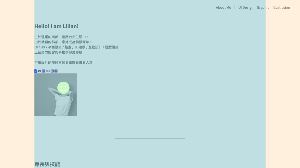
按照div 分好區塊
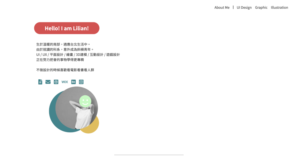
<div class="about-me" >
            <div>
                <h2 class="big-title" >Hello! I am Lilian!</h2>
                <p>生於溫暖的南部,適應台北生活中。<br>
                    由於就讀的科系,意外成為斜槓青年。<br>
                    UI / UX / 平面設計 / 繪畫 / 3D建模 / 互動設計 / 遊戲設計<br>
                    正在努力把會的事物學得更專精<br><br>
                    不做設計的時候喜歡看電影看書看人群
                </p>
                <div class="icons">
                    <a href="#" alt="履歷表"><i class="fas fa-file-alt"></i></a>
                    <a href=""><i class="fas fa-envelope"></i></a>
                    <a href=""><i class="fab fa-dribbble-square"></i></a>
                    <a href=""><i class="fab fa-wix"></i></a>
                    <a href=""><i class="fab fa-behance-square"></i></a>
                    <a href=""><i class="fab fa-instagram-square"></i></a>
                </div>
            </div>
            <div class="img-head">
                <img src="./img/head01.jpg" alt="" width="200px" height="200px">
                <div class="circle01"></div>
                <div class="circle02"></div>
            </div>
</div>
首先是標題,加上class="big-title" ,因為之後也會出現相同區塊大標題,所以給他們套上同一個class。這邊的circle01 與circle02 是為了做出照片底下的兩個圓形,所放置的div。
.big-title{
    color:#ffffff;
    background-color:#D15352;
    width: fit-content;
    padding: 10px 50px;
    border-radius: 50px;
    margin-bottom: 30px;
}
接下來文字跟icon的部分很簡單,設好margin跟padding就好了。
.about-me p{
    margin-bottom: 10x;
    padding:5px 10px;
}
.about-me .icons{
    padding: 5px 10px;
    font-size: 24px;
}
.about-me .icons a{
    color:#44858C;
    margin-left: 10px;
}
.about-me .icons a:hover{
    color:#D15352;
}
再來,圖片的部分,為了之後的三個圓形排版,先將最外層的 .img-head 設為 position:relative;。
.img-head{
    width: 205px;
    height: 220px;
    position: relative;
    margin-left: 100px;
}
裡面的圖片與兩個圓形,分別設為position:absolute;,再去調整它的位置。
.img-head img{
    border-radius: 200px;
    position: absolute;
    z-index: 1;
}
.circle01{
    width: 200px;
    height: 200px;
    background-color: #44858C;
    border-radius: 200px;
    position: absolute;
    top: 15px;
    left:-30px;
}
.circle02{
    width: 100px;
    height: 100px;
    background-color: #E0BD5E;
    border-radius: 100px;
    position: absolute;
    bottom: 0px;
    right: 0px;
}
最後來排版!使用justify-content: center; 與align-items: center; 讓他在垂直與水平都置中。
.about-me{
    display: flex;
    flex-flow: row wrap;
    justify-content: center;
    align-items: center;
}
我們的About me 區域就大功告成啦!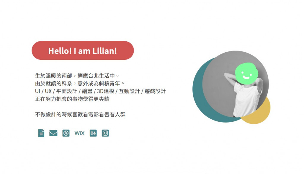
下一章 Keep Going 5 - 專長三角形
※本文章所使用之圖片皆為本人作品,內容則為本人之經驗分享

 iThome鐵人賽
 看影片追技術