今天會介紹以下utility css class以及相關的CSS基礎
一、區塊型式
二、定位
三、間距
四、字型格式
五、其它 (滑鼠、卷軸、等寬等高、邊框圓角)
六、移除
對應Quasar文件:
https://quasar.dev/style/other-helper-classes#Size-Related
https://quasar.dev/style/visibility#Introduction
每一種網頁元素都會有html為它預設的display屬性。
分為inline element以及block-level element
(1) 會自適應內容大小。
(2) 不能設定width、height、background-img。
(3) 常見的置中方式為,在父層設定text-align:center
例如:a、span、img…

<div class="wrapper">
  <span class="is_inline">
    display: inline;
  </span>
</div>
.wrapper {
  background: green;
  text-align: center;
}
.is_inline {
  width: 600px;
  height: 600px;

  padding: 10px;
  margin: 10px;

  font-size: 24px;
  background-color: orange;
}
在Quasar無對應的css class
(1) 預設會佔滿父元素的寬度,所以可能會換行如
(2) 可以設定width、height、background-img
(3) 常見的置中方式為,在元素本身設定margin:xx auto;
例如:div、p、ul、li、h1、h2…

<div class="wrapper">
  <p class="is_block">
    display: block;
  </p>
</div>
.wrapper {
  background: green;
  overflow: auto;
}
.is_block {
  width: 200px;
  height: 200px;

  padding: 10px;
  margin: 10px auto;

  font-size: 24px;
  background-color: orange;
}
在Quasar可以設定 class="block"
<div class="block">display: block;</div>
(1) 外在像inline不會換行且會自適應大小,
(2) 內在像block可以設定width、height、background-img
(3) 可以在block element設為inline block,在父層使用text-align置中
<div class="wrapper">
  <span class="is_inline_block">
    display: inline-block;
  </span>
</div>
.wrapper {
  background: green;
  text-align: center;
}
.is_inline_block {
  display: inline-block;

  width: 200px;
  height: 200px;

  padding: 10px;
  margin: 10px;

  font-size: 24px;
  background-color: orange;
}

在Quasar可以設定 class="inline-block"
<div class="inline-block">display: inline-block;</div>
隱藏標籤元素
在quasar可以設定 class="hidden"
<div class="hidden">display: none;</div>
對應Quasar文件:
https://quasar.dev/style/positioning#Introduction
藉由指定元件的「上」、「下」、「左」、「右」位置進行排版
常用的定位方式包含「相對定位 (relative)+絕對定位(absoulte)」與「固定位置(fixed)」
Quasar根據這三種Position定義的CSS Class:
| CSS | Description |
|---|---|
| fullscreen | Fix position covering all window real-estate |
| fixed | Set position to fixed without specifying top, left, right or bottom properties |
| fixed-center | Set position to fixed but in the middle of window. |
| absolute | Set position to absolute without specifying top, left, right or bottom properties |
| absolute-center | Set position to absolute but in the middle of the container (container needs relative position). |
| fixed-top, absolute-top | Fixed or absolute position to top of screen |
| fixed-right, absolute-right | Fixed or absolute position to the right edge of screen |
| fixed-bottom, absolute-bottom | Fixed or absolute position to bottom of screen |
| fixed-left, absolute-left | Fixed or absolute position to the left edge of screen |
| fixed-top-left, absolute-top-left | Fixed or absolute position to top left of screen |
| fixed-top-right, absolute-top-right | Fixed or absolute position to top right of screen |
| fixed-bottom-left, absolute-bottom-left | Fixed or absolute position to bottom left of screen |
| fixed-bottom-right, absolute-bottom-right | Fixed or absolute position to bottom right of screen |
| fixed-full, absolute-full | Fixed or absolute position to all screen edges |
| relative-position | Set position to relative |
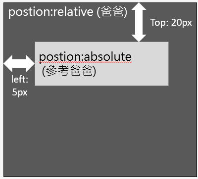
設定絕對定位的元件位置(absolute),會參考在上一層設定(relative)的位置
若上一層無設定relative,則會一直往上找。
若完全沒有任何父層有設定relative,則會參考<body>
<div class="parent">
    <div class="child"></div>
</div>
.parent {
    position: relative;
}
.child {
    position: absolute;
    top: 20px;
    left: 10px;
}
將「相對定位 (relative)+絕對定位(absolute)」的例子改寫:
<div class="parent relative-position">
    <div class="child absolute"></div>
</div>
.child {
    top: 20px;
    left: 10px;
}
不管視窗位置、大小怎麼變化,區塊永遠顯示頁面的某個位置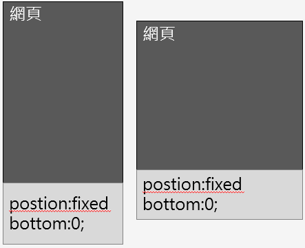
<div class="fixed-bottom">position:fixed; botton:0;</div>
不管視窗位置、大小怎麼變化,區塊永遠顯示頁面的某個位置
對應Quasar 文件:
https://quasar.dev/style/spacing#Syntax
元件本身與外面的間距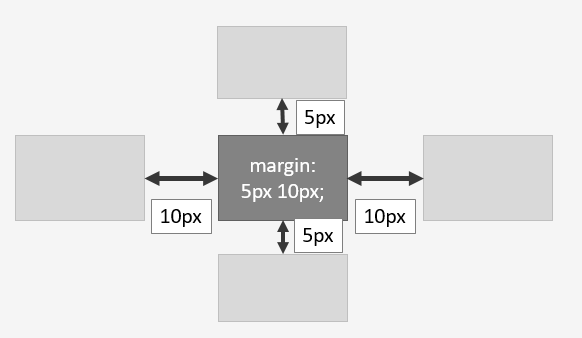
元件內容與元件本身的間距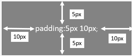
Quasar的Spacing CSS樣式
q-[p|m][t|r|b|l|a|x|y]-[none|auto|xs|sm|md|lg|xl]
    T       D                   S

T - type
  - values: p (padding), m (margin)

D - direction
  - values:
      t (top), r (right), b (bottom), l (left),
      a (all), x (both left & right), y (both top & bottom)

S - size
  - values:
      none,
      auto (ONLY for specific margins: q-ml-*, q-mr-*, q-mx-*),
      xs (extra small),
      sm (small),
      md (medium),
      lg (large),
      xl (extra large)
例如:
<div class="q-pa-sm">padding: map.get($space-sm, x) map.get($space-sm, y)</div>
<div class="q-my-md q-mx-lg">margin: map.get($space-md, y)  map.get($space-lg, x);</div>
size大小依據src/css/quasar.variables.scss、src/css/quasar.variables.sass 或 src/css/quasar.variables.styl裡面的變數設定
$space-base   : 16px !default
$space-x-base : $space-base !default
$space-y-base : $space-base !default

$space-none : (x: 0, y: 0) !default
$space-xs   : (x: ($space-x-base * .25), y: ($space-y-base * .25)) !default
$space-sm   : (x: ($space-x-base * .5), y: ($space-y-base * .5)) !default
$space-md   : (x: $space-x-base, y: $space-y-base) !default
$space-lg   : (x: ($space-x-base * 1.5), y: ($space-y-base * 1.5)) !default
$space-xl   : (x: ($space-x-base * 3), y: ($space-y-base * 3)) !default
對應Quasar文件:
https://quasar.dev/style/typography
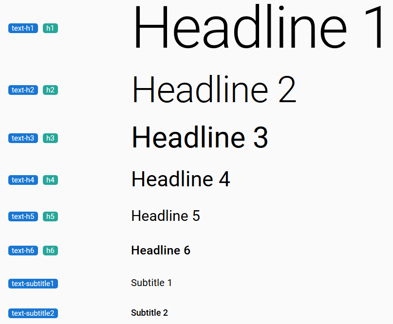
套用與<hx>相同的css樣式
<!--<h1>h1</h1> -->
<div class="text-h1">h1</div>
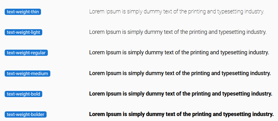
相當於css的font-weight
<!--font-weight: bold -->
<div class="text-weight-bold">font-weight: bold;</div>
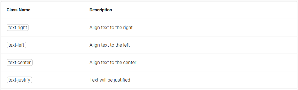
相當於css的text-align
<!--text-align: center -->
<div class="text-center">text-align: center;</div>
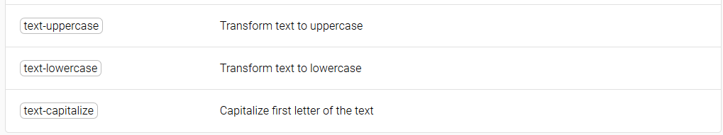
相當於css的text-transform
<!--text-transform: uppercase -->
<div class="text-uppercase">text-transform: uppercase</div>
對應Quasar文件:
https://quasar.dev/style/other-helper-classes#Mouse-Related
相當於css的cursor
經常用來設定滑鼠移到上面時的圖示
<!--cursor: pointer -->
<div class="cursor-pointer">cursor: pointer;</div>
相當於css的 overflow
經常用來設定卷軸的顯示和隱藏
<!--overflow: scroll -->
<div class="scroll">overflow: scroll;</div>
<div class="overflow-hidden">overflow: hidden;</div>
經常用來設定等寬或等高
<div class="fit">width: 100%; height: 100%</div>

<div class="full-width">width: 100%;</div>
<div class="full-height">height: 100%;</div>

<div class="window-width">width: 100vw;</div>
<div class="window-height">width: 100vh;</div>
經常用來移除原有的邊框、圓角和陰影
<div class="no-border">border: none;</div>

<div class="no-border-radius">border-radius: none<div>
<div class="no-box-shadow">box-shadow: none</div>
當我們需要對Quasar元件預設的CSS樣式進行修改
卻不想要因此另外寫CSS規則
就可以使用這些utility css class
下方延伸閱讀的兩個網站
是對於剛學HTML和CSS的人來說非常有用的網站
第一個網站,可以快速查詢某個標籤的屬性範例及預設的區塊形式
第二個網站,可以快速查詢某個CSS屬性的使用範例
htmlreference.io
cssreference.io


 iThome鐵人賽
 看影片追技術