一、圖文資訊元件
二、ICON: Webfont & SVG
三、通知訊息元件
四、總結
QImg比起HTML的 img,可以很方便的處理額外的特殊需求
包括Responsive、Transition、Caption
此元件是以Background來呈現,可以設定Background-size是cover還是contain
contain會強制維持原比例寬高,cover則是依照設定的寬或高,超出的部分則會裁切掉。
The QImg component makes working with images (any picture format) easy and also adds a nice loading effect to it along with many other features (example: the ability to set an aspect ratio).
https://quasar.dev/vue-components/img
程式碼示意: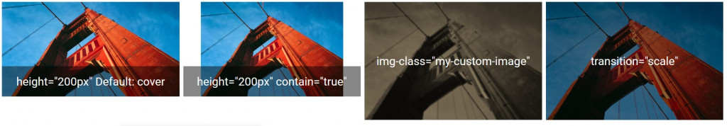
<template>
  <div class="q-pa-sm row q-col-gutter-sm">
    <div class="col-3">
      <q-img src="https://cdn.quasar.dev/img/parallax2.jpg" height="200px">
        <div class="absolute-bottom text-h5 text-center">
            height="200px"
            Default: cover
          </div>
      </q-img>
    </div>
    <div class="col-3">
      <q-img src="https://cdn.quasar.dev/img/parallax2.jpg" height="200px" :contain="true">
        <div class="absolute-bottom text-h5 text-center">
            height="200px"
            contain="true"
         </div>
      </q-img>
    </div>
    <div class="col-3">
      <q-img src="https://cdn.quasar.dev/img/parallax2.jpg" img-class="my-custom-image">
        <div class="absolute-full text-h5 flex flex-center">
          img-class="my-custom-image"
        </div>
      </q-img>
    </div>
    <div class="col-3">
      <q-img src="https://cdn.quasar.dev/img/parallax2.jpg" transition="scale">
        <div class="absolute-full text-h5 flex flex-center">
          transition="scale"
        </div>
      </q-img>
    </div>
  </div>
</template>

<script>
export default {
  data () {
    return {
    }
  }
}
</script>

<style lang="scss" scoped>
.my-custom-image {
  filter: blur(1px) sepia()
}
</style>
此元件可呈現圖片或影片捲動時的視差效果
Parallax scrolling is a technique in computer graphics and web design, where background images move by the camera slower than foreground images, creating an illusion of depth in a 2D scene and adding to the immersion.
https://quasar.dev/vue-components/parallax#QParallax-API
程式碼示意:
<div class="q-pa-md">
    <div style="height: 100px;"></div>
    <q-parallax>
      <template v-slot:media>
        <img src="https://cdn.quasar.dev/img/parallax2.jpg">
      </template>

      <template v-slot:content="scope">
        <div
          class="absolute column items-center"
          :style="{
            opacity: 0.45 + (1 - scope.percentScrolled) * 0.55,
            top: (scope.percentScrolled * 60) + '%',
            left: 0,
            right: 0
          }"
        >
          <img src="https://cdn.quasar.dev/logo/svg/quasar-logo.svg" style="width: 150px; height: 150px">
          <div class="text-h3 text-white text-center">Quasar Framework</div>
          <div class="text-h6 text-grey-3 text-center">
            v{{ $q.version }}
          </div>
        </div>
      </template>
    </q-parallax>
    <div style="height: 100px;"></div>
</div>
將文字、圖片、icon裁切成圓形、圓角矩形或方形
The QAvatar component creates a scalable, color-able element that can have text, icon or image within its shape.
https://quasar.dev/vue-components/avatar
程式碼示意:

<div class="q-pa-sm">
    <q-item class="bg-yellow-7" clickable v-ripple>
      <q-item-section side>
        <q-avatar size="48px">
          <img src="https://cdn.quasar.dev/img/avatar.png" />
          <q-badge floating color="teal">new</q-badge>
        </q-avatar>
      </q-item-section>
      <q-item-section>
        <q-item-label>Mary</q-item-label>
        <q-item-label caption>2 new messages</q-item-label>
      </q-item-section>
      <q-item-section side>
        3 min ago
      </q-item-section>
    </q-item>
</div>
1.大多元件的icon屬性
以QBtn為例:
<q-btn unelevated icon="settings" label="settings" color="blue"></q-btn>
2.使用QIcon元件
The QIcon component allows you to easily insert icons within other components or any other area of your pages.
https://quasar.dev/vue-components/icon#Custom-mapping
<q-btn unelevated color="blue">
      <q-icon class="q-mr-sm" name="settings"></q-icon>
      <div>settings</div>
</q-btn>
可以在quasar.config.js > extras: [] 設定你需要的Icon Font Library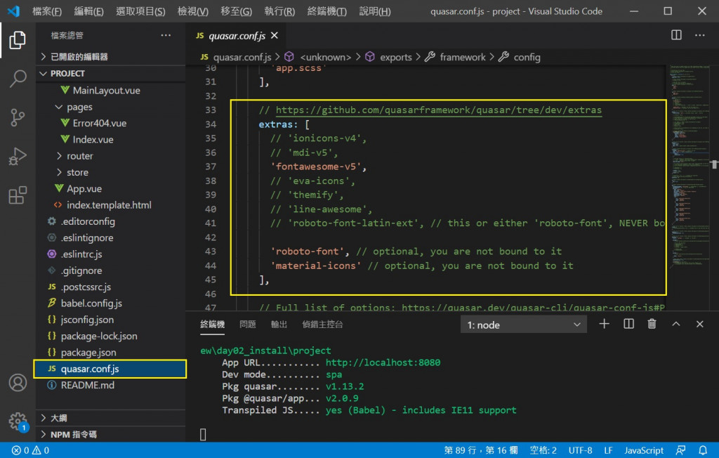
除了Webfont icons,也可以使用自訂的SVG檔
以下是兩種方便修改大小與顏色的SVG使用方式
1. svguse
(1)在public底下新增一個svg資料夾,把svg檔案放在裡面
(2)在svg檔案,給予<svg>一個id,並確定沒有設定任何長度與寬度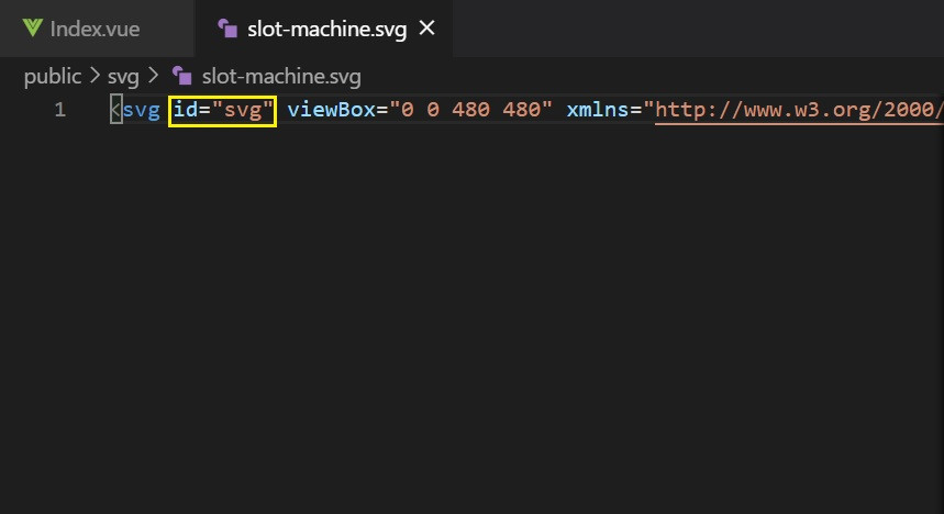
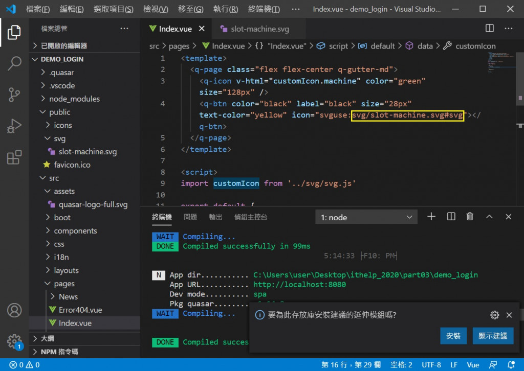
(3)在元件的icon屬性,或者QIcon的name,使用svguse,指定SVG的public路徑與id
icon="svguse:path#id"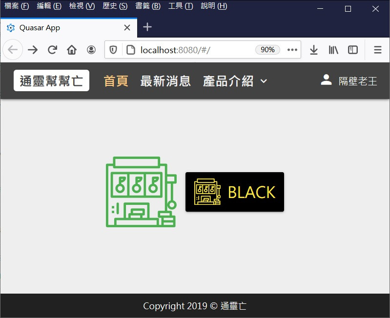
<template>
  <q-page class="flex flex-center q-gutter-md">
    <q-icon v-html="customIcon.machine" color="green" size="128px" />
    <q-btn color="black" label="black" size="28px" text-color="yellow" icon="svguse:svg/slot-machine.svg#svg"></q-btn>
  </q-page>
</template>

<script>
export default {
  name: 'PageIndex',

  data () {
    return {
    }
  },
  mounted () {
  }
}
</script>
2.SVG + v-html
(1)在src底下新增一個svg資料夾,接著在svg資料夾新增svg.js
(2)把svg的內容export出去
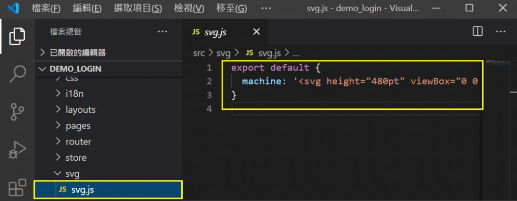
export default {
  machine: '<svg height="480pt" viewBox="0 0 480 480" width="480pt" xmlns="http://www.w3.org/2000/svg"><path d="m136 144c0-4.417969-3.582031-8-8-8h-32c-4.417969 0-8 3.582031-8 8v41.136719c-15.601562 4.027343-25.777344 19.03125-23.746094 35.015625s15.632813 27.96875 31.746094 27.96875 29.714844-11.984375 31.746094-27.96875-8.144532-30.988282-23.746094-35.015625v-9.136719c17.664062-.019531 31.980469-14.335938 32-32zm-18.148438 8c-2.855468 4.949219-8.136718 8-13.851562 8v-8zm-5.851562 64c0 8.835938-7.164062 16-16 16s-16-7.164062-16-16 7.164062-16 16-16c8.832031.011719 15.988281 7.167969 16 16zm0 0"/><path d="m248 144c0-4.417969-3.582031-8-8-8h-32c-4.417969 0-8 3.582031-8 8v41.136719c-15.601562 4.027343-25.777344 19.03125-23.746094 35.015625s15.632813 27.96875 31.746094 27.96875 29.714844-11.984375 31.746094-27.96875-8.144532-30.988282-23.746094-35.015625v-9.136719c17.664062-.019531 31.980469-14.335938 32-32zm-18.148438 8c-2.855468 4.949219-8.136718 8-13.851562 8v-8zm-5.851562 64c0 8.835938-7.164062 16-16 16s-16-7.164062-16-16 7.164062-16 16-16c8.832031.011719 15.988281 7.167969 16 16zm0 0"/><path d="m376 104h-336c-4.417969 0-8 3.582031-8 8v160c0 4.417969 3.582031 8 8 8h336c4.417969 0 8-3.582031 8-8v-160c0-4.417969-3.582031-8-8-8zm-328 16h96v144h-96zm112 0h96v144h-96zm208 144h-96v-144h96zm0 0"/><path d="m320 248c16.101562.035156 29.710938-11.925781 31.746094-27.902344 2.03125-15.972656-8.148438-30.960937-23.746094-34.960937v-9.136719c17.664062-.019531 31.980469-14.335938 32-32 0-4.417969-3.582031-8-8-8h-32c-4.417969 0-8 3.582031-8 8v41.136719c-15.597656 4-25.777344 18.988281-23.746094 34.960937 2.035156 15.976563 15.644532 27.9375 31.746094 27.902344zm21.851562-96c-2.855468 4.949219-8.136718 8-13.851562 8v-8zm-21.851562 48c8.835938 0 16 7.164062 16 16s-7.164062 16-16 16-16-7.164062-16-16c.011719-8.832031 7.167969-15.988281 16-16zm0 0"/><path d="m472 120h-56v-64c0-4.417969-3.582031-8-8-8h-40v-40c0-4.417969-3.582031-8-8-8h-304c-4.417969 0-8 3.582031-8 8v40h-40c-4.417969 0-8 3.582031-8 8v416c0 4.417969 3.582031 8 8 8h456c4.417969 0 8-3.582031 8-8v-64c0-4.417969-3.582031-8-8-8h-16v-24c0-4.417969-3.582031-8-8-8h-24v-184h24v113.136719c-15.601562 4.027343-25.777344 19.03125-23.746094 35.015625s15.632813 27.96875 31.746094 27.96875 29.714844-11.984375 31.746094-27.96875-8.144532-30.988282-23.746094-35.015625v-113.136719h16c4.417969 0 8-3.582031 8-8v-48c0-4.417969-3.582031-8-8-8zm-8 208c0 8.835938-7.164062 16-16 16s-16-7.164062-16-16 7.164062-16 16-16c8.832031.011719 15.988281 7.167969 16 16zm-400-312h288v48h-288zm8 448v-32h272v32zm208-48h-32v-16h8c4.417969 0 8-3.582031 8-8v-32c0-4.417969-3.582031-8-8-8h-80c-4.417969 0-8 3.582031-8 8v24h-8c-4.417969 0-8 3.582031-8 8v24h-16v-88h144zm-96-32v-16h64v16zm48 16v16h-64v-16zm224 64h-64v-16h64zm0-32h-64v-16h64zm-24-32h-64v-16h64zm-72-32c-4.417969 0-8 3.582031-8 8v32c0 4.417969 3.582031 8 8 8h16v48h-16v-40c0-4.417969-3.582031-8-8-8h-56v-96c0-4.417969-3.582031-8-8-8h-160c-4.417969 0-8 3.582031-8 8v96h-56c-4.417969 0-8 3.582031-8 8v40h-40v-400h32v8c0 4.417969 3.582031 8 8 8h304c4.417969 0 8-3.582031 8-8v-8h32v304zm104-200h-48v-32h48zm0 0"/><path d="m80 312c-4.417969 0-8 3.582031-8 8v64c0 4.417969 3.582031 8 8 8s8-3.582031 8-8v-64c0-4.417969-3.582031-8-8-8zm0 0"/><path d="m40 368h16v16h-16zm0 0"/><path d="m40 336h16v16h-16zm0 0"/></svg>'
}
(3) import 到 vue 裡面的data,塞到QIcon的v-html
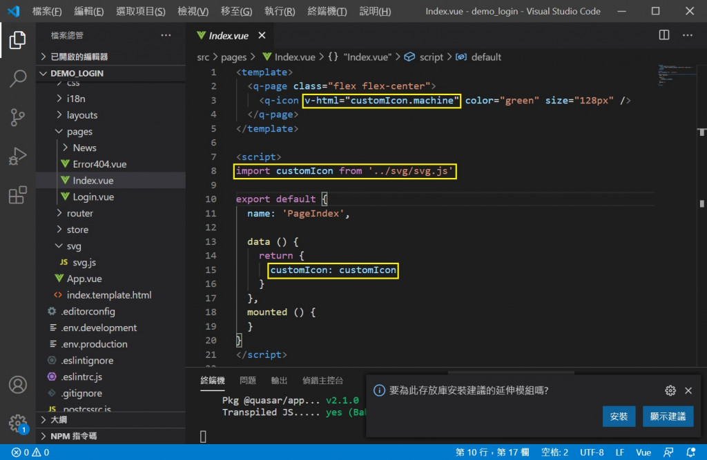
<template>
  <q-page class="flex flex-center">
    <q-icon v-html="customIcon.machine" color="green" size="128px" />
  </q-page>
</template>

<script>
import customIcon from '../svg/svg.js'

export default {
  name: 'PageIndex',

  data () {
    return {
      customIcon: customIcon
    }
  },
  mounted () {
  }
}
</script>
常用於通知類的資訊顯示
The QBadge component allows you to create a small badge for adding information like contextual data that needs to stand out and get noticed. It is also often useful in combination with other elements like a user avatar to show a number of new messages.
https://quasar.dev/vue-components/badge
程式碼示意:

<template>
  <div class="q-pa-sm">
    <q-btn dense color="purple" round icon="email" class="q-ml-md" size="24px">
      <q-badge class="badge" color="red" floating>4</q-badge>
    </q-btn>
  </div>
</template>

<style lang="scss" scoped>
.badge {
  padding: 8px;
  font-size: 20px;
}
</style>
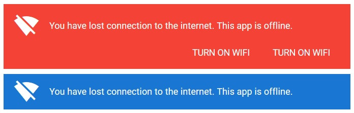
告知使用者某項狀態資訊,以及可執行的動作
The QBanner component creates a banner element to display a prominent message and related optional actions.
https://quasar.dev/vue-components/banner
程式碼示意:
<div class=" q-pa-sm q-gutter-sm">
    <q-banner class="text-white bg-red">
    <template v-slot:avatar>
        <q-icon name="signal_wifi_off" color="white"> </q-icon>
     </template>
      You have lost connection to the internet. This app is offline.
      <template v-slot:action>
        <q-btn flat color="white" label="Turn ON Wifi"></q-btn>
        <q-btn flat color="white" label="Turn ON Wifi" > </q-btn>
      </template>
    </q-banner>
    <q-banner class="text-white bg-blue-8">
    <template v-slot:avatar>
        <q-icon name="signal_wifi_off" color="white"> </q-icon>
     </template>
      You have lost connection to the internet. This app is offline.
    </q-banner>
</div>
常用於告知使用者,做完某個操作後的結果狀態
Notify is a Quasar plugin that can display animated messages (floating above everything in your pages) to users in the form of a notification. They are useful for alerting the user of an event and can even engage the user through actions. Also known as a toast or snackbar.
https://quasar.dev/quasar-plugins/notify
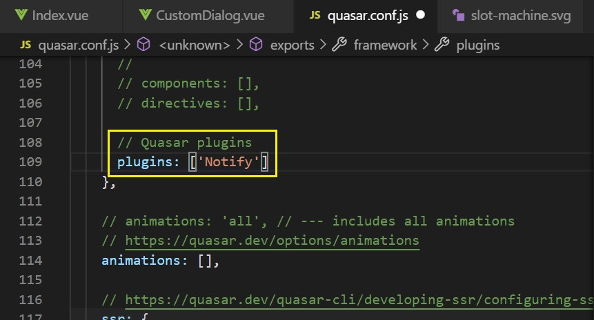
1. 前置作業
必須先在quasar.config.js 檔案底下的 Frameworks > plugins,設定 'notify'
Notify的全域設定可以寫在 Frameworks > config > notify: {}
return {
  framework: {
    plugins: [
      'Notify'
    ],
    config: {
      notify: {
          position: 'top',
          timeout: 3000,
      }
    }
  }
}
2. 使用方式
// outside of a Vue file
import { Notify } from 'quasar'

Notify.create('Danger, Will Robinson! Danger!')
// or with a config object:
Notify.create({
  message: 'Danger, Will Robinson! Danger!'
})

// inside of a Vue file
this.$q.notify('Message')
// or with a config object:
this.$q.notify({...})
3. 通知類型
透過type參數設定
程式碼示意:

<template>
  <div class="q-pa-md">
    <div class="row q-gutter-sm">
      <q-btn no-caps unelevated color="positive" @click="triggerPositive" label="Trigger 'positive'" />
      <q-btn no-caps unelevated color="negative" @click="triggerNegative" label="Trigger 'negative'" />
      <q-btn no-caps unelevated color="warning" text-color="dark" @click="triggerWarning" label="Trigger 'warning'" />
      <q-btn no-caps unelevated color="info" @click="triggerInfo" label="Trigger 'info'" />
      <q-btn no-caps unelevated color="grey-8" @click="triggerOngoing" label="Trigger 'ongoing' (v1.14+)" />
    </div>
  </div>
</template>

<script>
export default {
  methods: {
    triggerPositive () {
      this.$q.notify({
        type: 'positive',
        message: `This is a "positive" type notification.`
      })
    },
    triggerNegative () {
      this.$q.notify({
        type: 'negative',
        message: `This is a "negative" type notification.`
      })
    },
    triggerWarning () {
      this.$q.notify({
        type: 'warning',
        message: `This is a "warning" type notification.`
      })
    },
    triggerInfo () {
      this.$q.notify({
        type: 'info',
        message: `This is a "info" type notification.`
      })
    },
    triggerOngoing () {
      // we need to get the notification reference
      // otherwise it will never get dismissed ('ongoing' type has timeout 0)
      const notif = this.$q.notify({
        type: 'ongoing',
        message: 'Looking up the search terms...'
      })
      // simulate delay
      setTimeout(() => {
        notif({
          type: 'positive',
          message: 'Found the results that you were looking for',
          timeout: 1000
        })
      }, 4000)
    }
  }
}
</script>
4. 方向
透過position參數設定
程式碼示意:

<template>
  <div class="q-pa-md">
    <div class="row q-gutter-sm">
      <q-btn no-caps unelevated color="positive" @click="triggerPositive" label="Trigger 'positive'" />
    </div>
  </div>
</template>

<script>
export default {
  methods: {
    triggerPositive () {
      this.$q.notify({
        type: 'positive',
        position: 'top',
        message: `This is a "positive" type notification.`
      })
    }
  }
}
</script>
5. 自訂類型
使用registerType自訂一個預設的類型
在呼叫時,可以直接傳入參數覆寫該類型的預設樣式
程式碼示意:
<template>
  <div class="q-pa-md">
    <div class="row q-gutter-sm">
      <q-btn no-caps color="primary" @click="triggerCustomRegisteredType" label="Custom Notify"></q-btn>
    </div>
  </div>
</template>

<script>
export default {
  methods: {
    triggerCustomRegisteredType () {
      // this one overrides some of the original
      // options of the "my-notif" registered type
      this.$q.notify({
        type: 'my-notif',
        position: 'top',
        icon: 'contactless',
        message: `This notification is using a custom type.`,
        caption: `It overrides the type's default icon and color.`,
        color: 'primary'
      })
    }
  },

  created () {
    /**
     * The reason we have this here
     * is that the type needs to be
     * registered before using it.
     *
     * The best place would be a boot file instead
     * of a .vue file, otherwise it'll keep on
     * registering it every time your component
     * gets to be used :)
     */

    this.$q.notify.registerType('my-notif', {
      icon: 'announcement',
      progress: false,
      color: 'brown',
      textColor: 'white',
      classes: 'glossy'
    })
  }
}
</script>
明天將會繼續介紹「表單與按鈕」的元件

 iThome鐵人賽
 看影片追技術