相信像下列的輸入框需求,在前端開發的時候很容易遇到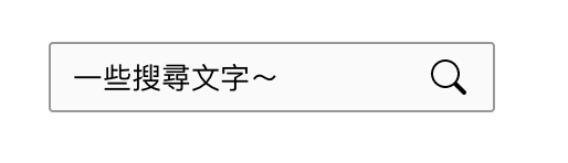
菜鳥前端的第一直覺大概就會想要這樣寫... 把icon的部分直接放在 <input>裡面
<input>
    <svg/>
</input>
如果運氣好一點,你寫的是直接的html的話,會發現貼心的瀏覽器幫你變成這樣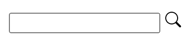
但是運氣不好的話,或是寫的是React的JSX的話,就會收到以下警訊,然後什麼東西都沒跑出來
Uncaught Error: input is a void element tag and must neither have
childrennor usedangerouslySetInnerHTML.
簡單來說,<input>裡面不能放子元素!
好der,所以到底該怎麼做呢?
除了直接使用Boostrap、Semantic或Material提供的樣板之外
其實HTML應該要拆成這樣才對: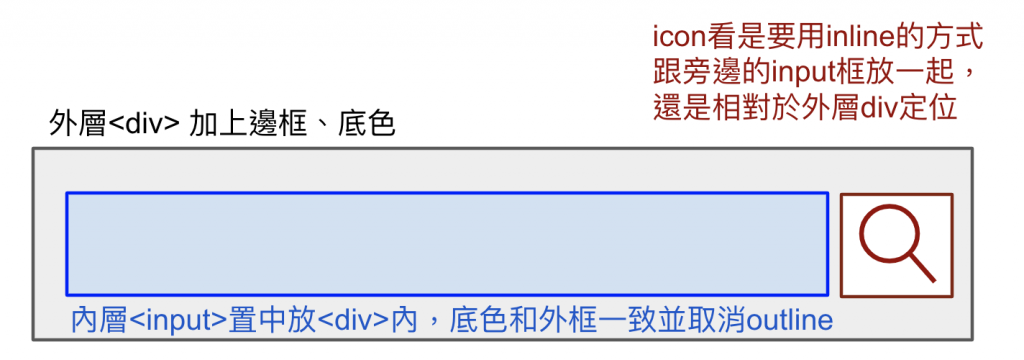
這邊附上純HTML的寫法與使用React Hook 和Function Component的寫法!
<div
    style="
        width: 200px;
        height: 30px;
        background: #FaFaFa 0% 0% no-repeat padding-box;
        border: 1px solid #989898;
        border-radius: 2px;
        padding: 0px;
        display: flex;
        align-items: center;
    "
>
    <input
        style="
            border: none;
            outline: none;
            background: #FaFaFa 0% 0%  padding-box;
            margin: 0px 0px 0px 10px;
            padding: 0px;
            width: 162px;
        "
    />
    <svg xmlns="http://www.w3.org/2000/svg" width="16" height="16" fill="currentColor" class="bi bi-search" viewBox="0 0 16 16"><path d="M11.742 10.344a6.5 6.5 0 1 0-1.397 1.398h-.001c.03.04.062.078.098.115l3.85 3.85a1 1 0 0 0 1.415-1.414l-3.85-3.85a1.007 1.007 0 0 0-.115-.1zM12 6.5a5.5 5.5 0 1 1-11 0 5.5 5.5 0 0 1 11 0z"></path></svg>

</div>
export function MySearchBar(){
  const [searchBarValue, setSearchBarValue] = useState('');
  function searchBarInputChangeHandler(event: React.ChangeEvent<HTMLInputElement>): void
  {
    setSearchBarValue(event.target.value);
  }

  const searchBarDivStyle: CSSProperties = {
    width: '200px',
    height: '30px',
    background: '#FaFaFa 0% 0% no-repeat padding-box',
    border: '1px solid #989898',
    borderRadius: '2px',
    padding: '0px',
    display: 'flex',
    alignItems: 'center',
  }
  const searchBarInputStyle: CSSProperties = {
    border: 'none',
    outline: 'none',
    background: '#FaFaFa 0% 0% no-repeat padding-box',
    margin: '0px 0px 0px 10px',
    padding: '0px',
    width: '162px'
  }

  return (
      <div style={searchBarDivStyle}>
        <input
          style={searchBarInputStylr}
          value={searchBarValue}
          onChange={(event) => { searchBarInputChangeHandler(event); }}
        />
         <svg xmlns="http://www.w3.org/2000/svg" width="16" height="16" fill="currentColor" class="bi bi-search" viewBox="0 0 16 16"><path d="M11.742 10.344a6.5 6.5 0 1 0-1.397 1.398h-.001c.03.04.062.078.098.115l3.85 3.85a1 1 0 0 0 1.415-1.414l-3.85-3.85a1.007 1.007 0 0 0-.115-.1zM12 6.5a5.5 5.5 0 1 1-11 0 5.5 5.5 0 0 1 11 0z"></path></svg>
      </div>
  );
}
<input>內不管是要包Icon,還是包按鈕
都可以用<div>+CSS包裝的方式來達成,也就是
<div>:<input>:假如還是不想自己刻,還是可以參考現成工具:
Bootstrap: https://getbootstrap.com/docs/4.0/components/input-group/
Semantic-UI: https://react.semantic-ui.com/elements/input/#input-example-action
Material-UI: https://material-ui.com/components/text-fields/
以上!
 一宵三筵
一宵三筵

 iThome鐵人賽
 看影片追技術