繼昨天 ThemeProvider 的部分今天來講解一下 Material UI 的 Theme,大家可以從側邊欄的這個位置
去查看詳細。
我們可以先從Overview的部分看起,ThemeProvider 已經大致在昨天的文章講解過了,我們可以直接 focus Theme configuration variables 的部分,分別為:
顧名思義就是可以設定網站的主色調,設定基本的 primary, secondary... 等等, 不同的顏色,至於要調成怎樣的顏色可以透過色彩的章節來做調整,也可以用它本身的 color 去做色彩上的修改,這裡的色票其實算是蠻完整的,但還是得看設計給的色碼是否有符合,一般來說如果本身設計就是用 material design 的色票來調整顏色的話,那你這裡就能直接使用,在這裡可以看到它給的預設值色票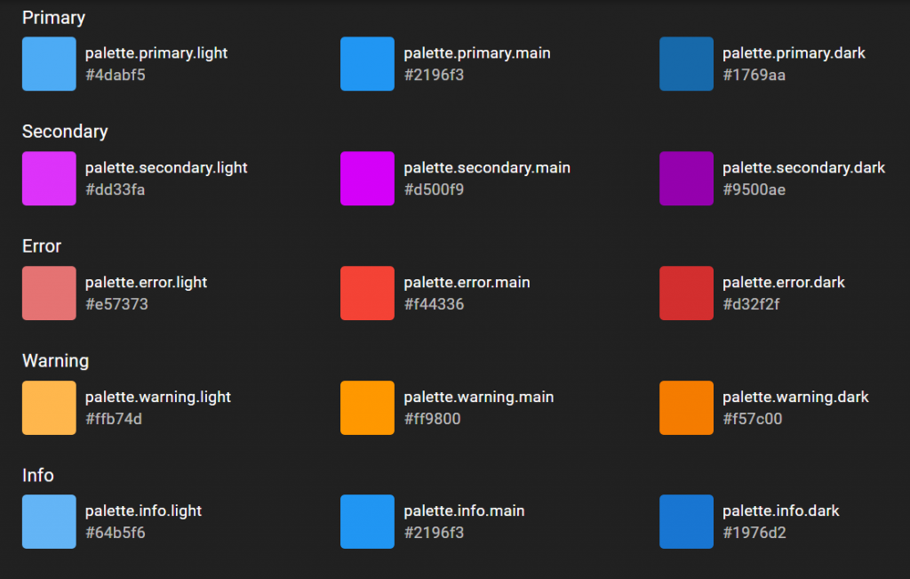
這裡可以像昨天的範例一樣的寫法覆蓋掉 default 的 primary color 或是添加不同情況時的顏色:
import { createTheme } from '@material-ui/core/styles';

const theme = createTheme({
  palette: {
    primary: {
      // light: 如果省略將從 palette.primary.main 依照 tonalOffset 的值去計算
      main: '#ff4400',
      // dark: 如果省略將從 palette.primary.main 依照 tonalOffset 的值去計算,
      // contrastText: 如果省略將從 palette.primary.main 依照 contrastThreshold 的值去計算
    },
    secondary: {
      light: '#0066ff',
      main: '#0044ff',
      // dark: 如果省略將從 palette.secondary.main 的值去計算,
      contrastText: '#ffcc00',
    },
    // 這裡的值將會影響未定義的contrastText的計算結果
    contrastThreshold: 3,
    // “tonalOffset”值可以是 0 到 1 之間的數字,這將適用於淺色和深色變體
    // E.g., shift from Red 500 to Red 300 or Red 700.
    tonalOffset: 0.2,
  },
  },
});
這裡的 typography 指的是'樣式',也就是在 theme 裡面的 typography,我們可以透過它來定義fontFamily, fontWeight... 等等, 詳細範例:
const theme = createTheme({
  typography: {
    fontFamily: [
      '-apple-system',
      'BlinkMacSystemFont',
      '"Segoe UI"',
      'Roboto',
      '"Helvetica Neue"',
      'Arial',
      'sans-serif',
      '"Apple Color Emoji"',
      '"Segoe UI Emoji"',
      '"Segoe UI Symbol"',
    ].join(','),
  },
});
Material-UI 使用 rem 單位作為字體大小,瀏覽器 html 元素默認字體大小為 16px,但瀏覽器可以選擇更改此值,因此 rem 單位允許我們適應用戶的設置,從而提供更好的支持。要更改 Material-UI 的字體大小,可以提供 property: fontSize 的值,默認值為 14px。
const theme = createTheme({
  typography: {
    // 設為12px
    fontSize: 12,
  },
});
也可以在上述的內部設定RWD時縮放的大小
const theme = createTheme({
  typography: {
    h3: {
      fontSize: '1.2rem',
      '@media (min-width:480px)': {
        fontSize: '2rem',
      },
    }
  }
});
在 typography 的組件中 property: variants 有以下 13 種 default:
const theme = createTheme({
  typography: {
    subtitle1: {
      fontSize: 12,
    },
    body1: {
      fontWeight: 500,
    },
    button: {
      fontStyle: 'italic',
    },
  },
});

const App = () => {
  return (
    <ThemeProvider theme={theme}>
      <Typography variant="subtitle1">subtitle</Typography>
      <Typography>body1</Typography>
      <Button>Button</Button>
    </ThemeProvider>
  )
}
那麼今天的講解就到這,明天會針對後續的Spacing做講解。


 看影片追技術