
今天會接續昨天的部分繼續講解 Theme 的 Spacing,這部分其實很簡單各位可以透過這裡直接引用官網的範例即可。
自定義的話可以用以下幾種方式:
const theme = createTheme({
  spacing: 4,
});

theme.spacing(2) // = 4 * 2
const theme = createTheme({
  spacing: factor => `${0.25 * factor}rem`,
});

theme.spacing(2); // = 0.25 * 2rem = 0.5rem = 8px
const theme = createTheme({
  spacing: [0, 4, 8, 16, 32, 64],
});

theme.spacing(2); // = 8
theme.spacing() 最多可以接受4個參數,參數與 CSS 的規則一樣,分別為上、右、下、左:
padding: theme.spacing(1, 2, 3, 4), // '8px 16px 24px 32px'
這裡和之前說明 Grid 時所提及的一樣,透過官方文件能夠更清楚的瞭解到他們各自的預設值與寫入方式: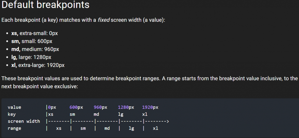
可以透過以下方式直接更改:
import React from 'react';
import { makeStyles } from '@material-ui/core/styles';
import Typography from '@material-ui/core/Typography';
import { green } from '@material-ui/core/colors';

const useStyles = makeStyles((theme) => ({
  root: {
    padding: theme.spacing(1),
    [theme.breakpoints.down('sm')]: {
      backgroundColor: theme.palette.secondary.main,
    },
    [theme.breakpoints.up('md')]: {
      backgroundColor: theme.palette.primary.main,
    },
    [theme.breakpoints.up('lg')]: {
      backgroundColor: green[500],
    },
  },
}));

export default function MediaQuery() {
  const classes = useStyles();
  return (
    <div className={classes.root}>
      <Typography>{'down(sm): red'}</Typography>
      <Typography>{'up(md): blue'}</Typography>
      <Typography>{'up(lg): green'}</Typography>
    </div>
  );
}
或是重新自訂 theme 中的 breakpoints
// 下面是預設值
const theme = createTheme({
  breakpoints: {
    values: {
      xs: 0,
      sm: 600,
      md: 960,
      lg: 1280,
      xl: 1920,
    },
  },
})
也可以隨意使用任意數量或任意數量的斷點,以自己希望的任何方式命名它們。
const theme = createTheme({
  breakpoints: {
    values: {
      tablet: 640,
      laptop: 1024,
      desktop: 1280,
    },
  },
});
這部分官方文件提供一些default,修改方式也跟上述差別不大,也沒有特別的 function 利用,所以我就不再贅述了。
那麼今天的講解就先到這邊,明天會將最後的 Globals 講解完畢,並繼續官網側邊欄的組件繼續講解

 看影片追技術