隨著智慧型手機的普及
網頁設計也要隨著時代的潮流而寫出適合智慧型手機用戶的網頁
今天的筆記是目前最常見的 RWD 應用:固定浮動選單
首先先上範例圖:
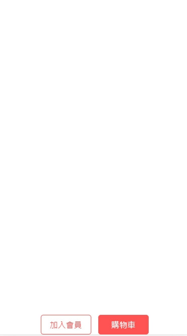
背景雖然是白的但應該是看得出來我所說的效果吧XD
這是目前智慧型手機用戶在線上購物最常見的排版:加入購物車及加入會員
範例語法如下:
<style>
  .button-block {
    position: fixed;
    bottom: 0;
  }

  .button-style {
    border: 1px solid #ff5353;
    border-radius: 5px;
    color: #ff5353;
    text-decoration: none;
    padding: 8px 0;
    margin-right: 10px;
    width: 98px;
    display: inline-block;
    text-align: center;
    background: #fff;
  }

  .button-style2 {
    border: 1px solid #ff5353;
    border-radius: 5px;
    color: #fff;
    background: #ff5353;
    text-decoration: none;
    padding: 8px 0;
    width: 98px;
    display: inline-block;
    text-align: center;
  }

  @media screen and (max-width:375px) {
    .button-block {
      left: 50%;
      margin-left: -107px;
      text-align: center;
    }
  }
</style>

<body>


  <div class="button-block">
    <a class="button-style" href="https://www.google.com/">加入會員</a>
    <a class="button-style2" href="https://www.google.com/">購物車</a>
  </div>


</body>
值得注意的是 position: fixed;這個語法
通常我們會希望這兩個按鈕區塊要在固定的頁尾位子
這時候利用 position: fixed;固定浮動的方式就能呈現我們所想要的效果囉


 看影片追技術