第五天的文章就來談談工作上學習到的切版畫面
首先一樣附上範例圖:
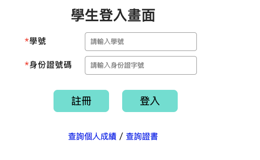
這是常見的登入會員或是加入會員的頁面
為了讓文字及區塊內容畫面一致,所以這次來學著用 table 排版
範例code:
HTML:


        <table cellspacing="0" cellpadding="0">
          <tr>
            <td>學<span>號</span></td>
            <td><input type="text" placeholder="請輸入學號" required /></td>
          </tr>
          <tr>
            <td>身份證號碼</td>
            <td><input type="text" placeholder="請輸入身份證字號" /></td>
          </tr>
        </table>

        <div class="button-style">
          <button>註冊</button>
          <button>登入</button>
        </div>

        <nav class="other-link">
          <a href="#" title="查詢個人成績">查詢個人成績</a> /
          <a href="#" title="查詢證書">查詢證書</a>
        </nav>
      </form>
CSS

form {
  width: 1200px;
  display: inline-block;
}

.input-style table {
  width: 350px;
  margin: 0 auto 30px;
}

.input-style table tr:nth-child(1) {
  margin-bottom: 10px;
}

.input-style table tr td:nth-child(1) {
  text-align: left;
  width: 110px;
  letter-spacing: 1px;
}

.input-style table tr td:nth-child(2) {
  padding-bottom: 10px;
}

.input-style table tr:last-child td:nth-child(2) {
  padding-bottom: 0;
}

.input-style table tr td:nth-child(1)::before {
  content: "*";
  color: red;
}

.input-style table tr td:nth-child(2) input {
  width: 200px;
  border-radius: 5px;
  border: 1px solid #999;
}


.input-style input {
  width: 170px;
  padding: 10px;
  border-radius: 3px;
}

.student-id {
  display: inline-block;
  width: 60px;
  text-align:justify;
  text-align-last:justify;
  margin-left: 5px;
}

.disperse {
  display:inline-block;
  margin-right: -30px;
}
.student-id,
.id-number {
  color: #292929;
  font-weight: bold;
  font-size: 24px;
  line-height: 1.5;
  width: 145px;
  display: inline-block;
  margin-left: 13px;
}

.id-number {
  margin-bottom: 30px;
}

.button-style button {
  cursor: pointer;
  border-radius: 8px;
  border: 0px;
  margin: 0 10px 40px;
  font-size: 20px;
  background-color: turquoise;
  padding: 8px 35px;
}

.button-style button:hover {
  box-shadow: 0px 1px 10px 3px #ccc;
}

.button-style button:last-child {
  margin-right: 0;
}

nav.other-link a {
  text-decoration: none;
  font-size: 16px;
}
這次學著用 table 方法排表單內容發現可以更快速整潔,更加速開發的效率
在使用 table 前我是用一般的div之類的去排,發現文字都無法對稱整個畫面就是很怪
砍掉重練後用 table 排這個區塊就有一種很開心的感覺,原來這麼方便呢XD
分享一個套件叫做Bootstrap,https://getbootstrap.com/,以您目前的畫面都可以用div做排版對齊~分享給您試試看
感謝~