
今天會接續Button的部分做個總結。
ButtonGroup 組件可用於對相關按鈕進行分組:
<ButtonGroup color="primary" aria-label="預設就是outlined">
  <Button>One</Button>
  <Button>Two</Button>
  <Button>Three</Button>
</ButtonGroup>
<ButtonGroup
  variant="contained"
  color="primary"
  aria-label="contained & text 要另外下"
>
  <Button>One</Button>
  <Button>Two</Button>
  <Button>Three</Button>
</ButtonGroup>
<ButtonGroup
  variant="text"
  color="secondary"
  size="small"
  aria-label="size & color的邏輯和前面的Button是一致的"
>
  <Button>One</Button>
  <Button>Two</Button>
  <Button>Three</Button>
</ButtonGroup>
orientation: vertical可以將水平調成垂直
<ButtonGroup
  orientation="vertical"
  color="primary"
  aria-label="vertical"
>
  <Button>One</Button>
  <Button>Two</Button>
  <Button>Three</Button>
</ButtonGroup>
在官方文件中有 Split button 的範例,這裡我就不再詳細解說了,因為實際用到的機會還不如它本身下拉或是autoComplete來的多,如果有興趣的朋友可以研究看看。
一個浮動操作按鈕出現在所有屏幕內容的前面,通常是一個圓形,中間有一個圖標,詳細可看連結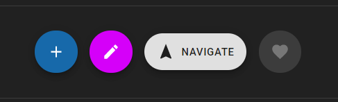
用法跟IconButton一樣:
<Fab color="primary" size="small" aria-label="add">
  <AddIcon />
</Fab>
<Fab color="secondary" size="medium" aria-label="edit">
  <EditIcon />
</Fab>
<Fab variant="extended" size="large">
  <NavigationIcon style={{ marginRight: 8 }} />
  Navigate
</Fab>
<Fab disabled aria-label="like">
  <FavoriteIcon />
</Fab>
以上就是 material Button 組件的大部分內容了,如果有 follow 官方文件的話會發現有些範例他們會用 makeStyles 以外的方式處裡,這裡我還是提一下比較基礎的應用好了,因為我有些觀念是從styled-component借鏡過來的,但這篇的目的還是希望給更多新手可以更快上手,所以我提及的章節會盡量以完全都不懂的情況去著想,那麼就跟我一起跳到Styles的章節,補齊基本的觀念吧!
Material-UI 的樣式解決方案的靈感來自許多其他樣式庫,例如 styled-components 和 emotion。
CSS-in-JS 解決方案克服了許多這些限制,並釋放了許多強大的功能(主題嵌套、動態樣式、自支持等)。
基礎可以使用 3 種方法來生成和應用樣式,但是它們都共享相同的底層邏輯。
import React from 'react';
import { makeStyles } from '@material-ui/core/styles';
import Button from '@material-ui/core/Button';

const useStyles = makeStyles({
  root: {
    background: 'linear-gradient(45deg, #FE6B8B 30%, #FF8E53 90%)',
    border: 0,
    borderRadius: 3,
    boxShadow: '0 3px 5px 2px rgba(255, 105, 135, .3)',
    color: 'white',
    height: 48,
    padding: '0 30px',
  },
});

export default function Hook() {
  const classes = useStyles();
  return <Button className={classes.root}>Hook</Button>;
}
import React from 'react';
import { styled } from '@material-ui/core/styles';
import Button from '@material-ui/core/Button';

const MyButton = styled(Button)({
  background: 'linear-gradient(45deg, #FE6B8B 30%, #FF8E53 90%)',
  border: 0,
  borderRadius: 3,
  boxShadow: '0 3px 5px 2px rgba(255, 105, 135, .3)',
  color: 'white',
  height: 48,
  padding: '0 30px',
});
// styled(x) x的值可以換成任何html Tag
export default function StyledComponents() {
  return <MyButton>Styled Components</MyButton>;
}
import React from 'react';
import PropTypes from 'prop-types';
import { withStyles } from '@material-ui/core/styles';
import Button from '@material-ui/core/Button';

const styles = {
  root: {
    background: 'linear-gradient(45deg, #FE6B8B 30%, #FF8E53 90%)',
    border: 0,
    borderRadius: 3,
    boxShadow: '0 3px 5px 2px rgba(255, 105, 135, .3)',
    color: 'white',
    height: 48,
    padding: '0 30px',
  },
};

function HigherOrderComponent(props) {
  const { classes } = props;
  return <Button className={classes.root}>Higher-order component</Button>;
}

HigherOrderComponent.propTypes = {
  classes: PropTypes.object.isRequired,
};

export default withStyles(styles)(HigherOrderComponent);
以上三種方式都可以依照個人喜好去選擇方式修改,我個人是偏好 hook & styled component。
在三種方式中都支持巢狀結構編寫style sheet:
const useStyles = makeStyles({
  root: {
    color: 'red',
    '& p': {
      color: 'green',
      '& span': {
        color: 'blue'
      }
    }
  },
});
既然是css in js那麼自然也可以將變數帶入style sheet之中,
const useStyles = makeStyles({
  // style rule
  foo: props => ({
    backgroundColor: props.backgroundColor,
  }),
  bar: {
    // CSS property
    color: props => props.color,
  },
});

function MyComponent() {
  // props也可以是從父輩傳遞的值
  const props = { backgroundColor: 'black', color: 'white' };
  // 將 props 作為 useStyles() 的一個變數傳入
  const classes = useStyles(props);

  return <div className={`${classes.foo} ${classes.bar}`} />
}
另外三種 API 的詳細用法請至官方文檔查看,這裡就不再過多的贅述了。
那麼今天的內容就先講解到這裡,之後的講解會著重於components的章節,希望這些東西能幫助大家更快了解範例的應用

 看影片追技術