這裡先提一下 key: overrides,當組件間相互傳遞的 key: props 預設值,它可以讓你能夠自定義組件類型的所有實例的外觀。
import React from 'react';
import { createTheme, ThemeProvider } from '@material-ui/core/styles';
import Button from '@material-ui/core/Button';

const theme = createTheme({
  overrides: {
    // Style sheet name ⚛️ 這裡要擺你想更動的組件className,可以透過dev-tool去找Style sheet name
    MuiButton: {
      // Name of the rule
      text: {
        // Some CSS
        background: 'linear-gradient(45deg, #FE6B8B 30%, #FF8E53 90%)',
        borderRadius: 3,
        border: 0,
        color: 'white',
        height: 48,
        padding: '0 30px',
        boxShadow: '0 3px 5px 2px rgba(255, 105, 135, .3)',
      },
    },
  },
});

function OverridesCss() {
  return (
    <ThemeProvider theme={theme}>
      <Button>Overrides CSS</Button>
    </ThemeProvider>
  );
}

export default OverridesCss;
官網文件有特別提到 CssBaseline,其實它就是在做global normalize 的動作:
import React from 'react';
import CssBaseline from '@material-ui/core/CssBaseline';

export default function MyApp() {
  return (
    <React.Fragment>
      <CssBaseline />
      {/* The rest of your application */}
    </React.Fragment>
  );
}
至此,我大致講解完畢需要知道的基本 material UI theme 的運作流程,及如何客製化不同的樣式,這樣希望能幫助大家在看官網其他部分的文件時,比較不會那麼吃力。
接著,讓我們回到側邊欄 components 的部分接續講解 inputs 吧!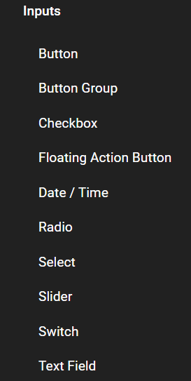
我們先從最常用到的Button開始講起吧!
引入Button後可以透過property: variant, 更改外觀樣式:
// 預設值也是text
<Button variant="text">text</Button>
<Button variant="contained" color="pirmary">contained</Button>
<Button variant="outlined" color="secondary">outlined</Button>
// 去除 contained 陰影
<Button variant="contained" color="pirmary" disableElevation>contained</Button>
// onClick
<Button variant="text" onClick={() => alert('嗨~')}>text</Button>
上傳檔案的部分可以用 label 替代,作法跟原生的寫法差不多:
<input
  accept="image/*"
  style={{ display: 'none' }}
  id="contained-button-file"
  multiple
  type="file"
/>
<label htmlFor="contained-button-file">
  <Button variant="contained" color="primary" component="span">
    Upload
  </Button>
</label>
<input
  accept="image/*"
  style={{ display: 'none' }}
  id="icon-button-file"
  type="file"
/>
<label htmlFor="icon-button-file">
  <IconButton color="primary" aria-label="upload picture" component="span">
    <PhotoCamera />
  </IconButton>
</label>
按鈕的大小可以透過 css 或是 property: size 去更改:
<Button variant="contained" color="pirmary" size="small">small</Button>
<Button variant="contained" color="pirmary" size="medium">medium</Button>
<Button variant="contained" color="pirmary" size="large">large</Button>
iconButton 的部分如果引入的不是 Material ui 自家的 icon 的話大小會有點差異,所以平常我在使用的時候很少直接用它提供的 size 來調整。
也可以透過 Button 裡面提供的 startIcon || endIcon 去塞入 inline 屬性的 icon 進入 Button
<Button
  variant="contained"
  color="pirmary"
  startIcon={<SaveIcon />}
>
  save
</Button>
<Button
  variant="contained"
  color="pirmary"
  endIcon={<SendIcon />}
>
  send
</Button>
如果要和 react-router-dom 聯動成 Link 的話可以參考以下:
// 這裡的Link要注意是從 react-router || react-router-dom 引入
<Button
  variant="contained"
  color="pirmary"
  component={Link}
  to={`你想導向url地址`}
>
  連結
</Button>
今天的講解就到這邊,明天會接續後面 input 組件繼續做講解,希望有幫助到各位,謝謝!!


 看影片追技術