今天來談一談有關常用的button設計,像是他預設的顏色是白色,然後當我點擊按鈕時變成黑色等等類似的操作,那麼就開始今天的主題:
我主要要來做樣式以及在點擊時改變它的顏色,而為了方便辨識先把selector(選擇器)及shape(樣式)分開講。
首先先在drawable新建一個Drawable Resource File的檔案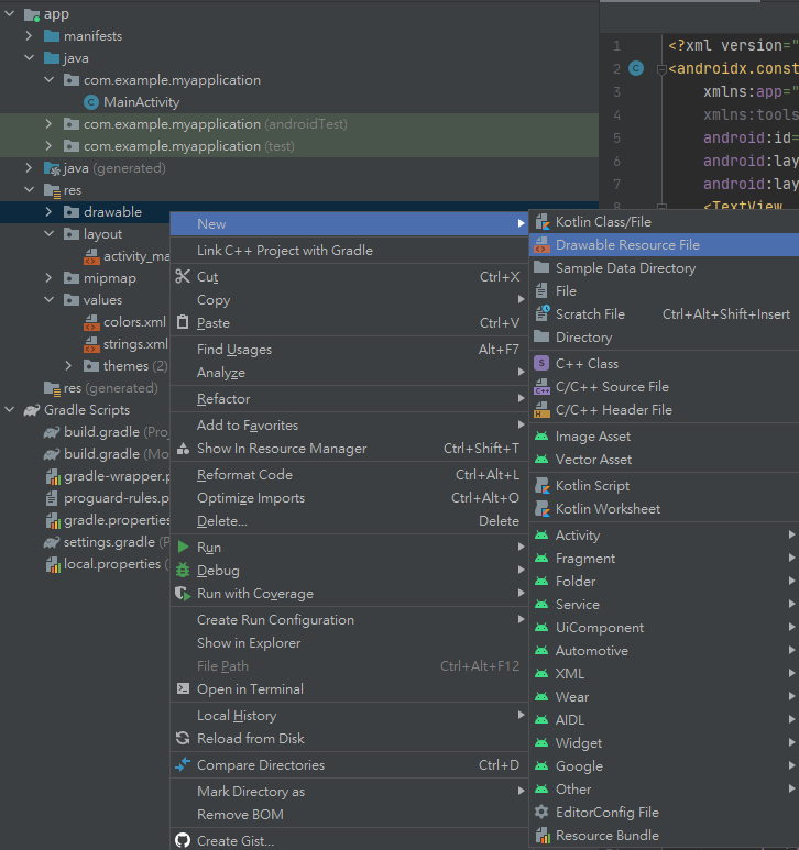
然後Root element設selector(如果沒有要做狀態的話可以只用shape,按鈕在用background套用)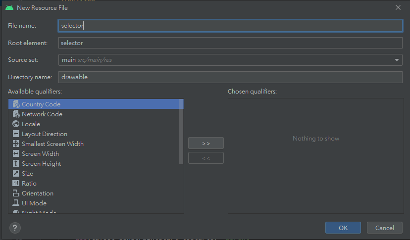
而在selector內,可以包含一個或多個item元素,而item就是繪製的對象。
item裡面的屬性包含android:drawable(繪製的圖)、android:state(按鈕狀態)。
接著就先來講selector常用到的按鈕狀態(android:state)
其他更多詳情:android developers/狀態列表
接著就設計出一個簡單的狀態出來
<?xml version="1.0" encoding="utf-8"?>
<selector xmlns:android="http://schemas.android.com/apk/res/android">
    <!--不設狀態為DEFAULT默認-->
    <item android:drawable="@drawable/shape">
        <!--shape-->
    </item>
    <!--點擊按鈕時的樣式-->
    <item android:drawable="@drawable/shape" android:state_pressed="true">
        <!--shape-->
    </item>
</selector>
因為我主要是只有改顏色,當然也可以定義不同的drawable來做不同的應用,然後要來提shape的部分。
首先先看一下官方給的程式語法(取自Android Developers):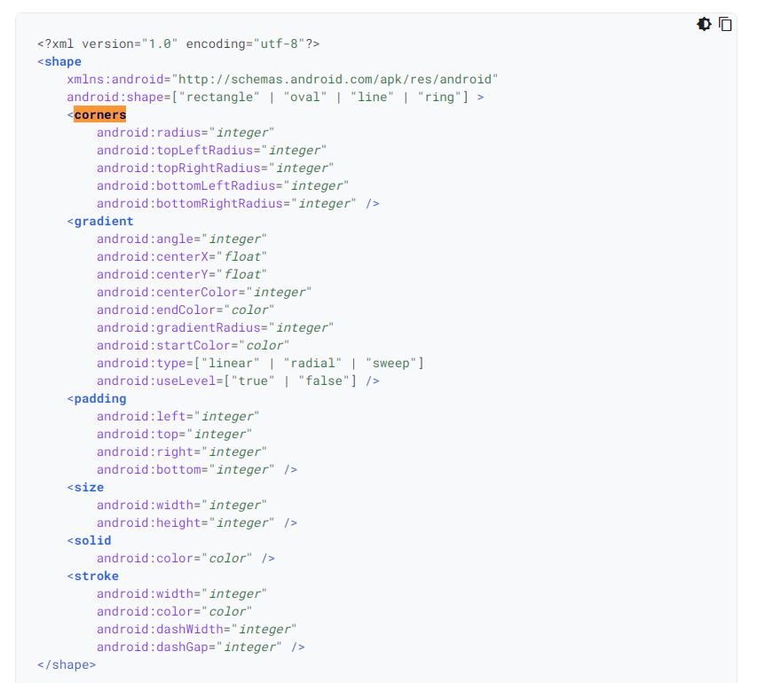
可以看到主要有corners(產生圓角用)、gradient(漸層顏色)、padding(內邊距)、size(大小)、solid(填充色)、stroke(邊線),那麼就先來開始做設計。
<?xml version="1.0" encoding="utf-8"?>
<selector xmlns:android="http://schemas.android.com/apk/res/android">
    <!--沒按下的狀態(默認)-->
    <item android:state_pressed="false">
        <!--形狀長方形-->
        <shape android:shape="rectangle">
            <!--邊界3dp、顏色黑色-->
            <stroke android:width="3dp"
                android:color="@color/black"/>
            <!--填充顏色為紫色-->
            <solid android:color="@color/purple_200"/>
            <!--四周圓角角度4dp-->
            <corners android:radius="4dp"/>
        </shape>
    </item>
    <!--點擊按鈕時的樣式-->
    <item android:state_pressed="true">
        <shape android:shape="rectangle">
            <!--改邊界顏色為白色-->
            <stroke android:width="3dp"
                android:color="@color/white"/>
            <!--改填充色為淺藍-->
            <solid android:color="#3AB1E8"/>
            <corners android:radius="4dp"/>
        </shape>
    </item>
</selector>
其他更多詳細的屬性請參閱:android developers
設計完之後再回layout的頁面,利用background來套用屬性。
<Button
        android:id="@+id/button"
        android:layout_width="wrap_content"
        android:layout_height="wrap_content"
        android:text="送出"
        app:layout_constraintBottom_toBottomOf="parent"
        app:layout_constraintEnd_toEndOf="parent"
        app:layout_constraintStart_toStartOf="parent"
        app:layout_constraintTop_toTopOf="parent"
        app:layout_constraintVertical_bias="0.645"
        <!--套用(background)-->
        android:background="@drawable/selector"/>
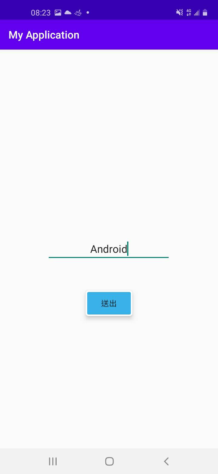
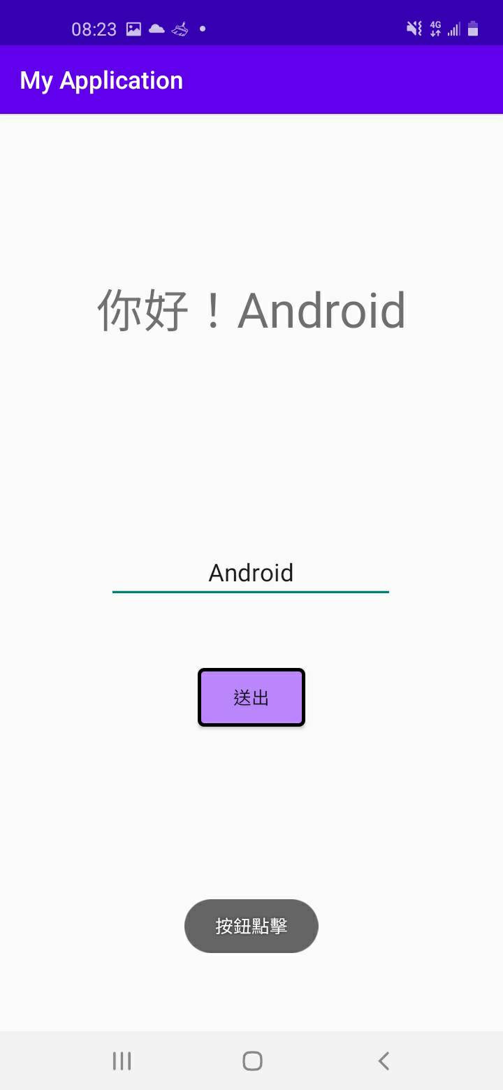
成果: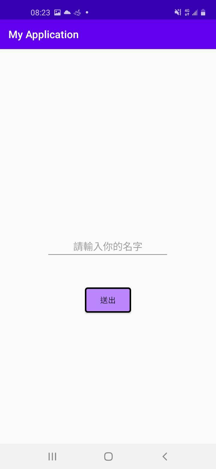

 iThome鐵人賽
 看影片追技術