Q: 還是Loading嗎?
A: 一大系列!接下來的樣式會比較不同~
上兩篇做完圓圈的Loading效果,本篇來個方形的Loading,並給予不同的樣式~
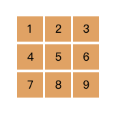
/* 以下每個範例都將使用相同的基礎html及css,如下:*/
<style>
  .container {
    display: inline-flex;
    flex-wrap: wrap;
    justify-content: space-between;
    width: 120px;
  }
  .item {
    width: 32%;
    height: 0;
    padding-top: 31%;
    margin-bottom: 3%;
    background-color: SandyBrown;
  }
</style>
<div class="container">
  <div class="item"></div>
  <div class="item"></div>
  <div class="item"></div>
  <div class="item"></div>
  <div class="item"></div>
  <div class="item"></div>
  <div class="item"></div>
  <div class="item"></div>
  <div class="item"></div>
</div>

有時候@keyframes的寫法很簡單,如這個例子只由0%的opacity: 1演繹到100%的opacity: 0,並透過animation-delay讓每個動畫演繹的起始時間延遲以達到此Loading的動畫效果。
<style>
  .item {
    animation: hideItem .8s infinite;
  }
  .item:nth-child(1) { animation-delay: 0s; }
  .item:nth-child(2) { animation-delay: 0.1s; }
  .item:nth-child(3) { animation-delay: 0.2s; }
  .item:nth-child(6) { animation-delay: 0.3s; }
  .item:nth-child(9) { animation-delay: 0.4s; }
  .item:nth-child(8) { animation-delay: 0.5s; }
  .item:nth-child(7) { animation-delay: 0.6s; }
  .item:nth-child(4) { animation-delay: 0.7s; }
  .item:nth-child(5) { opacity: 0; }

  @keyframes hideItem {
    100% { opacity: 0; }
  }
</style>

這個例子也是運用animation-delay的屬性,讓元素演繹動畫之前各別延遲不同的秒數,藉由延遲的秒數差做出不同的效果。如果不用animation-delay做得出一樣的效果嗎?答案是可以的!這時候就要針對每個不同的元素,在設定@keyframes的腳本時給予不同的設定。
<style>
  .item {
    animation: scaleItem .75s infinite ease-in-out;
  }
  .item:nth-child(1) {
    animation-delay: 0s;
  }
  .item:nth-child(2),
  .item:nth-child(4) {
    animation-delay: .15s;
  }
  .item:nth-child(3),
  .item:nth-child(5),
  .item:nth-child(7) {
    animation-delay: 0.3s;
  }
  .item:nth-child(6),
  .item:nth-child(8) {
    animation-delay: 0.45s;
  }
  .item:nth-child(9) {
    animation-delay: 0.6s;
  }

  @keyframes scaleItem {
    0%, 100% {
      transform: scale(.1);
    }
    30%, 70% {
      transform: scale(1);
    }
  }
</style>

<style>
  .item {
    animation: rotateItem 3s infinite;
  }

  @keyframes rotateItem {
    0%, 100% {
      transform: rotate(-45deg) scale(.8);
    }
    25% {
      transform: rotate(-90deg) scale(1);
    }
    50% {
      transform: rotate(45deg) scale(.8);
    }
    75% {
      transform: rotate(90deg) scale(1);
    }
  }
</style>

同一個樣式可以演繹各式各樣的動畫,只看希望怎麼演繹它;同一個動畫可以有很多種寫法,可以依照需求、個人習慣去做調整。複製貼上雖然是最快的,在看範例的同時不妨試著修改參數,當對屬性的運用越熟練時,就可以依照自己的想法做出更多變化,何不試著玩出其他變化呢?
如果有寫錯的地方,歡迎點評! 會及時改進~
如果有更好的寫法,歡迎指教! 希望各位不吝賜教~
如果想看更多效果,歡迎敲碗! 提供示意圖小編寫寫看~
如果內容疑似侵權,拜託告知! 內容皆為小編理解後原創~
如果對你有點幫助,拿去用吧!


 看影片追技術