如標題!這篇就是要來聊聊為什麼Flex沒有,而grid卻有
以下我們都會以討論justify-self為主,因為它和justify-items本質上是一樣的,且使用justify-content的效果會和使用justify-items一樣
首先,Flex是一維空間,在還沒設置flex-wrap:wrap前,它是單行的
所以所有元素都會「擠」在主軸(row)上,也就是水平方向
從這個現象,就可以很明顯的發現主軸(row)和交錯軸(column)在對齊上的差異:
「主軸只有一列,且堆疊了很多個內元素。交錯軸有十行,但都只堆疊一個內元素」
如下圖所示: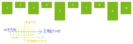
這代表什麼?代表如果想控制交錯軸上的元素,就必須用align-self,因為每行的內元素都「單獨」對齊
但在主軸上,self就沒有存在的意義,因為內元素通通都「擠」在一起
如果看不太懂上面的說法,我們也可以透過self和content的可用屬性來理解
Content可以用space-around、space-between、space-evenly的屬性,但self不行,它只有start、end…等
兩者的差異在於:「content適用於該軸有很多元素的情況,而self僅適用於該軸只有一個元素的情況」,故self沒辦法使用space-*的用法
也有一種說法是,Flex可以用flex-direction:column輕鬆轉換主軸、交錯軸的方向,所以就能在水平方向用align-self去取代justify-self
那麼我如果想在水平方向使用justify-self,且不使用flex-direction:column呢?
你可以用margin-*:auto的方式呈現
用講的太抽象了,來看一下範例吧!
首先,先看一下我們HTML和CSS的代碼
HTML:
<div class="container">
    <div class="box box_1">1</div>
    <div class="box box_2">2</div>
    <div class="box box_3">3</div>
    <div class="box box_4">4</div>
    <div class="box box_5">5</div>
</div>
CSS:
.container {
    border:solid 5px darkgray;
    background-color:beige;
    width:800px;
    display:flex;
}
.box {
    background-color:rgb(173, 209, 243);
    width:100px;
    height:70px;
    line-height:70px;
font-size:40px;
    text-align:center;
}
.box_1 {
}
.box_2 {
}
.box_3 {
}
.box_4 {
}
.box_5 {
}
結果如下圖所示: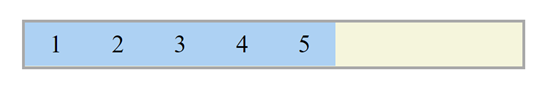
Ex1: 在container設定justify-content:flex-start,而.box_5設定margin-left:auto,其box_5的呈現會和justify-self:flex-end一樣
.box_1 {
    margin-left:auto;
}
結果如下圖所示: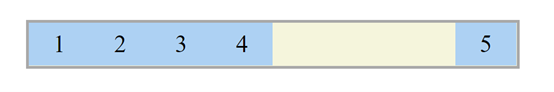
Ex2: 在container設定justify-content:flex-end,而.box_1設定margin-right:auto,其box_1的呈現會像justify-self:flex-start一樣
.box_3 {
    margin-right:auto;
}
結果如下圖所示: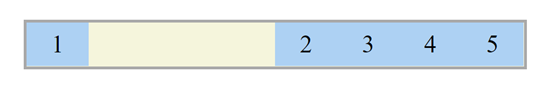
Ex3 : 在.box_3設定margin-left:auto、margin-right:auto,其box_3的呈現會和justify-self:center一樣
.box_3 {
	margin-left:auto;
    margin-right:auto;
}
結果如下圖所示: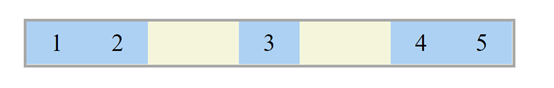
Ex4: 在container設定justify-content:flex-end、height:200px,而.box_1設定margin-top:auto、margin-right:auto,其box_1的呈現會像justify-self:flex-start、align-self:flex-end一樣
.box_1 {
    margin-top:auto;
    margin-right:auto;
}
結果如下圖所示: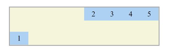
Ex5: 把box_2~5移除,並在.box_1設定margin:auto其box_1的呈現會像justify-self:center、align-self:center一樣
.box_1 {
    margin:auto;
}
結果如下圖所示: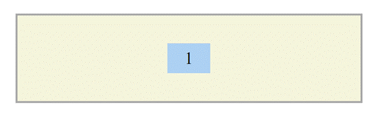
那如果今天每個box的寬度都不一樣呢?那我們該怎麼讓它置中?
這裡就不能用margin-*:auto了,因為box寬度不一樣,所以不會在container裡置中 (會有偏差)
解決方法: absolute (絕對定位)
這裡我們先把HTML的box_4和box5移除
<div class="container">
        <div class="box box_1">1</div>
        <div class="box box_2">2</div>
        <div class="box box_3">3</div>
</div>
然後將CSS設定如下:
.container {
    position:relative;
}
.box_1 {
    width:150px;
}
.box_2 {
    width:100px;
    position:absolute;
    left:50%;
    transform:translate(-50%, 0); /* 在x軸上往左移動自身的一半,也就是50px */
}
.box_3 {
    width:50px;
    margin-left:auto;
}
結果如下圖所示: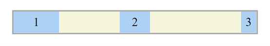
以上就是大致上的原因和替代方案
說了這麼多,總結來講就是CSS的開發者認為,justify-self不是個必要的存在
所以才延伸出很多種解釋justify-self不是必要的說法
Grid是二維的,所以它的「水平方向(justify)」和「垂直方向(align)」都有存在self的必要
希望這篇有解答到大家的疑惑!
如果不太理解transform:translate(-50%, 0);,可以去以下網站看一下:
https://www.itread01.com/content/1541780346.html


 iThome鐵人賽
 看影片追技術