Q: 這個用Svg做吧?
A: 如果你的需求跟我這款一樣,Css就可以畫囉~
上一篇的時鐘給小編這一篇的靈感!倒數計時的圓餅圖自己做~網路上很多svg的範本,本篇以animation做出圓餅圖的效果!!
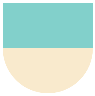
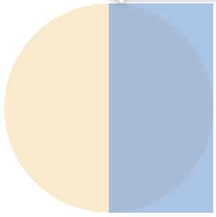
本篇要畫的只有一個圓!至於半圓的效果,以父層 border-radius: 50%搭配overflow: hidden,這樣子層的元素就算是方形的,也會因為父層的overflow: hidden被遮住。
<style>
  .container {
    position: relative;
    display: inline-block;
    width: 300px;
    height: 300px;
    background-color: BlanchedAlmond;
    border-radius: 50%;
    overflow: hidden;
  }
  .half-round {
    position: absolute;
    top: 0;
    left: 0;
    width: 100%;
    height: 50%;
    transform-origin: bottom;
    background: MediumTurquoise;
  }
</style>

<div class="container">
  <div class="half-round first"></div>
  <div class="half-round second"></div>
</div>
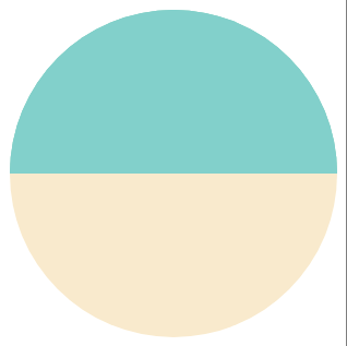
將第一個半圓負的旋轉90deg,第二個半圓正的旋轉90deg,即可填滿整個圓。
<style>
  .first {
    transform: rotate(-90deg);
  }
  .second {
    transform: rotate(90deg);
  }
</style>
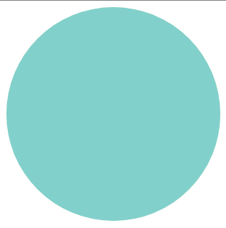
animation-duration皆設置為10秒。animation-fill-mode皆設置為forwards,這樣動畫演繹結束後,元素的樣式會停留在動畫的最後一個樣子。<style>
.half-round {
animation-duration: 10s;
animation-fill-mode: forwards;
}
</style>
animation-timing-function設置為steps(1, start)。由於這個值的設定,動畫看起來就會跟之前認知到的animation效果看起來比較不一樣!之後會有篇章特別說明。<style>
.first {
animation-name: roundFirst;
animation-timing-function: steps(1, start);
}
@keyframes roundFirst {
0%, 50% {
background: MediumTurquoise;
left: 0;
z-index: 0;
}
100% {
background-color: BlanchedAlmond;
left: 50%;
z-index: 1;
}
}
</style>
前半段時間會顯示第一張圖的樣式,後半段時間會顯示第二張圖樣式
Mov轉換Gif一直失敗,無法顯示正確的動畫效果,以文字說明
<style>
  .second {
    animation-timing-function: linear;
    animation-name: roundSecond;
  }
  @keyframes roundSecond {
    0% {
      transform: rotate(90deg);
    }
    100% {
      transform: rotate(450deg);
    }
  }
</style>

其實到目前為止,希望的效果已經做完了!!如果想要再多一點變化,加上文字或是中間再遮上一個圓讓倒數看起來是邊框在倒數。本篇的例子不用svg,而是使用比較特別的animation-timing-function的steps,下一篇為大家特別說明囉!
如果有寫錯的地方,歡迎點評! 會及時改進~
如果有更好的寫法,歡迎指教! 希望各位不吝賜教~
如果想看更多效果,歡迎敲碗! 提供示意圖小編寫寫看~
如果內容疑似侵權,拜託告知! 內容皆為小編理解後原創~
如果對你有點幫助,拿去用吧!


 iThome鐵人賽
 看影片追技術