今天要來介紹的是定位(position),可以用來設定元素的擺放位置了
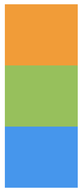
正常排序,依照html的code由上往下排列,對於top、right、bottom、left屬性及z-index屬性無效。
<div class="box">
    <div class="item orange"></div>
    <div class="item green"></div>
    <div class="item blue"></div>
</div>
.item{
  width: 120px;
  height: 100px;
}
.orange{
  background-color:#ff9800;
}
.green{
  background-color: #8bc34a;
}
.blue{
  background-color:#2196f3;
}
相對於自己原本位置做偏移,但原來的位置會被留下來
用top、right、bottom、left設定位移量
範例:
.green{
  background-color: #8bc34a;
  position: relative;
  left: 30px;
}

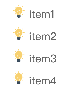
我自己是會用在像是項目清單的icon做位置微調
<ul class="list">
    <li>
      <img src="img/icon.png" alt="">
      item1
    </li>
    <li>
      <img src="img/icon.png" alt="">
      item2
    </li>
    <li>
      <img src="img/icon.png" alt="">
      item3
    </li>
    <li>
      <img src="img/icon.png" alt="">
      item4
    </li>
  </ul>
.list{
  list-style: none;
  font-size: 20px;
  color: #666;
}
.list li{
  margin-bottom: 10px;
}
.list img{
  height: 25px;
}
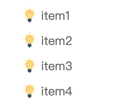
設定完後,想要圖片能夠垂直置中對齊文字,將img設定position: relative; top: 4px;,圖片就垂直置中文字了
.list img{
  height: 25px;
  position: relative;
  top: 4px;
}
定位方式是相對於瀏覽器左上角,視窗滾動時,區塊也會跟著滾動
用top、right、bottom、left設定位移量
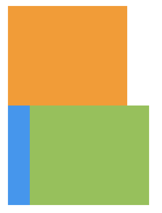
範例:設定absolute後,原本的區塊位置會被下面的取代
.green{
  background-color: #8bc34a;
  position: absolute;
  left: 30px;
}
當我要製作item定位時,就會與relative一起使用,讓我們來看下面的範例
我要顯示這樣子的版面,讓文字浮在圖片上面,所以我將文字設定absolute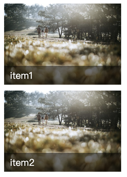
<div class="list">
    <div class="item">
      <div class="img">
        <img src="img.jpg" alt="">
      </div>
      <div class="txt">
        item1
      </div>
    </div>
    <div class="item">
      <div class="img">
        <img src="img.jpg" alt="">
      </div>
      <div class="txt">
        item2
      </div>
    </div>
</div>
.item{
  width: 200px;
  margin-bottom: 10px;
  position: relative;
}
.list .img{
  height: 138px;
}
.list img{
  width: 100%;
  height: 100%;
  object-fit: cover;
}
.list .txt{
  position:absolute;
  width: 100%;
  background-color: rgba(0,0,0,.5);
  bottom: 0;
  padding: 5px 10px;
  color: #fff;
  box-sizing: border-box;
}
但是卻變成這樣子,所有.item的.txt區塊都堆疊在下方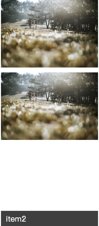
所以在.item(父元素)加上position: relative;所有txt定位就會以父元素的bottom來定位,否則會以body的bottom
.item{
  width: 200px;
  margin-bottom: 10px;
  position: relative;
}
定位方式是相對於瀏覽器左上角,視窗滾動時,區塊不會跟著滾動
用top、right、bottom、left設定位移量
範例:設定fixed,top:30px, left:30px,無論捲軸如何滾動區塊都會維持在設定的位置
.green{
  background-color: #8bc34a;
  position: fixed;
  top: 30px;
  left: 30px;
}
通常會用在scrollTop或是側邊固定的預約/客服資訊
這這網站的預約資訊就固定在右邊,是方便使用者看完資訊後可以立即預約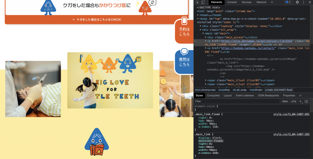
圖片來源
scrollTop按鈕當你滾動頁面,想要返回到最上層,點固定在右下角的按鈕就可以了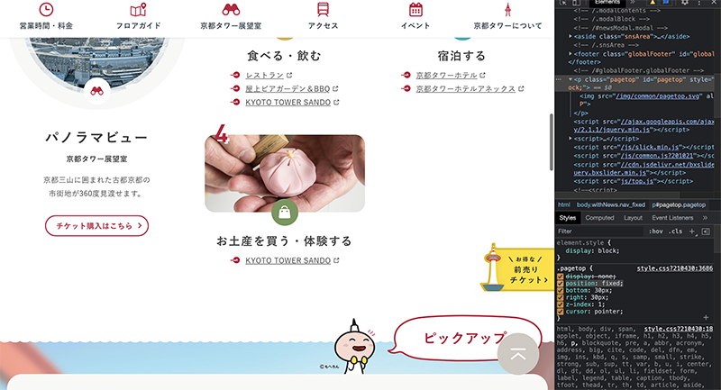
圖片來源
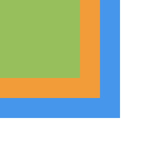
sticky可以說是relative與fixed的結合,用在scroll事件的監聽上。
範例:在滑動時,綠色區塊距離父元素的距離達到sticky定位(top:0)時,就會固定到適當位置,固定後不管捲軸如何向下滾動,都會定位在top:0位置
<div class="box">
  <div class="item red"></div>
  <div class="item green"></div>
  <div class="item blue"></div>
  <div class="item red"></div>
  <div class="item blue"></div>
</div>
.green{
  background-color: #8bc34a;
  position: sticky;
  top: 0;
}
綠色區塊一開始的位置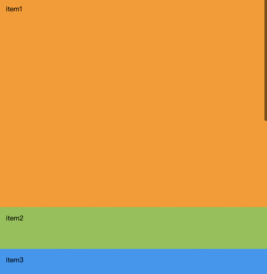
捲軸向下滑動,綠色區塊一樣固定在top:0的位置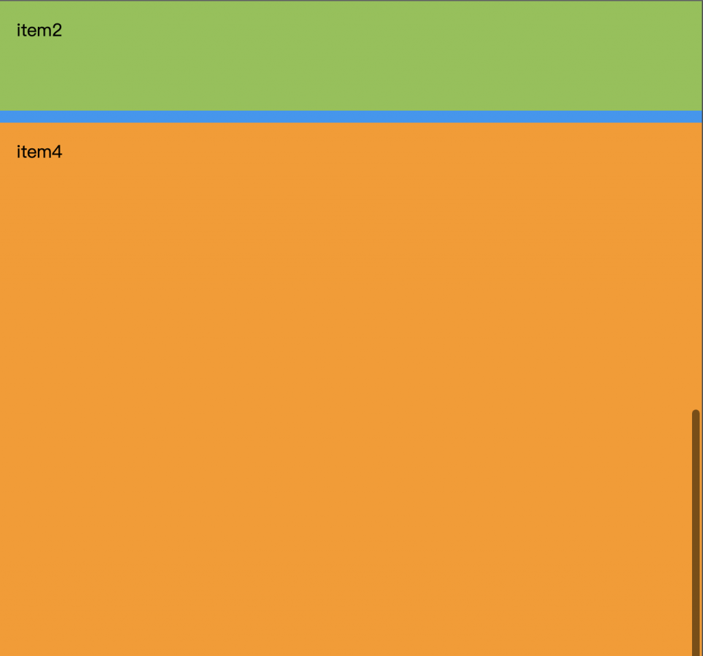
使用sticky需要注意的地方:
通常會用在header區塊,當捲軸滾動時header固定在上方
像下圖這網站,他在滾動時他會固定在上方是使用sticky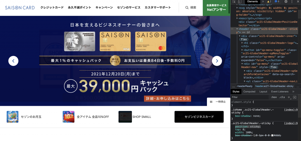
圖片來源
但也有人會使用fixed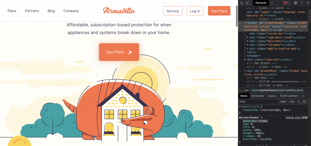
圖片來源
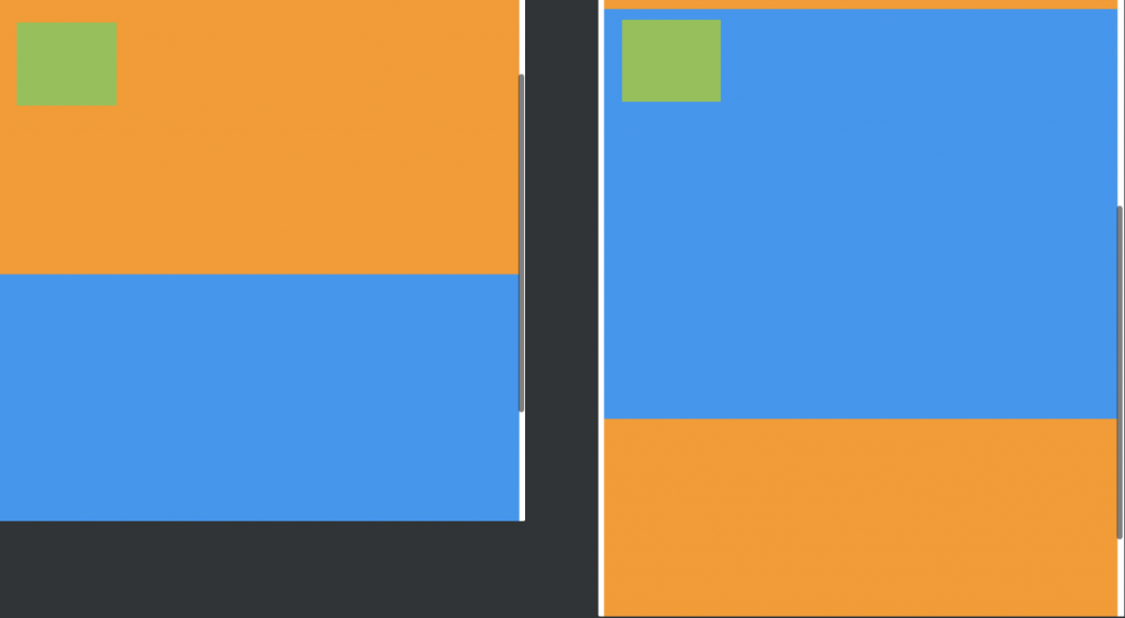
設定position屬性後,就可以設置z-index,數字越大,堆疊的順序越上層
<div class="box">
    <div class="item red"></div>
    <div class="item green"></div>
    <div class="item blue"></div>
  </div>
.item{
  width: 100px;
  height: 100px;
  padding: 15px;
  box-sizing: border-box;
  position: absolute;
  z-index: 4;
}
.red{
  background-color:#ff9800;
  z-index: 10;
}
.green{
  background-color: #8bc34a;
  width: 80px;
  height: 80px;
  z-index: 30;
}
.blue{
  background-color:#2196f3;
  width: 120px;
  height: 120px;
}
製作網頁要符合使用者習慣,加上手機瀏覽網站的人非常多,為了方便使用者操作,header通常都會隨著捲軸滾動固定在上方,側邊會有scrollTop固定在側邊,讓使用者可以快速回到網頁最頂端。
以上是定位的介紹,相信你對定位有基礎的了解了,在區塊設置css就能更上手了

 iThome鐵人賽
 看影片追技術