在設計網頁時通常會加一些動畫特效,吸引使用者的目光及添加與使用者的互動性。
過去製作動畫時以Flash為主,CSS3也可以建立動畫,不再只能用JavaScript或jQuery 才做得到了
transition-property: none|all|property;
<h1>test</h1>
h1{
	height:100px;
	background-color:yellow;
	transition-property:color,background,height;
	transition-duration:3s;
}
h1:hover{
	color:red;
	background-color:green;
	height:300px
}
transition-delay: time;
transition-timing-function: value;
順序為:
transition: property duration timing-function delay | initial | inherit
.box{
	width:100px;
	height:100px;
	background:blue;
	transition:width,height 3s;
	-moz-transition:width,height 3s; /* Firefox 4 */
	-webkit-transition:width,height 3s; /* Safari and Chrome */
	-o-transition:width,height 3s; /* Opera */
}
.box:hover{
	width:400px;
	height:300px;
}
使用時要再加上前綴,讓屬性在每個瀏覽器能夠支援
-moz-     /* firefox瀏覽器 */
-webkit-  /* Safari, google瀏覽器 */
-o-       /* Opera瀏覽器(早期) */
-ms-      /* Internet Explorer  */
animation-name是設定@keyframes動畫名稱
animation-name: keyframe動畫名稱
要與animation-duration屬性搭配,不然動畫不會執行
animation-duration: time;
animation-direction: normal|alternate;
animation-delay: time;
animation-duration 和 animation-delay前者是動畫持續時間,後者為動畫延遲時間
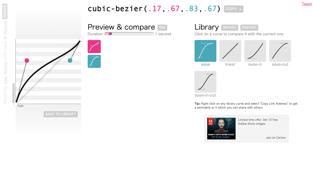
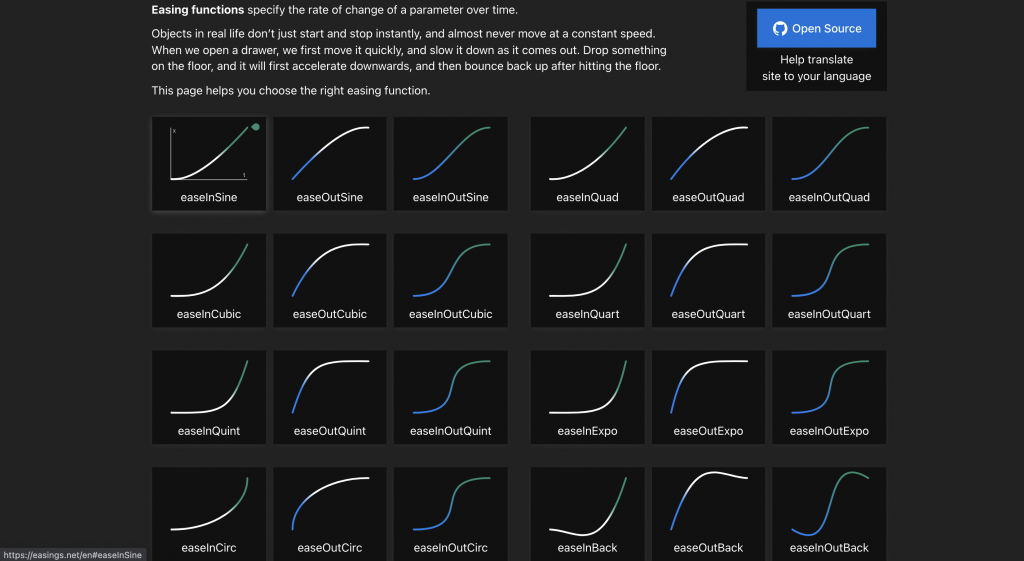
動畫的速度曲線
animation-timing-function: value
animation-iteration-count: number |infinite
number:播放次數,預設是1,0的不會執行
inifinite:無限次數執行
animation-play-state: paused|running
順序為:
animation: name duration timing-function delay iteration-count direction;
<div class="box"></div>
.box{
	width:100px;
	height:100px;
	background:orange;
	position:relative;
	animation:mymove 5s infinite;
	-webkit-animation:moveBox 5s infinite; /*Safari and Chrome*/
}

@keyframes movebox{
	from {left:0px;}
	to {left:200px;}
}
 /*Safari and Chrome*/
@-webkit-keyframes movebox{
	from {left:0px;}
	to {left:200px;}
}
@keyframes animationname {
	keyframes-selector {
		css-styles;
	}
}
搭配frome-to來做動畫設定
.box{
	position:relative;
	animation:moveBox 5s infinite;
}
@keyframes moveBox{
	from {top:0px;}
	to {top:200px;}
}
搭配百分比來做動畫設定
.box{
	position:relative;
	animation:moveBox 5s infinite;
}
@keyframes moveBox{
	0% {background: red;}
  50% {background: green;}
  100% {background: blue;}
}
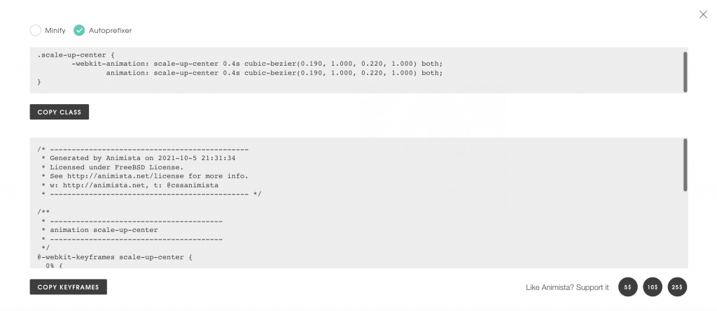
除了自己寫動畫,網路上也有CSS 的動畫特效庫
Animation.css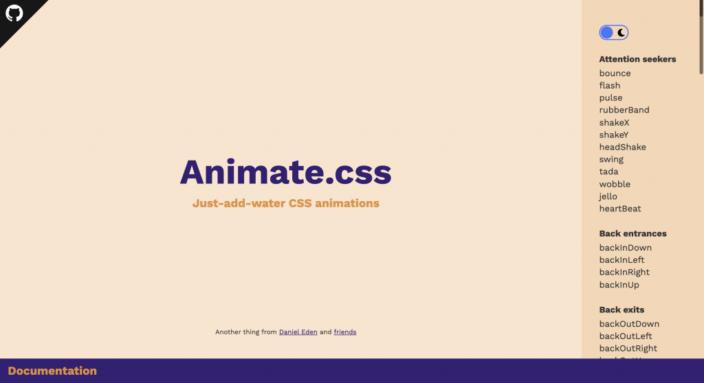
需要引入css檔案,安裝方式有兩種
方法一:CDN方式
<link href="https://cdnjs.cloudflare.com/ajax/libs/animate.css/4.1.1/animate.min.css" />
方法二:npm或yarn
npm
npm install animate.css --save
yarn
yarn add animate.css
下載完後再import
import "animate.css"
只要在標籤元素添加class名稱animate__animated以及任一動畫名稱如 animate__bounce(記得前綴 animate__!)就會有效果了
<h1 class="animate__animated animate__bounce">An animated element</h1>
裡面提供數十種的淡入、淡出、旋轉等效果,不需要額外引入JS,只要選好自己的樣式後,點選右上角的 {‧} 按鈕,檢視原始碼,把他複製到你的檔案裡面了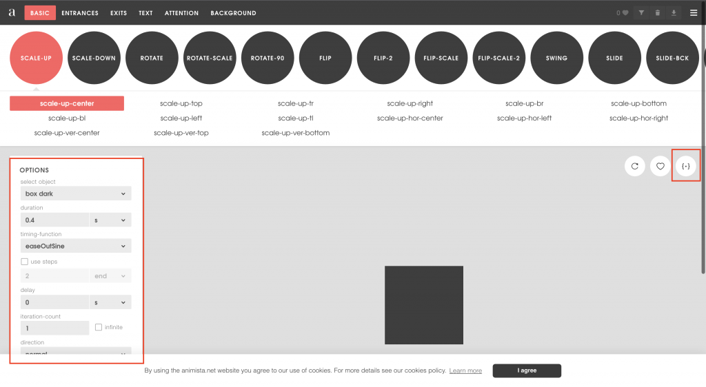
介紹了漸變與動畫,你一定會問他們兩者之間有什麼差別,transition是需要被觸發才會執行,像是滑鼠移入(hover)效果,animation則是直接就執行。。


 看影片追技術