此系列文章已改編成書,歡迎購買:https://www.tenlong.com.tw/products/9786267146460?list_name=i-r-zh_tw
此次會透過 TailwindCSS 與 SCSS 共同使用來完成此頁面,並透過 CSS 的屬性作出翻轉卡片的效果。
因要做翻轉卡片,所以要先建立兩面卡片的樣式。
為了不需要再卡片寬高重工,在配置檔先把卡片的寬高定義好。
module.exports = {
  mode: "jit",
  purge: ["./**/*.html", "./src/**/*.css", "./js/**/*.js"],
  darkMode: false, // or 'media' or 'class'
  theme: {
    extend: {
      height: {
        md: "240px",
      },
      width: {
        md: "160px",
      },
    },
  },
  variants: {
    extend: {},
  },
  plugins: [],
};
並且寫入背景與卡片的樣式,
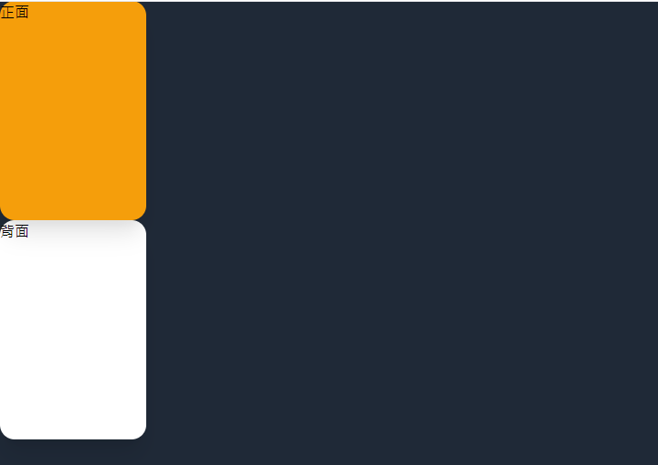
<body class=" bg-gray-800">
  <div class=" w-full min-h-screen">
    <div class="h-md w-md">
      <div
        class="h-full w-full rounded-2xl shadow-xl transform cursor-pointer  bg-yellow-500"
      >
        正面
      </div>
      <div class="h-full w-full rounded-2xl shadow-xl bg-white">背面</div>
    </div>
  </div>
</body>
進度可參考看目前程式碼
寫到這裡相信會發現卡片可以把同樣的樣式元件化,並且透過傳統 CSS 加入背景圖片。
  <div class="bg-gray-800 w-full min-h-screen">
  <div class="h-md w-md">
    <div class="card cardBack  bg-yellow-500">正面</div>
    <div class="card bg-white">背面</div>
  </div>
</div>
.cardBack {
  @apply cursor-pointer;
  background-image: url(https://cdn.hk01.com/di/media/images/dw/20201109/402473894201528320460173.jpeg/OXglr-kbvM04_6gksS3P-SxlWYsZn_N_T48RUU-PEVE?v=w1920);
  background-position: center center;
  background-size: cover;
}

.card {
  @apply h-full w-full rounded-2xl shadow-xl transform;
}
這樣即完成卡片正反面的樣式設定。

進度可參考目前程式碼
HTML
<div class="h-md w-md relative">
     <div class="card cardBack bg-yellow-500">正面</div>
     <div class="card bg-white">背面</div>
</div>
現在已經完成兩張卡片,要把正反面合併成一張,這邊使用的是絕對定位,讓正面與背面的重疊在一起。
CSS
.card {
  @apply h-full w-full rounded-2xl shadow-xl transform absolute;
  backface-visibility: hidden;
}
因我要兩張卡片屆時會有翻轉的效果,我在包裝後的 card 的樣式中加上 absolute 屬性以及之後要做翻轉的 transform 屬性。雖說 TailwindCSS 有高彈性的 Utility 可以使用,但還是有些效果需要手刻,例如 CSS 3d 效果以及這次範例使用到的 backface-visibility 屬性(MDN)。
如前面所提到,翻轉效果要自己加上去,故在 CSS 上再加上要翻轉的 3D 效果屬性。
CSS
@tailwind base;
@tailwind components;
@tailwind utilities;

.cardBack {
  @apply cursor-pointer;
  background-image: url(https://cdn.hk01.com/di/media/images/dw/20201109/402473894201528320460173.jpeg/OXglr-kbvM04_6gksS3P-SxlWYsZn_N_T48RUU-PEVE?v=w1920);
  background-position: center center;
  background-size: cover;
}

.card {
  @apply h-full w-full rounded-2xl shadow-xl transform absolute;
  backface-visibility: hidden;
}

/*翻轉屬性*/
.transform-style-3d {
  transform-style:preserve-3d;
}
.transform-style-3d:active {
  transform:rotateY(180deg);
}
.transform-rotateY-180 {
  transform:rotateY(180deg);
}
在 HTML 上也將要卡片翻轉的效果加上去。
HTML
 <div class="bg-gray-800 w-full min-h-screen">
  <div class="h-md w-md">
    <div class="card cardBack  bg-yellow-500">正面</div>
    <div class="card bg-white">背面</div>
  </div>
</div>
這時就會發現卡片會翻轉了!
demo: https://play.tailwindcss.com/9A9UHaSsaM
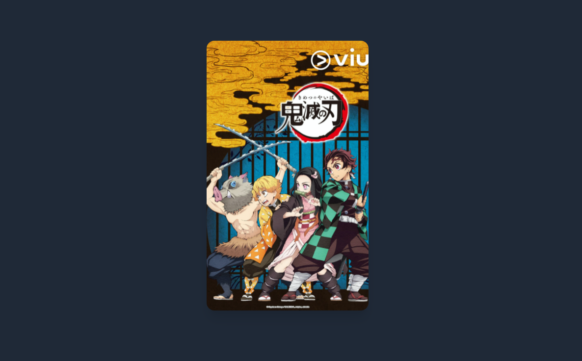
最後在調成想要的大小跟把背面放入想要的圖片,即完成一個翻轉卡片的效果囉!
HTML
 .cardBack {
  @apply cursor-pointer;
  background-image: url(https://cdn.hk01.com/di/media/images/dw/20201109/402473894201528320460173.jpeg/OXglr-kbvM04_6gksS3P-SxlWYsZn_N_T48RUU-PEVE?v=w1920);
  background-position: center center;
  background-size: cover;
}

.card {
  @apply h-full w-full rounded-2xl shadow-xl transform;
}
tailwind.config.js
module.exports = {
  mode: "jit",
  purge: ["./**/*.html", "./src/**/*.css", "./js/**/*.js"],
  darkMode: false, // or 'media' or 'class'
  theme: {
    extend: {
      height: {
        md: "550px",
      },
      width: {
        md: "330px",
      },
    },
  },
  variants: {
    extend: {},
  },
  plugins: [],
};
demo: https://play.tailwindcss.com/qwY2qWGrub?file=config
如果使用 JIT 模式,配置檔都不用特別設定,只要直接設定寬高即可,w-[330px] 以及 h-[550px],
<div
  class="bg-gray-800 w-full min-h-screen sm:flex sm:justify-center sm:items-center"
>
  <div class="h-[550px] w-[330px] relative transform-style-3d duration-300  ">
    <div class="card cardBack  bg-yellow-500 "></div>
    <div class="card bg-white transform-rotateY-180 ">
      <img
        src="https://live.staticflickr.com/65535/50493221951_2f110d9c75_b.jpg"
        alt="煉獄杏壽郎"
      />
      <p class=" text-center text-gray-700 pt-3 font-bold text-3xl">
        炎柱 - 煉獄杏壽郎
      </p>
    </div>
  </div>
</div>
GitHub: https://github.com/hsuchihting/transform_card


 看影片追技術