這次Kotlin 實踐 Material Design 懶人包,文章主要關注在 Material Design components 的實作上,所以會有大量實作內容,請大家多多指教。
開始的第一天首先介紹
Material Design 是 Google 的設計語言,創建於 2014 年,是Google 制定的一套指南,旨在通過一致的設計實踐改善 Android 應用程序的整體外觀和感覺。
在2021年隨著Android 12和Pixel6 發佈時,推出「Material You」為新一代UI設計,也就Material Design 3,同時官方也發佈Components的相關文件,所以接下來的30天文章要來實作Material Design 3的Components實作。
一個全新的應用程序設計方法,可以根據每個用戶的主題顏色,進行動態個性化色系的服務。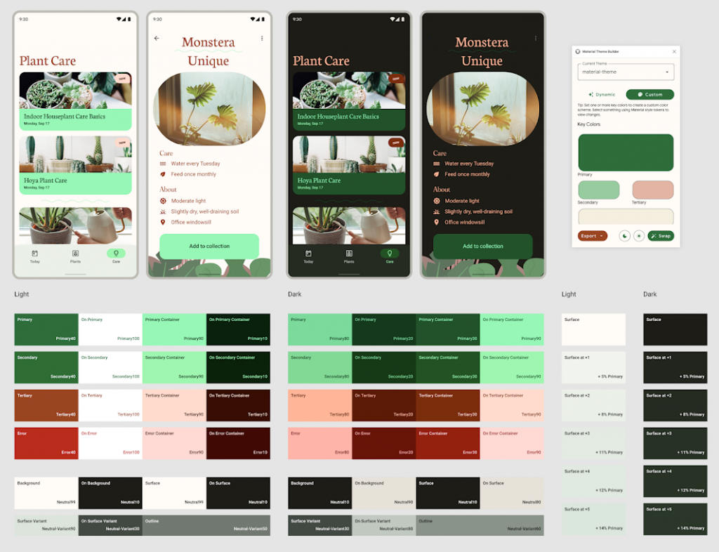
google有推出新工具 Material Theme Builder,使用上可以在 Figma 安裝或是直接網頁調用。
Material Theme Builder 也有提供導出 Android Views (XML)、Jetpack Compose (Kotlin) 和 Design System Package (DSP)的相關程式式碼,提供開發人與設計人員進行App主題的討論與溝通的工具。
在Google在2015年I/O大會上介紹過 Design Support Library,這個Library中提供數個設計好的元件供開發者使用,讓APP更美觀並符合Material Design的規範。
但每年隨著google不斷進步,至今 Material Design Components (MDC) 早已取代Design Support Library,如果現在舊有維護專案想開始使用MDC,那接下來就來分享如何開始。
在開始前先說明官方文件中提到 MDC 是使用 AndroidX Library 構建的,所以必須使用AndroidX 的Support Library ,但在使用AndroidX 的Support Library 前會先需升級專案中的compileSdk 28 
假如你是既有專案現在升級compileSdk 28,可以先看升級Android 9(API 28),官方所提供更新在做調整以免升級造成功能專案上的功能異常,最後就可以在根據官方Migrate to AndroidX 了。
dependencies {
		刪除 implementation ‘com.android.support:design:28.0.0’
		新增 implementation ‘com.google.android.material:material:version’ # version輸入版本號
}
刪除 <style name="Theme.App" parent="Theme.AppCompat.*">
新增 <style name="Theme.App" parent="Theme.MaterialComponents.*">
allprojects {
    repositories {
        **google()**
        **mavenCentral()**
    }
}
升級和設定都準備好後,就可以使用Material Desing Components ,接下來就介紹使用最新的Material Design 3 (Material You)
開始使用最新的Material You的動態主題服務或是設計 Material Design 3 的自定義設定,那就會需要準備以下的設定。
使用最新版本的 Android Material Components 和 AndroidX Jetpack,同時compileSdk升級 32、 如果既有專案再升級 Android 12(API 32) 時可以根據官方的更新進行調整
為了能使用最新功能,會需要更新開發軟體IDE Android Studio Chipmunk, version 2021.2.1
kotlinOptions {
        jvmTarget = '1.8'
    }
(1).需要注意更新gradle-wrapper.properties 檔案中將 Gradle 版本設定為指定 version 7.3+ 。
distributionUrl = "https\://services.gradle.org/distributions/gradle-7.3.3-bin.zip
(2). Android Gradle Plugin (AGP) version 7.2.0
檔案位置:build.gradle (Project層)
* 這是新版IDE Android studio New Project時預設寫法
plugins {
    id 'com.android.application' version '7.2.0-alpha07' apply false
    id 'com.android.library' version '7.2.0-alpha07' apply false
    id 'org.jetbrains.kotlin.android' version '1.6.10' apply false
}
* 舊的預設寫法
dependencies {
        classpath 'com.android.tools.build:gradle:7.1.2'
        classpath "org.jetbrains.kotlin:kotlin-gradle-plugin:1.5.31"
        classpath 'com.google.gms:google-services:7.1.2'
    }
(3). start includes Google's Maven Repository google()
* 原本檔案位置:build.gradle (Project層)
allprojects {
    repositories {
        google()
        mavenCentral()
    }
}

* 新版IDE Android studio New Project時預設將專案指定Google的Maven放在
檔案位置:settings.gradle

	dependencyResolutionManagement {
	   ...
	    repositories {
	        google()
			mavenCentral()
					...
	    }
	   ...
	}
dependencies {
		implementation 'androidx.appcompat:appcompat:1.5.0'
}
 <style name="Theme.MCDProject" parent="Theme.Material3.Light">

        <!-- Primary brand color. -->
        <item name="colorPrimary">@color/purple_500</item>
        <item name="colorPrimaryVariant">@color/purple_700</item>
        <item name="colorOnPrimary">@color/white</item>

        <!-- Secondary brand color. -->
        <item name="colorSecondary">@color/teal_200</item>
        <item name="colorSecondaryVariant">@color/teal_700</item>
        <item name="colorOnSecondary">@color/black</item>

       <!-- Status bar color. -->
        <item name="android:statusBarColor" tools:targetApi="l">?attr/colorPrimaryVariant</item>

        <!-- Customize your theme here. -->

    </style>
(2). 如果在既有專案上置換會需要測試,因元件樣式呈現會不一樣,所以在不能完全置換的狀態
可以在既有的 Theme 的 parent = Theme.MaterialComponents 中去新增 Material 3 的相關設定進行測試在置換
<style name="Theme.MCDProject" parent="Theme.MaterialComponents.DayNight.DarkActionBar">
        <!-- Primary brand color. -->
        <item name="colorPrimary">@color/purple_500</item>
        <item name="colorPrimaryVariant">@color/purple_700</item>
        <item name="colorOnPrimary">@color/white</item>
        <!-- Secondary brand color. -->
        <item name="colorSecondary">@color/teal_200</item>
        <item name="colorSecondaryVariant">@color/teal_700</item>
        <item name="colorOnSecondary">@color/black</item>
        <!-- Status bar color. -->
        <item name="android:statusBarColor" tools:targetApi="l">?attr/colorPrimaryVariant</item>
        <!-- Customize your theme here. -->

        <!-- Material3 attributes (needed if parent="Theme.MaterialComponents"). -->
        <item name="textAppearanceDisplayLarge">@style/TextAppearance.Material3.DisplayLarge</item>
        <item name="shapeAppearanceSmallComponent">@style/ShapeAppearance.Material3.SmallComponent</item>
    </style>
參考資料
Getting started with Material Components for Android
Google在2015年I/O大會上介紹過Design Support Library
Android 應用程式模組的預設專案結構
Google 的 Maven 存放區取得最新版的 Android 程式庫


 看影片追技術