在Material Design中提供不同樣式的Button,官方同時說明使用Button需根據操作的重要性選擇類型,當操作越重要時Button應該越具有強調性,因為Button可以傳達訊息,也影響著使用者採取的操作。通常Button放置整個APP的使用者介面中,例如:Dialogs、Cards、Toolbars等等。
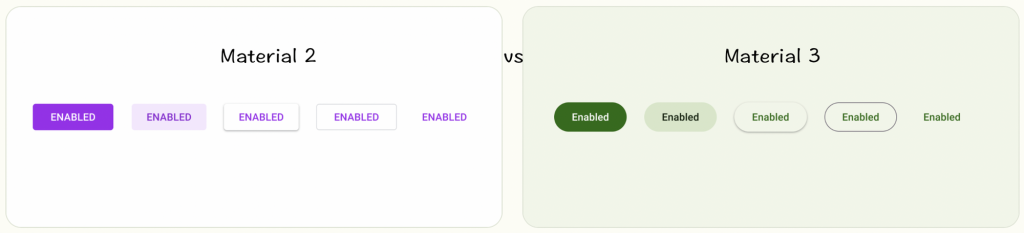
M2:預設四個角半徑略圓,按鈕文字使用全大寫,主要是這三種Button做變化
M3:預設是完全圓角,按鈕文字使用大小寫,新增下方三種Button
後續主要介紹Material Deaign 3
剛剛前面說到按鈕操作重要性,所以這邊會特別標記說明,通常Button沒有指定style時,預設會是Filled button。
Medium emphasis:基本是有陰影的輪廓按鈕,當需要按鈕與圖案背景進行視覺分離時使用,常用於不分散畫面其他元件注意力的重要操作
style分有無icon兩種使用方式
<Button
        style="@style/Widget.Material3.Button.ElevatedButton"
        android:layout_width="wrap_content"
        android:layout_height="wrap_content"
        android:text="Elevated button" />

<Button
        style="@style/Widget.Material3.Button.ElevatedButton.Icon"
        android:layout_width="wrap_content"
        android:layout_height="wrap_content"
        android:text="Elevated button"
        app:icon="@drawable/ic_add_24"/>
High emphasis:顏色突出的凸顯按鈕,常用於流程中的最終重要「取消」或「確定」操作較為常見操作
style分有無icon兩種使用方式
<Button
        style="@style/Widget.Material3.Button"
        android:layout_width="wrap_content"
        android:layout_height="wrap_content"
        android:text="Filled button" />

<Button
        style="@style/Widget.Material3.Button.Icon"
        android:layout_width="wrap_content"
        android:layout_height="wrap_content"
        android:text="Filled button"
        app:icon="@drawable/ic_add_24" />
Medium emphasis:具有較淺的背景顏色和較深的文字顏色,視覺上不像Filled button按鈕突出,在filled 、 outlined buttons 兩者之間,常用於「下一步」流程上,或是畫面比重不高訊息,不太強調的操作
style分有無icon兩種使用方式
<Button
        style="@style/Widget.Material3.Button.TonalButton"
        android:layout_width="wrap_content"
        android:layout_height="wrap_content"
        android:text="Filled tonal button" />

<Button
        style="@style/Widget.Material3.Button.TonalButton.Icon"
        android:layout_width="wrap_content"
        android:layout_height="wrap_content"
        android:text="Filled tonal button"
        app:icon="@drawable/ic_add_24"/>
Medium emphasis:包含重要訊息需要注意,但不是主要的操作,例如檢視全部或新增到購物車,這也是給某人改變主意或逃避流程的機會的按鈕。
style分有無icon兩種使用方式
<Button
        style="@style/Widget.Material3.Button.OutlinedButton"
        android:layout_width="wrap_content"
        android:layout_height="wrap_content"
        android:text="Outlined button" />

 <Button
        style="@style/Widget.Material3.Button.OutlinedButton.Icon"
        android:layout_width="wrap_content"
        android:layout_height="wrap_content"
        android:text="Outlined button"
        app:icon="@drawable/ic_add_24"/>
Low emphasis:文字按鈕的視覺突出度較低,因此應用於低強調的操作,特別是在顯示多個選項時,還可以放置在各種背景上。例如替代選項。
style分有無icon兩種使用方式
<Button
        style="@style/Widget.Material3.Button.TextButton"
        android:layout_width="wrap_content"
        android:layout_height="wrap_content"
        android:text="Text button" />


<Button
        style="@style/Widget.Material3.Button.TextButton.Icon"
        android:layout_width="wrap_content"
        android:layout_height="wrap_content"
        android:text="Text button"
        app:icon="@drawable/ic_add_24"/>
當你把箭頭放在文字上後,會出現灰色視窗,出現 style parent Widget.Material.Button,已經有設定好的固定高度、左右內距、當有icon時的內距、icon size,你也可再根據不同呈現方式做設定調整。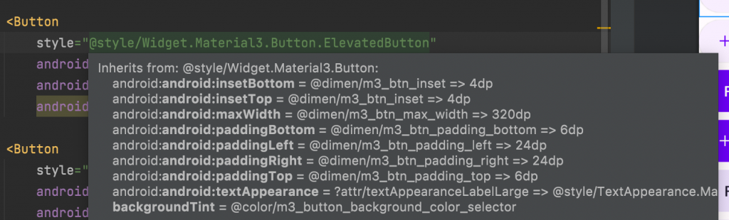
前四種一樣
Elevated button
Filled button
Filled tonal button
Outlined button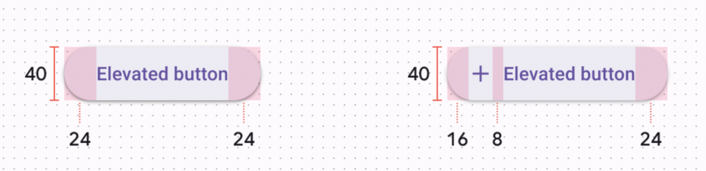
TextButton
style 預設底色是透明色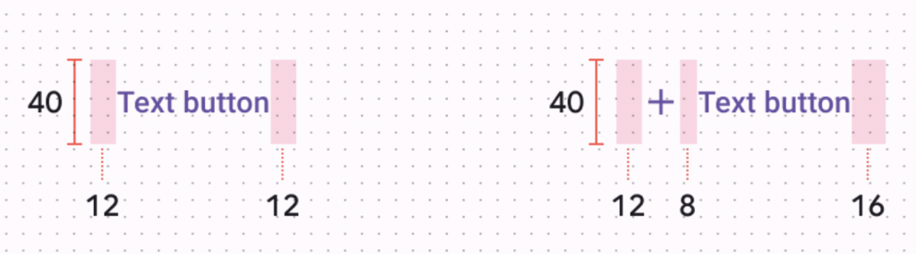
Enabled 啟用、Disabled 禁用、Hovered 懸停、 Focused 聚焦、 Pressed 按下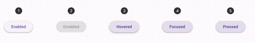
感謝您耐心看到這邊,這篇重點說明Button使用選擇。
明天會介紹 Text Fields,後天就將使用所學到Button、Text Fields實作一個小專案。
參考資料
Material Design 3 Common Buttons


 看影片追技術