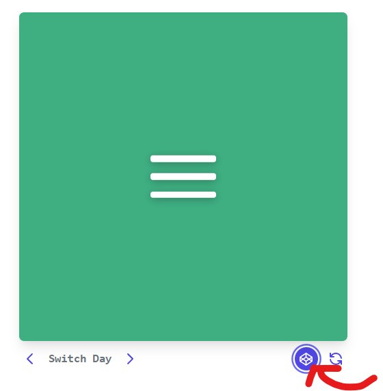
在每天的實作中,都會遇到不熟、不知道如何使用語法完成的難題,可以點擊CSS 100作者本身的CodePen參考(參考下圖紅色箭頭),像是背景色、動畫效果之類的,然後在自己挑戰時做出自己的變化。
今天我們挑戰Day #2,此Menu Icon 是很常見於網頁的選單,這個漢堡包點擊之後會變成叉叉,再點擊叉叉就會收合回漢堡包,接下來讓我們來一探玄機吧!
CodePen: https://codepen.io/stevetanus/pen/qBYZgxr
<div class="frame">
  <div class="center">
    <div class="menu-icon">
      <div class="line1 no-animation"></div>
      <div class="line2 no-animation"></div>
      <div class="line3 no-animation"></div>
    </div>
  </div>
</div>
.menu-icon包住三條線.line1, .line2, .line3,三條線都有個no-animation的class。
由於我們一開始不知道三條線要怎樣的長度,且之後有可能會再修改來看效果,所以我們先定義變數,方便之後程式進行修改。
$menu-icon-line-height: 12px;
$menu-icon-line-space: 20px;
$menu-icon-line-offsetY: $menu-icon-line-height + $menu-icon-line-space;
$menu-icon-height: (3 * $menu-icon-line-height) + (2 * $menu-icon-line-space);
$cubic-bezier-in: cubic-bezier(0.3, 1, 0.7, 1);
$menu-icon-line-offsetY 是線的高度加上線之間的空白高度,方便我們在animation語法中進行消除。
關於SASS變數可以參考以下文章 ~
Cubic Bezier 由四個點所組成(P0, P1, P2, P3),P0和P1為一控制點,P2和P3為一控制點,在起始點到終點之間會受到控制點的影響,形成不同的貝茲曲線,呈現出特別的動畫速度效果。cubic-bezier(0.3, 1, 0.7, 1)為前快後慢的動畫效果。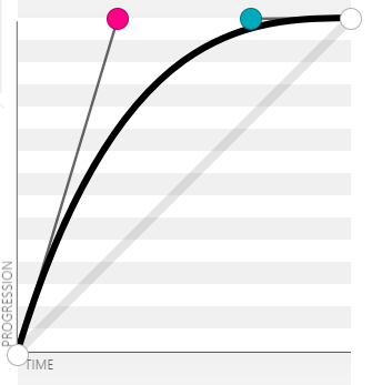
.menu-icon {
  cursor: pointer;
  &:hover {
    .line1,
    .line2,
    .line3 {
      background: darken(#fff, 10%);
    }
cursor: pointer(cur)讓我們滑鼠經過其元素時變成食指。我們也會發現背景顏色變暗了10%。
  &.active {
    .line1,
    .line2,
    .line3 {
      background: darken(#fff, 20%);
    }
    .line1 {
      animation: animate-line1 0.7s $cubic-bezier-in forwards;
    }
    .line2 {
      animation: animate-line2 0.7s $cubic-bezier-in forwards;
    }
    .line3 {
      animation: animate-line3 0.7s $cubic-bezier-in forwards;
    }
  }
後面會使用JavaScript讓.menu-icon增加active屬性,在.active之中,三條線都有自己的animation。
@keyframes animate-line1 {
  0% {
    transform: translate3d(0, 0, 0) rotate(0deg);
  }
  50% {
    transform: translate3d(0, $menu-icon-line-offsetY, 0) rotate(0deg);
  }
  100% {
    transform: translate3d(0, $menu-icon-line-offsetY, 0) rotate(45deg);
  }
}
@keyframes 用來定義動畫的規則,在animate-line1中,動畫進行0%(初始狀態)與原本相同,50%時y軸往下移動了整條線加上線間空白的高度,100%時高度與之前(50%)相同,但正向旋轉45度。animation 則是動畫屬性的縮寫,animation: animate-line1 0.7s $cubic-bezier-in forwards;
是指在.active的line1會啟動animate-line1的動畫,在0.7秒內以變數$cubic-bezier-in的速度執行,最後停在元素停在動畫結束的位置。
@keyframes animate-line2 {
  0% {
    transform: scale(1);
    opacity: 1;
  }
  100% {
    transform: scale(0);
    opacity: 0;
  }
}
@keyframes animate-line3 {
  0% {
    transform: translate3d(0, 0, 0) rotate(0deg);
  }
  50% {
    transform: translate3d(0, -$menu-icon-line-offsetY, 0) rotate(0deg);
  }
  90% {
    transform: translate3d(0, -$menu-icon-line-offsetY, 0) rotate(145deg);
  }
  100% {
    transform: translate3d(0, -$menu-icon-line-offsetY, 0) rotate(135deg);
  }
在.active的line2,加入animate-line2的動畫,達到縮小不見的效果。
在.active的line3,加入animate-line3的動畫,達到上升再正向旋轉145度與往回10度的效果。
@keyframes animate-line1-rev{...}@keyframes animate-line2-rev{...}@keyframes animate-line3-rev{...}
定義反向動畫效果在三條線上,然後我們需要防止第一次loading進入的動畫效果,這時候.no-animation就派上用場:
.no-animation {
  animation: none !important;
}
!important可以蓋過所有選擇器的語法,讓動畫效果消除(然而 !important 語法請盡量減少使用)。
const menuIcon = document.querySelector('.menu-icon')
const lines = document.querySelectorAll('.no-animation');
menuIcon.addEventListener('click',()=>{
	lines.forEach((line)=>{
		line.classList.remove('no-animation')
	})
  menuIcon.classList.toggle('active')
})
定義menuIcon為class="menu-icon"的元素。
定義lines為所有class="no-animation"的元素。
在menuIcon安裝監聽器,點擊時,每個在lines裡面的元素(.line1, .line2, .line3)的class會移除"no-animation",menuIcon的class如果沒有"active"會加上"active";反之,則會移除。如此一來,在點擊menuIcon時,就會產生常見的漢堡包選單啦!
中秋連假的第二天,好多人都在烤肉呢!!! 我雖然沒有吃到烤肉,但製作個漢堡包也是蠻不錯的吧

 iThome鐵人賽
 看影片追技術