今天我們來挑戰Day #3 金字塔,不要問我為什麼多了個e,我們要尊重作者的命名~
金字塔這個作品是一個連貫的動畫,在天空、太陽、金字塔、陰影、地板都用著相同的動畫速度$cubic-bezier: cubic-bezier(.4,0,.49,1);
https://cubic-bezier.com/#.4,0,.49,1
,這動畫效果與ease-in-out很相似,在動畫速度30%到70%較快速的期間設定了明顯的斷點,使得太陽的移動明顯,讓觀眾們感受到金字塔隨著太陽而有的變化,再來讓我們繼續看下去!
Codepen: https://codepen.io/stevetanus/pen/gOzMgEY
<div class="frame">
  <div class="center">
    <div class="circle">
      <div class="sky"></div>
      <div class="sun"></div>
      <div class="leftside"></div>
      <div class="rightside"></div>
      <div class="shadow"></div>
      <div class="ground"></div>
    </div>
  </div>
</div>
.circle為中心圓,裡面有著天空(.sky)、太陽(.sun)、金字塔(.leftside, .rightside)、陰影(.shadow)、地面(.ground)的元素。
.frame {
  background: #272C34;
  ...
整個frame的背景色偏暗,與中心圓形成對比,讓觀眾更為聚焦在中心圓。
.circle {
  position: relative;
  overflow: hidden;
  width: 180px;
  height: 180px;
  .sky {
    position: absolute;
    left: 0;
    right: 0;
    height: 124px;
    ...}
  .ground {
    position: absolute;
    bottom: 0;
    left: 0;
    right: 0;
    height: 56px;
.sky設定為絕對位置,left:0、right:0讓天空的寬度和父層定位點一樣,這邊的高度設定為124px,.ground的高度設定為58px並加上bottom: 0置底,相加起來剛好是.circle的高度。
clip-path 可以讓我們指定元素要呈現的部分,其餘則會被修剪掉(clipped away)。
CSS TRICKS: https://css-tricks.com/almanac/properties/c/clip-path/
在此作品中,有許多三角形和圓形,可以使用clip-path屬性完成:
.circle {
  position: relative;
  overflow: hidden;
  width: 180px;
  height: 180px;
  clip-path: circle(90px at 90px 90px);
在.circle中我們用circle(90px at 90px 90px)來定義一個圓形半徑為90,圓心為(90,90),其餘則會被clipped掉。
.leftside {
    position: absolute;
    width: 116px;
    height: 57px;
    top: 67px;
    left: 35px;
    clip-path: polygon(0% 100%, 100% 100%, 50% 0%);
.rightside {
    position: absolute;
    width: 58px;
    height: 57px;
    top: 67px;
    left: 93px;
    clip-path: polygon(30% 100%, 100% 100%, 0% 0%);
在.leftside和.rightside都用了polygon去畫出三角形,.leftside是一個正三角形,先畫兩點(固定y為100%,x從0%到100%),在畫頂點(x為50%,y為0%);.rightside在.leftside的上方,要注意到右側的width是左側的一半,其畫出的三角形離左側的正三角形中間加上了30%的右側width,形成一個像是背面的三角形。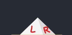
  .shadow {
    position: absolute;
    clip-path: polygon(115px 0%, 231px 0%, 80% 100%);
    z-index: 2;
    top: 124px;
    left: -80px;
    height: 30px;
    width: 360px;
.shadow也是用polygon來完成三角形,而因為是金字塔的陰影,我們將width設成360px,在陰影的頂點(80%, 100%)的地方會延伸超過中心圓,讓陰影更為真實。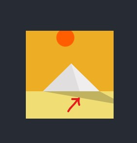
transform-origin的屬性很常與transform: rotate()進行搭配,預設的旋轉中心是center,而我們可以調整旋轉中心來達到日出日落的效果。
https://developer.mozilla.org/en-US/docs/Web/CSS/transform-origin
  .sun {
    height: 34px;
    width: 34px;
    transform-origin: 50% 400%;
    animation: sun-goes-down 4s $cubic-bezier infinite;
    ...}
@keyframes sun-goes-down {
  0% {
    background: #f57209;
    transform: rotate(-70deg);
  }

  30% {
    background: #ffef00;
    transform: rotate(-28deg);
  }

  70% {
    transform: scale(1.1);
    background: orangered;
  }

  100% {
    background: #f57209;
    transform: scale(1) rotate(70deg);
  }
}
.sun我們將其旋轉中心x向右移動50%,向下移動400%,加入sun-goes-down的動畫後,就會有從-70deg到-28deg到0deg(中間)到70deg,離開畫面的效果。
  .shadow {
    transform-origin: 50% 0%;
    animation: shadow-on-the-floor 4s $cubic-bezier infinite;
@keyframes shadow-on-the-floor {
  0% {
    transform: scaleY(0);
    clip-path: polygon(115px 0%, 231px 0%, 100% 100%);
  }

  30% {
    transform: scaleY(1);
    clip-path: polygon(115px 0%, 231px 0%, 80% 100%);
  }

  55% {
    transform: scaleY(0.4);
  }

  75% {
    transform: scaleY(1);
  }

  100% {
    transform: scaleY(0);
    clip-path: polygon(115px 0%, 231px 0%, 0% 100%);
  }
}
.shadow是作者提到不簡單的一塊,我們將旋轉中心設為(50%, 0%),如此陰影就會固定在金字塔底部旋轉,動畫效果在0%時X軸拉得更長,30%收回原本的陰影,55%縮小到0.4倍,75%回到1倍,最後縮小到一倍(陰影本身寬度為360px,必須注意在30%到100%間,clip-path的頂點會逐漸往左側到X軸0%的位置。)
  .rightside {
    animation: pyramide-shading 4s $cubic-bezier infinite reverse;
.rightside的animation-direction設定為reverse,是相對於.leftside的動畫的反向設定。
CSS
| 目標 | 屬性 |
|---|---|
| 思考斷點、動畫速度 | cubic-bezier、ease-in-out... |
| 畫出圖形 | clip-path |
| 常見動畫 | transform-origin + rotate |
今天的挑戰老實說挺難的,在做第二次的時候,還是很多不上手的地方,自己是在背景顏色做了些變化。沒想到這麼快中秋連假就結束了,我的文章儲備數還是0...緊接而來的是上班跟颱風,祝福大家不受到颱風影響,明天都收拾好心情開始上班~


 看影片追技術