在資訊爆炸的時代,每個人都有許多社群媒體,訊息通知是不停不停地響,叮咚叮咚,今天就來實作Day #7 打造一個訊息欄吧。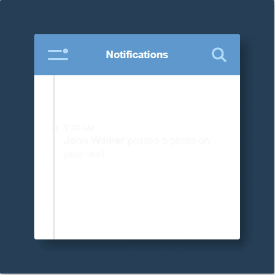
CodePen: https://codepen.io/stevetanus/pen/abGBrxo
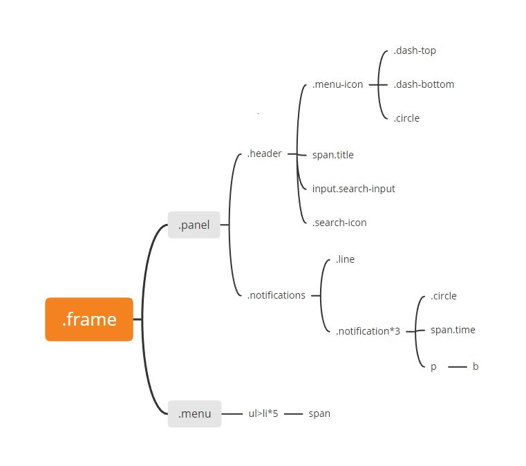
架構圖如上,.frame分成.panel和.menu,一開始的畫面只會看到.panel,點擊.menu-icon後.menu才會跑出來。input.search-input是一個搜尋欄,會在CSS設定為隱藏,是在點擊搜尋按鈕.search-icon才會出現。btag包住的文字會以粗體顯現。<input type="text" class="search-input" placeholder="Search...">inputtag可以設placeholder的屬性來提示使用者。.menu裡面的span使用到的icon為fontawesome資源。
w3schools.com/tags/tag_b.asp
fontawesome教學: https://kumo.tw/article.php?id=48
.panel{
    ...
    z-index: 2;
    transition: all 0.5s ease-in-out;
    &.show-menu {
        transform: translate3d(150px, 0, 0);
    }
}
.panel在加入.show-menu的class之後X軸會往右移150px。
.search-input {
    transition: all 0.3s ease-in-out;
    transform: translateX(10px);
    opacity: 0;
    pointer-events: none;
    ...
    &:focus {
        outline: none;
    }
    &.active {
        transform: translateX(0);
        opacity: 1;
        pointer-events: all;
    }
}
pointer-events設為none時,該元素沒有點擊效果。&:focus在&元素被點擊時,會有專注於上面的屬性。search-input在加入.active的class後,會左移10px,透明度從0變1,並可以點擊輸入文字。
.line{...}
.notification{
    @for $i from 2 through 4 {
        &:nth-child(#{$i}) {
			animation: here-am-i .5s ease-out ($i/5 + s);
            animation-fill-mode: both;
			}
        }
    }
}
@keyframes here-am-i {
	from {
		transform: translate3d(0,50px,0);
		opacity: 0;
	}
	to {
		transform: translate3d(0,0,0);
		opacity: 1;
	}
}
@for為Sass的迴圈,需要有$i、from、through的關鍵字。.notification上面有個.line,所以在notification:nth-child(2)會指定到第一個.notification,依序會有here-am-i的動畫在0.5秒內完成,($/5 + s)代表動畫的delay時間,從0.4s到0.6秒再到0.8s,形成一個訊息漸進的動畫。
@for https://sass-lang.com/documentation/at-rules/control/for
.menu {
  transition: all .5s ease-in-out;
  transform: translate3d(20px, 0, 0);
  &.active {
    box-shadow: 5px 5px 8px 0 rgba(0,0,0,0.2);
    transform: translate3d(0, 0, 0);
  }
.menu在加入.active會有X軸往左移並增加陰影的動畫。
const searchInput = document.querySelector(".search-input");
const searchIcon = document.querySelector(".search-icon");
searchIcon.addEventListener("click", () => { searchInput.classList.toggle("active");
});
const menuIcon = document.querySelector('.menu-icon');
const panel = document.querySelector('.panel')
const menu = document.querySelector('.menu')
menuIcon.addEventListener('click',()=>{
  panel.classList.toggle('show-menu');
  menu.classList.toggle('active');
})
.searchIcon跟.menuIcon加入eventListener,第一個參數為觸放事件類型為click,第二個參數定義觸發函式。HTML
| 待完成目標 | 使用工具 |
|---|---|
| 粗體字 | <b></b> |
| input預設字元 | <input placeholder="..."> |
| 好看的icon | fontawesome |
| CSS | |
| 完成目標 | 使用工具 |
| ------------- | ------------- |
| 滑鼠效果取消 | pointer-events: none |
| Scss 迴圈 | @for |
| 專注效果 | input:focus |
今天的實作比較晚才開始做,再加上最近上班開始變忙了,下班後的精力沒那麼旺盛,就沒有加什麼小巧思進去,大致上跟著範例去做,其中的動畫大多在前面就有出現,像是toggle元素的class就很常見。

 看影片追技術