今天我們來實作Day #8黏黏球,這是一個很常見的動畫,但實作上還是蠻有難度的,就讓我們繼續看下去吧~
CodePen: https://codepen.io/stevetanus/pen/JjvEVpM
.frame
  .center
    .ball
    - for i in (1..8)
      div class="blubb-#{ i }"
    - for i in (1..10)
      div class="sparkle-#{ i }"
這次使用的是Slim的模板語言,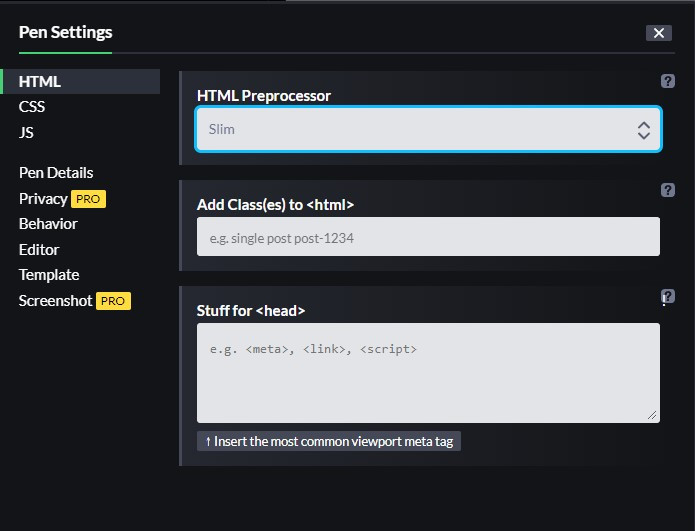
可以從上圖HTML Preprocessor設定。
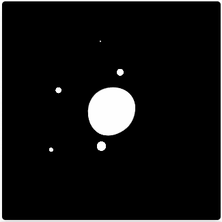
在.ball的div中,forloop創造了8個class為blubb-1到blubb-8的div,下個forloop創造了10個sparkle-1到sparkle-10的div。.ball是中間的白色圓圈,.blubb是八個在中間滾動的球,.sparkle則是會跑出去外面再回來的光點。
為了要製作出黏黏球的動畫,需要在外層的div下filter: contrast(x)對比的濾鏡,而在裡層的div下filter: blur(x)的模糊濾鏡。
噁心黏黏球文章: https://www.oxxostudio.tw/articles/201408/sticky-ball.html
噁心黏黏球文章二: https://ithelp.ithome.com.tw/articles/10226841
.frame {
    filter: contrast(25);
    .ball {
    position: relative;
    width: 90px;
    height: 90px;
    background: #fff;
    border-radius: 50%;
    filter: blur(15px);
    }
}
.frame設定了對比濾鏡25px,.ball則是設定了模糊濾鏡15px,這邊的.frame的contrast數值可以調整到.ball的邊邊不再模糊,就達到了黏黏球效果。
@keyframes rotate {
  from {
    transform: rotate(0deg) translate3d(0, 0, 0);
  }
  to {
    transform: rotate(360deg) translate3d(0, 0, 0);
  }
}
在.blubb跟.sparkle都會用到旋轉動畫,會正向旋轉360度。
@for $i from 1 through 8 {
	.blubb-#{$i} {
		position: absolute;
		top: 20px;
		left: 20px;
		width: 50px;
		height: 50px;
		transform: rotate( (random(300)) + deg);
		&:after {
			position: absolute;
			display: block;
			content: '';
			width: 20px;
			height: 20px;
			background: #fff;
			border-radius: 50%;
			transform-origin: (40 - $i * 3) + px (40 - $i * 3) + px;
			animation: rotate (2.5 + $i / 5) + s ease-in-out ($i / 5) + s infinite;
			filter: blur(5px);
		}
	}
}
.blubb有八個沒有背景色的正方形,transform: rotate((random(300)) + deg使得他們每個都會隨機旋轉角度,讓&:after的旋轉角度不同。.blubb:after的模糊濾鏡設為5px,為寬長20px的圓形,都有@keyframes rotate的動畫,其旋轉的軸心也會向右向下移動(transform-origin),旋轉軸心會依編號減少,使得.blubb會多少超出中間的.ball,動畫完成時間和delay時間會隨著$i而增加,達到循序出發與結束的效果。
@for $i from 1 through 10 {
  .sparkle-#{$i} {
    position: absolute;
    top: 38px;
    left: 38px;
    // background: green;
    width: (7 + $i) + px;
    height: (7 + $i) + px;
    transform: rotate((random(300)) + deg);
    &:after {
      position: absolute;
      display: block;
      content: "";
      width: (7 + $i) + px;
      height: (7 + $i) + px;
      background: #fff;
      border-radius: 50%;
      transform-origin: (60 - $i * 2) + px (60 - $i * 2) + px;
      animation: rotate (3.5 + $i / 5) + s ease-in-out ($i / 5) + s infinite;
      filter: blur(3px);
    }
  }
}
.sparkle的動畫效果跟.blubb相似,.sparkle:after的模糊濾鏡設為3px,為十顆相差1px的亮點((7+$i) + px),動畫為旋轉360度,循序出發。
HTML
| 目標 | 工具 |
|---|---|
| 模板HTML的一種形式 | Slim |
| CSS | |
| 目標 | 屬性 |
| ------------- | ------------- |
| 黏黏球動畫 | 母層filter: contrast(x),子層filter: blur(x) |
| 旋轉動畫改 | transform-origin(x,y)、animation-delay |
TGIF!
總算撐到星期五了,不要再看了啦,我也不要再寫了啦,周五就是要出去嗨呀!
沒有啦~我就是說說仔XD


 看影片追技術