這裡我們會使用到的工具是matplotlib繪圖庫模組,需要先安裝
pip install matplotlib
matplotlib是一個龐大的繪圖庫模組,基本上我們使用其中的pyplot子模組就可以了
常見圖表及對應的函數:
1. 折線圖:plot()
2. 散點圖:scatter()
3. 長條圖:bar()
4. 直方圖:hist()
5. 圓餅圖:pie()
先來繪製簡單的折線圖,語法格式為
plot(x,y,lw=x,ls='x',label='xxx',color)
import matplotlib.pyplot as plt

x = [x for x in range(11)]
squares = [0, 1, 4, 9, 16, 25, 36, 49, 64, 81, 100]
plt.plot(x, squares)
plt.show()
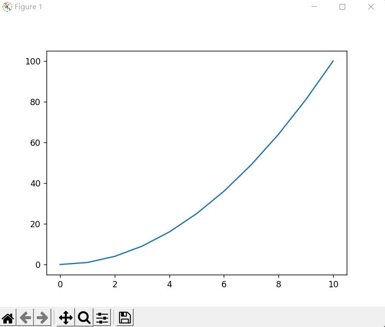
我們可以發現左下角的線刻度並未在(0,0)這個位置,這時我們可以用**axis()**設定
import matplotlib.pyplot as plt

squares = [0, 1, 4, 9, 16, 25, 36, 49, 64, 81, 100]
plt.plot(squares)
plt.axis([0, 10, 0, 100])
plt.show()
想要對應的更清楚可以加入**grid()**函數
import matplotlib.pyplot as plt

squares = [0, 1, 4, 9, 16, 25, 36, 49, 64, 81, 100]
plt.plot(squares)
plt.axis([0, 10, 0, 100])
plt.grid()
plt.show()
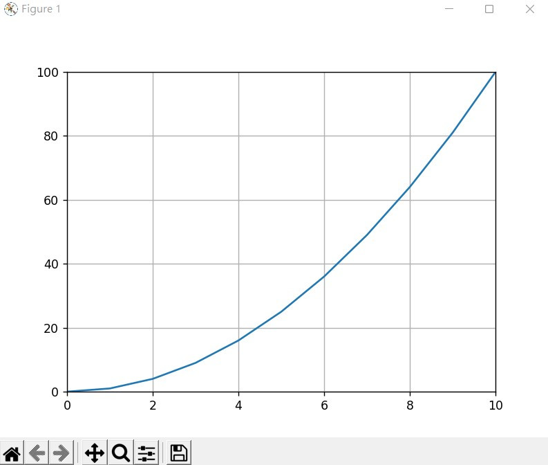
這樣可以讓x軸對應y軸時看的較清楚