上一篇分析完元件樣式 API ,今天就依照方式來客製化 Button 成設計稿的樣子
Button 設計稿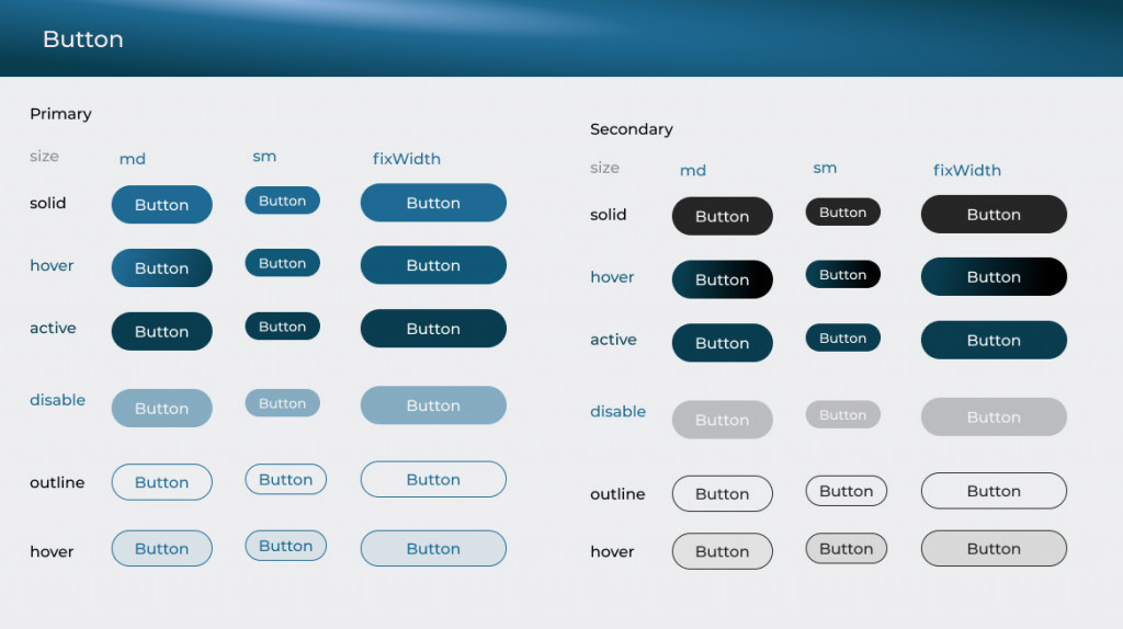
樣式: 除了主色的 Button 外,還有黑色的按鈕,以及外框的按鈕,這邊我們很容易用 variants 來達成樣式變化
const Button = {
  baseStyle: {
    display: 'flex',
    bgColor: 'blue.500',
    color: 'white',
    fontWeight: '400',
    letterSpacing: '1.5',
    rounded: 'full',
    fontSize: '16px',
  },
  sizes: {
    md: {
      px: '24px',
      py: '10px',
      fontSize: '16px',
    },
    sm: {
      px: '14px',
      py: '6px',
      fonSize: '14px',
    },
  },
  variants: {
    rounded: {
      rounded: 'full',
    },
    outline: {
      borderColor: 'blue.500',
      borderWidth: '1px',
    },
    secondary: {
      bgColor: 'gray.900',
      color: 'white',
    },
    fixedWidth: {
      width: '152px',
      py: '10px',
    },
    defaultProps: {
      variants: 'rounded',
      size: 'md',
    },
  },
};
const customTheme = {
//引入進來
  components: {
    Button,
  },
 }
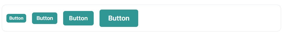
初步完成如下
接下來可以結合 Semantic Tokens 和 UI 狀態去調整


 看影片追技術