接下來的篇幅會開始講到 Selection Controls Components 簡稱 “選擇控件”:允許用戶完成涉及做出選擇的任務,例如選擇選項、打開或關閉設置或添加或刪除項目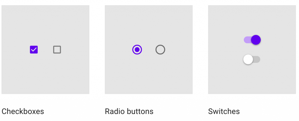
而今天要介紹的是 Switches,如果是 iphone 使用者的話很常會看到這個元件。但在現在的手機紅海市場,互相致敬(抄襲)已經是屢見不鮮了,但也多虧如此 Android 平台上也能使用這種設計樣式的元件
由於這元件的實作與設計篇幅有點短,所以就放在一起講,分為以下段落
是在行動裝置上是設置開關的首選方式,也最為人性化。設計上與上篇幅講過的 Slider 一樣,同為非常直覺與簡潔的控制元件,如同開門轉開門把一樣,直接傳達給用戶開與關的功能
應用在開與關某種功能的場景之下,能立即激活或停用某物。通常出現在設定、調整或篩選的畫面
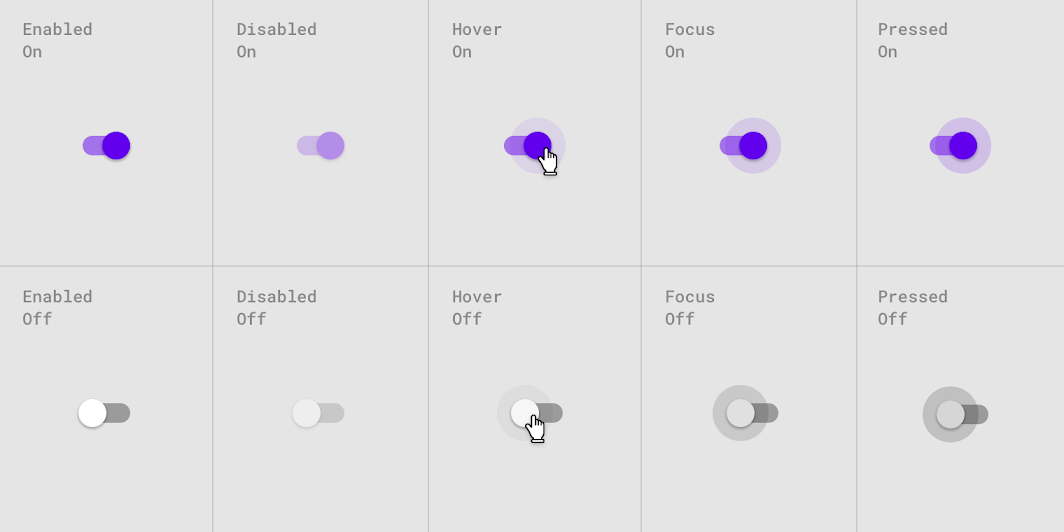
在設計上,我們有 checkboxes、radio buttons、switches 可以選擇,那要在何種情況下去使用 switches ?
如果一組中的每個項目都可以獨立控制,則應使用 switches 而不是 radio buttons
Radio buttons
Switches
當開關拇指在用戶交互時滑動到軌道的另一側時,開關成功切換

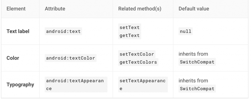
開關控制的選項,以及它現在的狀態,應該從相應的 Text Label 中清楚地呈現
避免在 icon 本身中使用 “on”和“off”。只要透過 Switch 切換的顏色就能知道開關了

如上圖所示,有些情況下我們開關某些功能,可能要耗費比較多的處理時間,這時候可以在 thumb 上面加入動畫,讓用戶知道當前開關的狀態,避免用戶執行後發現沒有效果,又再次重複執行相同動作,除了造成比較差的UX體驗,也會用應用程式浪費多餘資源
在觸摸時,執行拖曳與點擊在 thumb 的部分會出現 ripple 來告知用戶正在觸碰狀態,若是被關閉的狀態,則透過顏色的變化來向用戶傳達
實作上,也非常簡單,基本上所有的設置 Material design 都幫我們做好了
<com.google.android.material.switchmaterial.SwitchMaterial
    android:layout_width="wrap_content"
    android:layout_height="match_parent"
    android:checked="true"
    android:text="@string/label_1"/>

<com.google.android.material.switchmaterial.SwitchMaterial
    android:layout_width="wrap_content"
    android:layout_height="match_parent"
    android:text="@string/label_2"/>

<com.google.android.material.switchmaterial.SwitchMaterial
    android:layout_width="wrap_content"
    android:layout_height="match_parent"
    android:text="@string/label_3"/>

<com.google.android.material.switchmaterial.SwitchMaterial
    android:layout_width="wrap_content"
    android:layout_height="match_parent"
    android:text="@string/label_4"/>

<com.google.android.material.switchmaterial.SwitchMaterial
    android:layout_width="wrap_content"
    android:layout_height="match_parent"
    android:enabled="false"
    android:text="@string/label_5"/>
可透過 isChecked 的變化,來作不同的事件處理
switchMaterial.isChecked = true

switchMaterial.setOnCheckedChangeListener { buttonView, isChecked
    // if checked is true , do open function
    // if checked is false , do close function
}
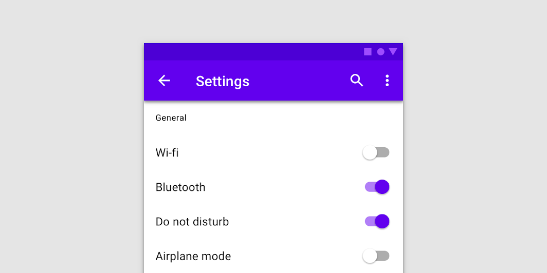
1.Thumb
2.Track

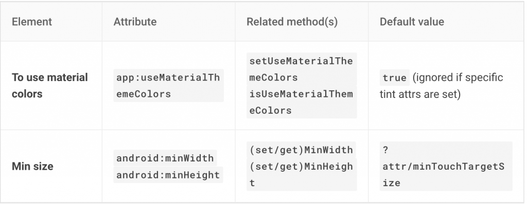
Switch 的顏色默認使用 Theme 中定義的 ?attr/colorSurface、?attr/colorOnSurface 和 ?attr/colorSecondary。如果想自己寫一個主題風格檔來更換,要先將 app:useMaterialThemeColors 設置為 false
<com.google.android.material.switchmaterial.SwitchMaterial
        ...
    app:useMaterialThemeColors="false"
    />
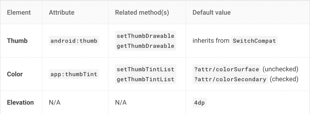
依照上述的屬性,我們就能自定義 track 與 thumb 的 check、unchecked 狀態顏色colorSecondary : thumb、track - checkedcolorOnSurface : thumb - uncheckedcolorSurface : track - unchecked
這邊我將 thumb 顏色鎖定,只有 track 會隨著 checked 改變 color
<style name="Widget.App.Switch" parent="Widget.MaterialComponents.CompoundButton.Switch">
        <item name="materialThemeOverlay">@style/ThemeOverlay.App.Switch</item>
    </style>

    <style name="ThemeOverlay.App.Switch" parent="">
        <!-- track checked -->
        <item name="colorSecondary">@color/darkGreen</item>
        <!-- track unchecked -->
        <item name="colorOnSurface">@color/darkGrey</item>
        <item name="thumbTint">@color/white</item>
    </style>
做出類似在 ios 上常見的 switches 造型
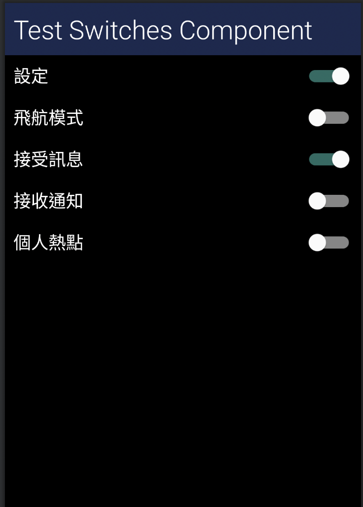
Switches 使用與設計上非常簡單,組件也只有兩個,所以重點就落在 thumb 與 track 的呈現,設計上應該避免過於複雜或華麗,簡潔有力才能快速傳達給用戶此元件的功用,若是應用上有對應到資料處理或是啟動繁重的任務,沒辦法立即開啟時,記得要加上動畫去告知用戶,避免用戶在不知情的狀況下不斷操作造成資源浪費。越是簡潔的元件,越是要透過顏色與形狀,來傳達狀態的變化
若對實作還是有點不懂的,這邊提供我的 Github 方便大家參考


 iThome鐵人賽
 看影片追技術