與上篇同為 Selection Controls Components,今天要講的是 Checkboxes,由於這些元件整體相對簡潔,Material Design 就沒有太大篇幅來介紹了,所以實作與設計會一起講
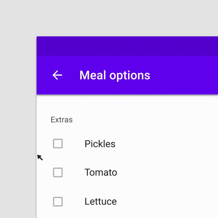
checkboxes 是一個允許用戶從一組中選擇一個或多個項目。也可以作為開關選項
如果畫面中列表中有多個選項,且這些選項是有關聯性的,應該使用 checkboxes,而不是 switches。這是因為 swtiches 是呈現各自獨立的開關功能,例如:開啟 wifi、飛航模式、熱點分享等等

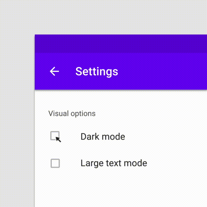
雖然 checkboxes 能應用在開關設計上,但如果要設定的項目很少或是沒有關聯性,應使用 switch
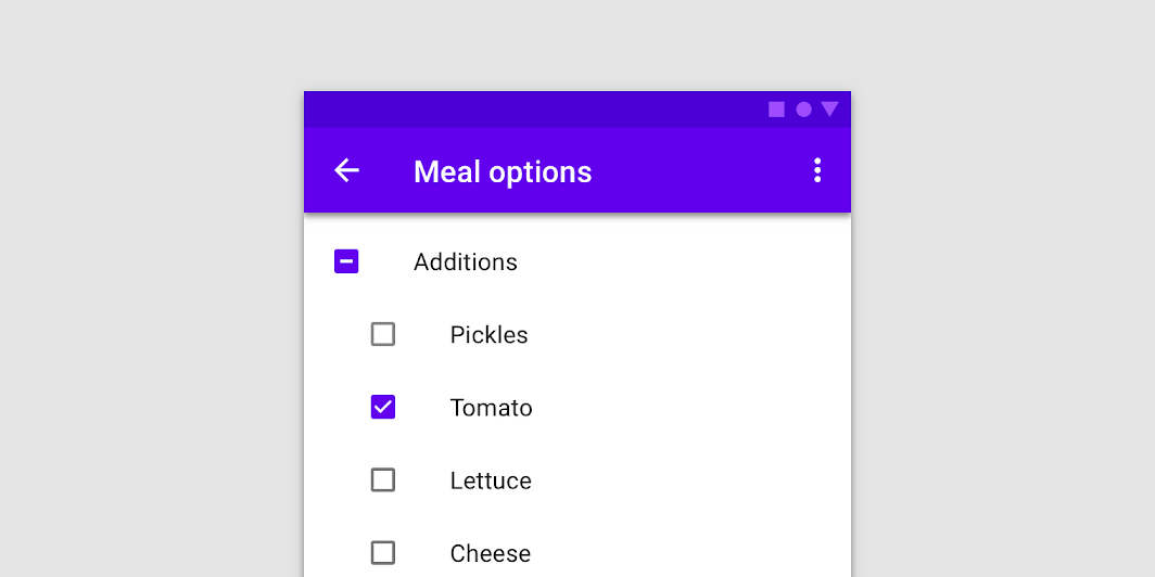
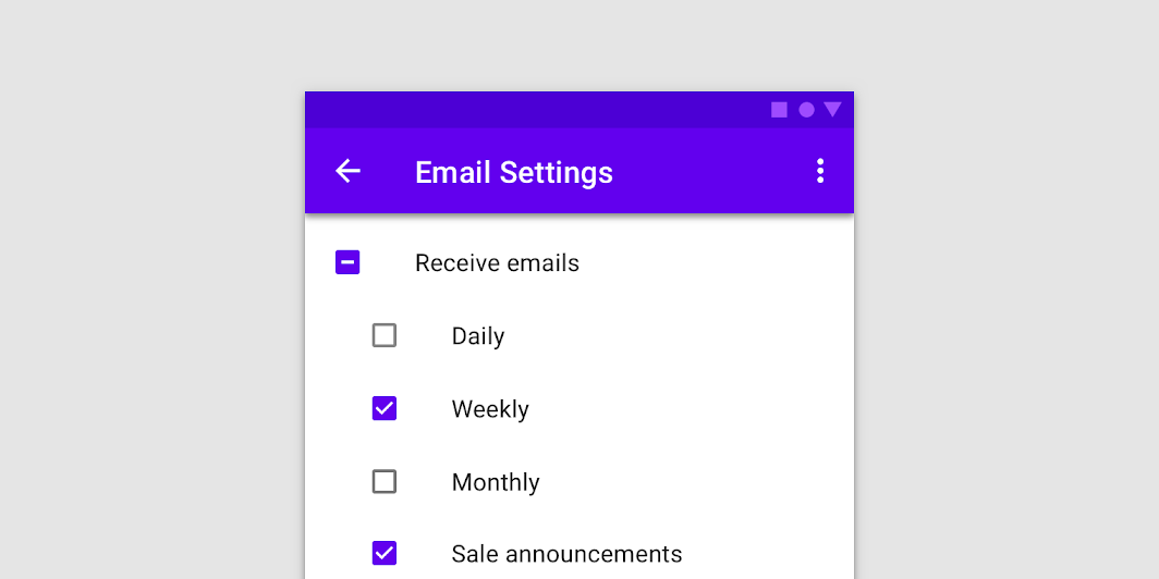
checkboxes 中會有父子層的關係情境,一個列表中還有一個小列表,讓用戶能做更加細節的選擇。而在這種情境有下列幾點要注意
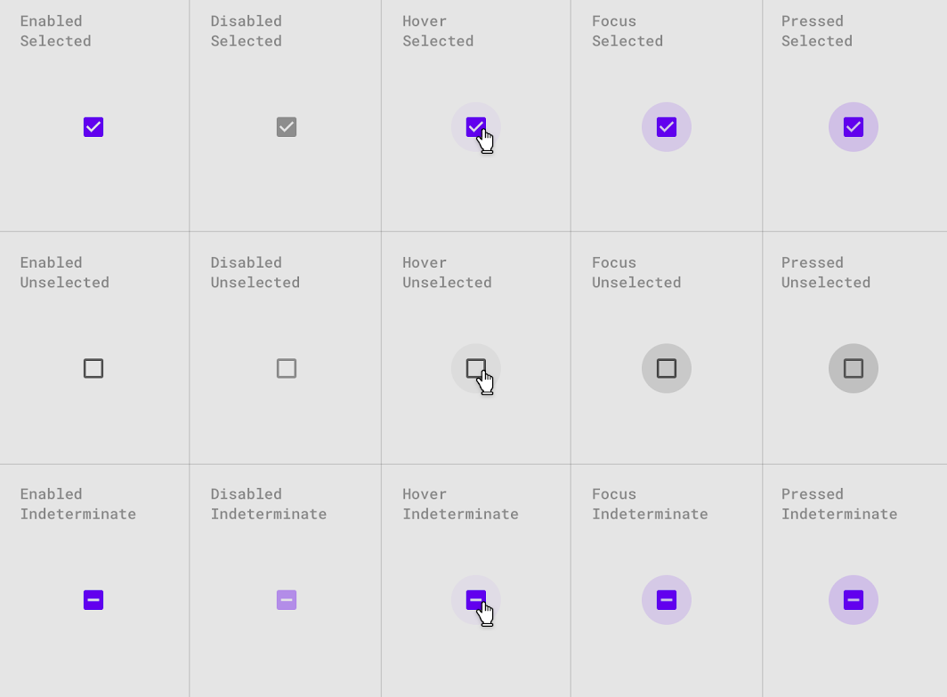
狀態設計上,要讓用戶能區分 checked 與 unchecked。點擊時出現 ripple ; 勾選後會出現 icon 與主題顏色,關閉狀態則透過顏色變化來傳達
實作上,Material Design 都幫我們設置好了,直接使用就可
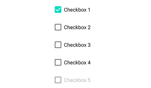
    <com.google.android.material.checkbox.MaterialCheckBox
        android:id="@+id/checkbox_1"
        android:layout_width="match_parent"
        android:layout_height="wrap_content"
        android:checked="true"
        style="@style/Widget.App.CheckBox"
        android:text="checkbox 1" />

    <com.google.android.material.checkbox.MaterialCheckBox
        android:id="@+id/checkbox_2"
        android:layout_width="match_parent"
        android:layout_height="wrap_content"
        style="@style/Widget.App.CheckBox"
        android:checked="true"
        android:text="checkbox 2" />

    <com.google.android.material.checkbox.MaterialCheckBox
        android:id="@+id/checkbox_3"
        android:layout_width="match_parent"
        android:layout_height="wrap_content"
        style="@style/Widget.App.CheckBox"
        android:text="checkbox 3" />

    <com.google.android.material.checkbox.MaterialCheckBox
        android:id="@+id/checkbox_4"
        android:layout_width="match_parent"
        android:layout_height="wrap_content"
        app:useMaterialThemeColors="false"
        style="@style/Widget.App.CheckBoxButtonTint"
        android:text="checkbox 4" />

    <com.google.android.material.checkbox.MaterialCheckBox
        android:id="@+id/checkbox_5"
        android:layout_width="match_parent"
        android:layout_height="wrap_content"
        style="@style/Widget.App.CheckBox"
        android:text="checkbox 5" />
// 可直接透過 ischecked 改動 checkbox 的狀態
checkbox.isChecked = true

// 透過 isChecked 的變化,來作不同的事件處理
checkbox.setOnCheckedChangeListener { buttonView, isChecked ->
    // if checked is true , do checked function
    // if checked is false , do cancel checked function
}

預設未選狀態顏色是?attr/colorOnSurface (unchecked)
選中狀態顏色是?attr/colorSecondary (checked)
如果不想使用預設的顏色或用自定義的 icon,可以將綁定 Theme 的設定關掉 app:useMaterialThemeColors="false"再透過 android:buttonTint設定想要的顏色
<CheckBox
        ...
    app:useMaterialThemeColors="false"
    android:buttonTint="@color/lightYellow"
    />
由於 checkbox 有兩個狀態,所以如果想在設計上讓 checked 與 unchecked 呈現不同顏色,應該去寫一個 selector,而不是直接套用一個 color
<?xml version="1.0" encoding="utf-8"?>
<selector xmlns:android="http://schemas.android.com/apk/res/android">
    <item android:color="@color/lightGreen" android:state_checked="true"/>
    <item android:color="@color/lightBlue" android:state_checked="false"/>
    <item android:color="@color/lightGreen"/>
</selector>
若是使用自訂的 icon,例如愛心圖案的挖空到填滿,也是透過 selector 去置換 drawable
<?xml version="1.0" encoding="utf-8"?>
<selector xmlns:android="http://schemas.android.com/apk/res/android">
    <item android:drawable="@drawable/ic_baseline_favorite_border_24" android:state_checked="false" />
    <item android:drawable="@drawable/ic_baseline_favorite_24" android:state_checked="true" />
    <item android:drawable="@drawable/ic_baseline_favorite_border_24" />
</selector>
<CheckBox
        android:layout_width="match_parent"
        android:layout_height="wrap_content"
        android:layout_marginStart="4dp"
        android:padding="10dp"
        android:button="@drawable/favorite_selector"
        android:text="favorite checkboxes" />


上面有稍微提到過如何自定義 checkbox 的顏色,這邊在整理一下
預設未選狀態顏色是?attr/colorOnSurface (unchecked)
選中狀態顏色是?attr/colorSecondary (checked)
而我魔改的不只單純是顏色,順便也調整了字體大小與間距
 <style name="Widget.App.CheckBox" parent="Widget.MaterialComponents.CompoundButton.CheckBox">
        <item name="android:textSize">20sp</item>
        <item name="android:padding">10dp</item>
        <item name="materialThemeOverlay">@style/ThemeOverlay.App.CheckBox</item>
</style>

<style name="ThemeOverlay.App.CheckBox" parent="">
        <!-- unchecked state -->
        <item name="colorOnSurface">@color/white</item>
        <!-- checked state -->
        <item name="colorSecondary">@color/lightYellow</item>
</style>
如果不想透過覆寫主題色來改變,可透過 app:useMaterialThemeColors="false",配合使用android:buttonTint 設定顏色,要記得使用 selector 來設置
<style name="Widget.App.CheckBoxButtonTint" parent="Widget.MaterialComponents.CompoundButton.CheckBox">
        <item name="android:textSize">20sp</item>
        <item name="android:padding">10dp</item>
        <item name="buttonTint">@color/checkboxes_tint_selector</item>
</style>
<selector xmlns:android="http://schemas.android.com/apk/res/android">
    <item android:color="@color/lightGreen" android:state_checked="true"/>
    <item android:color="@color/lightBlue" android:state_checked="false"/>
    <item android:color="@color/lightGreen"/>
</selector>

今天介紹的 checkboxes 是第二個 selection controls components,在設計與實作上都非常的簡潔與簡單。重點在於 checked 與 unchecked 在設計上應該讓用戶能快速辨識,避免過於複雜
適用在多複選或有層級群組選項的情境下,與 switches 最大的差別在於分組與分層的設計上,switches 呈現的是扁平化與各自獨立無相關的,在開關選擇上不會相互影響,而 checkboxes 則會,表示在這一群組中用戶分別選擇了哪些,這些選項則會交互影響而有不同的功能
應用上要與 switches 區隔開來,同時使用的話,會讓用戶不知道之間的差別與層級關係 
若對實作還是有點不懂的,這邊提供我的 Github 方便大家參考


 iThome鐵人賽
 看影片追技術