今日大綱
K近鄰演算法字面上的意思就是k個鄰居,此方法依據最近的k個鄰居所做分類。KNN可以用於分類與回歸問題上,而本篇文章將著重於二元分類。KNN與其他演算法不同的是不需要經過學習。
在分類未知的資料時,此方法計算出未知的資料與訓練資料之間的距離,並且找出最近的k個點,再以多數決的方式分類。
KNN一旦處理龐大的資料,分類速度就會變得緩慢,無法順利學習高維度的資料。因為KNN再分類未知的資料時,必須對大量的訓練資料做搜尋,找出鄰近的點。
使用sklearn裡的make_moons資料集作範例,noise參數越大時代表資料越混亂。
from sklearn.neighbors import KNeighborsClassifier
from sklearn.datasets import make_moons
from sklearn.model_selection import train_test_split
from sklearn.metrics import accuracy_score

x, y = make_moons(noise = 0.3)
x_train, x_test, y_train, y_test = train_test_split(x, y, test_size = 0.2, random_state = 1)
將k設為3
n_neighbor = 3
clf = KNeighborsClassifier(n_neighbors = n_neighbor )
clf.fit(x_train, y_train)
prediction = clf.predict(x_test)
print(accuracy_score(prediction, y_test))
結果測試集的準確率為0.9。
最後將資料視覺化,plot_decision_regions為畫出KNN結果的函數
from matplotlib.colors import ListedColormap
import matplotlib.pyplot as plt
import numpy as np

def plot_decision_regions(X, y, classifier, test_idx=None, resolution=0.02):

    # setup marker generator and color map
    markers = ('s', 'x', 'o', '^', 'v')
    colors = ('red', 'blue', 'lightgreen', 'gray', 'cyan')
    cmap = ListedColormap(colors[:len(np.unique(y))])

    # plot the decision surface
    x1_min, x1_max = X[:, 0].min() - 1, X[:, 0].max() + 1
    x2_min, x2_max = X[:, 1].min() - 1, X[:, 1].max() + 1
    xx1, xx2 = np.meshgrid(np.arange(x1_min, x1_max, resolution),
                           np.arange(x2_min, x2_max, resolution))
    Z = classifier.predict(np.array([xx1.ravel(), xx2.ravel()]).T)
    Z = Z.reshape(xx1.shape)
    plt.contourf(xx1, xx2, Z, alpha=0.4, cmap=cmap)
    plt.xlim(xx1.min(), xx1.max())
    plt.ylim(xx2.min(), xx2.max())

    for idx, cl in enumerate(np.unique(y)):
        plt.scatter(x=X[y == cl, 0], y=X[y == cl, 1],
                    alpha=0.8, c=cmap(idx),
                    marker=markers[idx], label=cl)
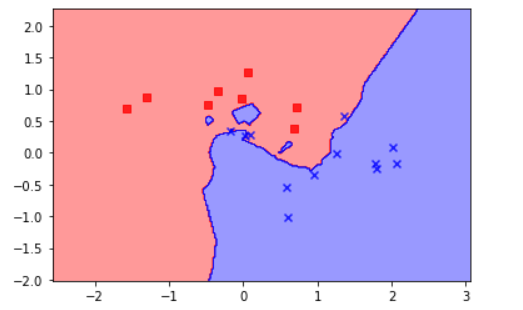
從圖可看出,大部分的資料被準確地分類。
程式碼已上傳至我的Github
感謝您的瀏覽,我們明天見!