StandardBottomSheet 是與主 UI 區域共存,並允許同時查看兩個區域並且可以互相交互,可以垂直拖動或向下滑動來完全關閉。
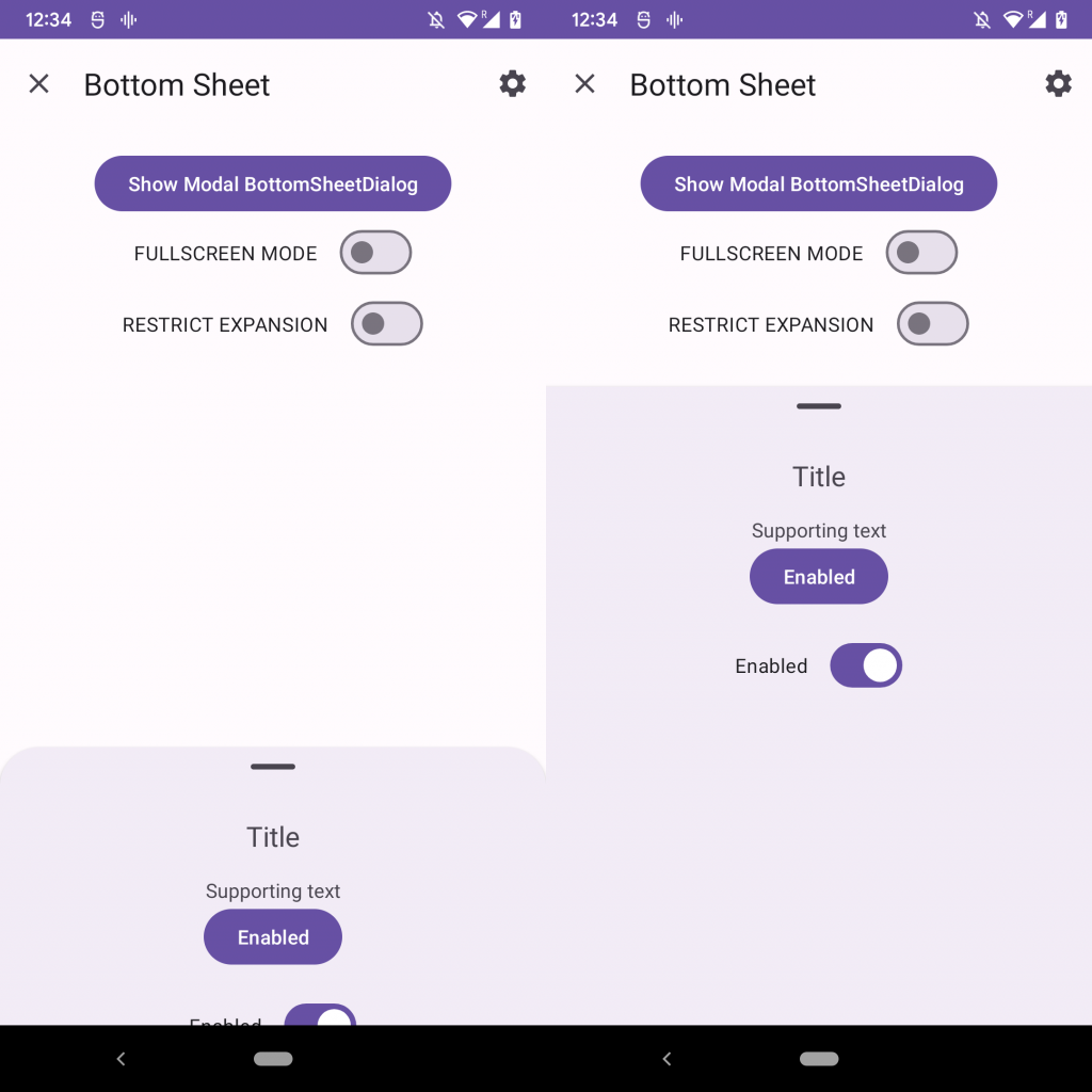
影片中點擊按鈕簡單的置換BottomSheet內的文字,同時有顯示了處於折疊(有圓角)和展開(沒有圓角)狀態的BottomSheet
為什麼外層需是CoordinatorLayout而不是其他的佈局layout,從程式碼中可看到BottomSheetBehavior是繼承CoordinatorLayout。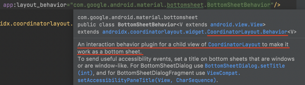
 <androidx.coordinatorlayout.widget.CoordinatorLayout
        android:layout_width="match_parent"
        android:layout_height="match_parent">

        <LinearLayout
            android:id="@+id/standard_bottom_sheet"
            style="@style/Widget.Material3.BottomSheet"
            android:layout_width="match_parent"
            android:layout_height="match_parent"
            android:orientation="vertical"
            app:layout_behavior="com.google.android.material.bottomsheet.BottomSheetBehavior">

            <!-- Drag handle for accessibility -->
            <com.google.android.material.bottomsheet.BottomSheetDragHandleView
                android:id="@+id/drag_handle"
                android:layout_width="match_parent"
                android:layout_height="wrap_content" />

            <!-- Bottom sheet contents. -->
            <TextView
                android:id="@+id/tvBottomContents"
                android:layout_width="wrap_content"
                android:layout_height="wrap_content"
                android:layout_gravity="center"
                android:text="Title" />

        </LinearLayout>
    </androidx.coordinatorlayout.widget.CoordinatorLayout>
完整程式碼
app:layout_behavior指定 BottomSheet類型<LinearLayout xmlns:android="http://schemas.android.com/apk/res/android"
xmlns:app="http://schemas.android.com/apk/res-auto"
android:layout_width="match_parent"
android:layout_height="match_parent"
android:gravity="center"
android:orientation="vertical">
<TextView
android:layout_width="wrap_content"
android:layout_height="wrap_content"
android:layout_gravity="center"
android:layout_margin="20dp"
android:text="Text" />
<Button
android:id="@+id/button"
android:layout_width="wrap_content"
android:layout_height="wrap_content"
android:layout_gravity="center"
android:text="Enabled" />
<androidx.coordinatorlayout.widget.CoordinatorLayout
android:layout_width="match_parent"
android:layout_height="match_parent">
<LinearLayout
android:id="@+id/standard_bottom_sheet"
style="@style/Widget.Material3.BottomSheet"
android:layout_width="match_parent"
android:layout_height="match_parent"
android:orientation="vertical"
app:layout_behavior="com.google.android.material.bottomsheet.BottomSheetBehavior">
<!-- Drag handle for accessibility -->
<com.google.android.material.bottomsheet.BottomSheetDragHandleView
android:id="@+id/drag_handle"
android:layout_width="match_parent"
android:layout_height="wrap_content" />
<!-- Bottom sheet contents. -->
<TextView
android:id="@+id/tvBottomContents"
android:layout_width="wrap_content"
android:layout_height="wrap_content"
android:layout_gravity="center"
android:text="Title" />
</LinearLayout>
</androidx.coordinatorlayout.widget.CoordinatorLayout>
</LinearLayout>
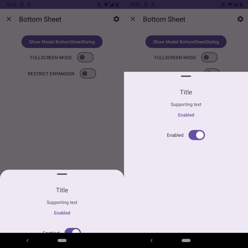
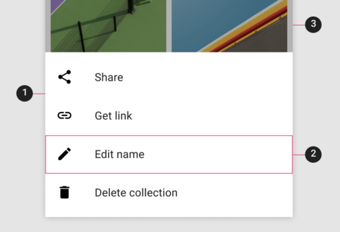
展開狀態時的背景呈現灰色,同時阻止與畫面其餘元件的交互點擊,可以垂直拖動或向下滑動來關閉,或是點擊對灰色部分也可以關閉BottomSheet。
使用BottomSheetDialogFragment實作
BottomSheetDialogFragment and overwrite onCreateView後inflater要顯示的layout (modal_bottom_sheet_content.xml)。
// ModalBottomSheet 繼承 BottomSheetDialogFragment
class ModalBottomSheet : BottomSheetDialogFragment() {

    override fun onCreateView(
        inflater: LayoutInflater,
        container: ViewGroup?,
        savedInstanceState: Bundle?
    ): View? = inflater.inflate(R.layout.modal_bottom_sheet_content, container, false)

    companion object {
        const val TAG = "ModalBottomSheet"
    }
}
modal_bottom_sheet_content.xml
<LinearLayout xmlns:android="http://schemas.android.com/apk/res/android"
    xmlns:app="http://schemas.android.com/apk/res-auto"
    android:layout_width="match_parent"
    android:layout_height="match_parent"
    android:orientation="vertical"
    app:layout_behavior="com.google.android.material.bottomsheet.BottomSheetBehavior">

    <!-- Drag handle for accessibility -->
    <com.google.android.material.bottomsheet.BottomSheetDragHandleView
        android:id="@+id/drag_handle"
        android:layout_width="match_parent"
        android:layout_height="wrap_content" />

    <!-- Bottom sheet contents. -->
    <TextView
        android:layout_width="wrap_content"
        android:layout_height="wrap_content"
        android:layout_gravity="center"
        android:layout_marginTop="20dp"
        android:text="Title" />

    <TextView
        android:layout_width="wrap_content"
        android:layout_height="wrap_content"
        android:layout_gravity="center"
        android:layout_marginTop="20dp"
        android:text="Title" />

    <TextView
        android:layout_width="wrap_content"
        android:layout_height="wrap_content"
        android:layout_gravity="center"
        android:layout_marginTop="20dp"
        android:text="Title" />

    <TextView
        android:layout_width="wrap_content"
        android:layout_height="wrap_content"
        android:layout_gravity="center"
        android:layout_margin="20dp"
        android:text="Title" />


</LinearLayout>
BottomSheetDialogFragment是AppCompatFragment的一個子類,所以需要在繼承AppCompatActivity得頁面上show ModalBottomSheet。
// MainActivity 透過 ModalBottomSheet show 來呼叫顯示
class MainActivity : AppCompatActivity() {
    ...
    val modalBottomSheet = ModalBottomSheet()
    modalBottomSheet.show(supportFragmentManager, ModalBottomSheet.TAG)
    ...
}
如果需求BottomSheetDialogFragment要可以控制取消、或是關閉。
從原碼中註解說明ModalBottomSheet是DialogFragment中的版本,所以會需要繼承BottomSheetDialogFragment。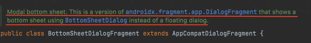
可以使用DialogFragment有提供的方法,皆可以透過override onCancel(DialogInterface) 、 onDismiss(DialogInterface),就不用在寫setOnCancelListener or setOnDismissListener。
Sheet attributes 的xml Attribute的設定、可以呼叫Method方法、預設的Default值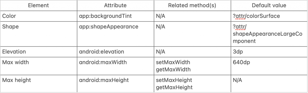
Behavior attributes 的xml Attribute的設定、可以呼叫Method方法、預設的Default值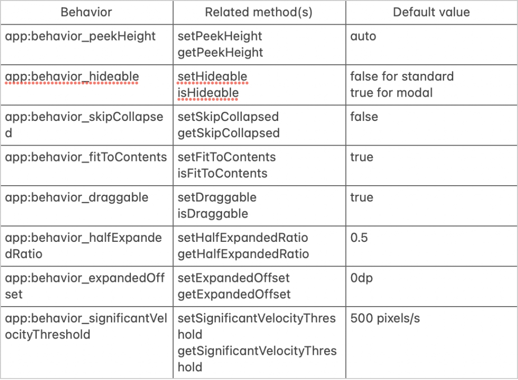
使用viewBinding取得layout的resources的Id,當然也可以用其他方式取到layout的resources的Id
val standardBottomSheet = binding.standardBottomSheet
val standardBottomSheetBehavior = BottomSheetBehavior.from(standardBottomSheet)

// 一開始顯示的折疊時的高度
standardBottomSheetBehavior.**peekHeight** = 350

// true 向下滑動時是可以隱藏
// false 向下滑動時不可以隱藏
// setHideable會提示換成isHideable,**實測預設是True下滑可以隱藏**
standardBottomSheetBehavior.**setHideable**(false)

// true 展開一次後隱藏時是否應跳過折疊狀態。同時setHideable(true)是可隱藏的,否則將此設置為true無效。
// false 下滑時可以先回到折疊狀態
standardBottomSheetBehavior.**skipCollapsed** = true

// true 展開的高度是由其內容的高度決定
// false 是分兩個階段展開(外層layout的一半高度,外層layout的全高)
// setFitToContents 會提示換成 isFitToContents
standardBottomSheetBehavior.**isFitToContents** = false

// true 是可以上下拖動折疊或展開
// false 不行上下拖動折疊或展開,固定位置
standardBottomSheetBehavior.**isDraggable** = true

// 當isFitToContents 為 false 時使用
// 調整「外層layout的一半高度的高度」,會隨著這個比率的降低而變小,而隨著它的增加而變高
// 必須小於 1.0 (不包含1.0)
standardBottomSheetBehavior.halfExpandedRatio = 0.2f

// 當isFitToContents 為 false 時使用
// 調整「外層layout的全高」主UI上最靠近的元件要間隔多少
standardBottomSheetBehavior.expandedOffset = 100
儲存配置更改時的行為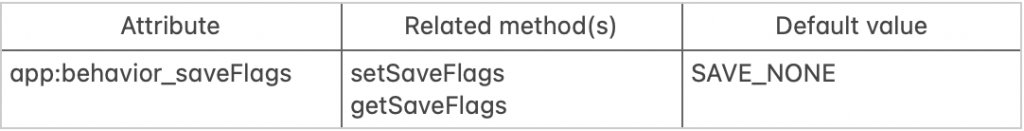
使用者點擊滑動狀態
// 設定方式
standardBottomSheetBehavior.saveFlags = BottomSheetBehavior.SAVE_ALL

// 使用在監聽BottomSheetCallback狀態變更時用
behavior.addBottomSheetCallback(object : BottomSheetBehavior.BottomSheetCallback() {

            override fun onStateChanged(bottomSheet: View, newState: Int) {
                when(newState){
                    BottomSheetBehavior.STATE_EXPANDED->{}
                    BottomSheetBehavior.STATE_COLLAPSED->{}
                    BottomSheetBehavior.STATE_DRAGGING->{}
                    BottomSheetBehavior.STATE_SETTLING->{}
                    BottomSheetBehavior.STATE_HIDDEN->{}
                }
            }

            override fun onSlide(bottomSheet: View, slideOffset: Float) {

            }

        })

參考資料:Material Design Component Bottom Sheets


 看影片追技術