通常我們大家熟悉的Dialogs 是讓使用者需要的操作、內容包含簡明扼要的陳述或問題。
Dialogs在應用程式內容前面,同時禁用所有應用程式功能,以提供關鍵資訊或請求決定,直到使用者點擊操作確認、關閉。
有兩種型別的對話方塊:Basic dialog和Full-screen dialog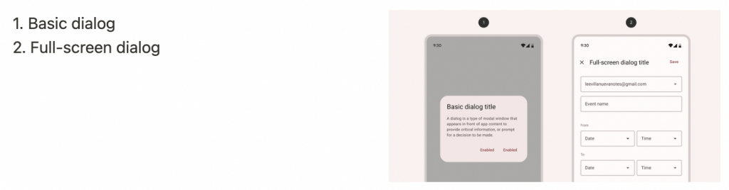
API and source code:
MaterialAlertDialogBuilder(context)
// Add customization options here
.show()
出現在應用程式內容前面,以提供關鍵資訊或要求做出決定。 對話方塊在出現時禁用所有應用程式功能,並保持在螢幕上,直到確認、關閉或採取必要行動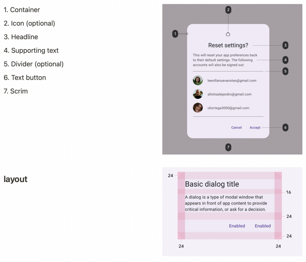
MaterialAlertDialogBuilder(context)
        .setTitle(resources.getString(R.string.title))
        .setMessage(resources.getString(R.string.supporting_text))
        .setNeutralButton(resources.getString(R.string.cancel)) { dialog, which ->
            // Respond to neutral button press
        }
        .setNegativeButton(resources.getString(R.string.decline)) { dialog, which ->
            // Respond to negative button press
        }
        .setPositiveButton(resources.getString(R.string.accept)) { dialog, which ->
            // Respond to positive button press
        }
        .show()
佔據了整個螢幕,例如建立帶有事件標題、日期、位置和時間的日曆。
通常沒有特定實作方法,所以也可以使用DialogFragment來實現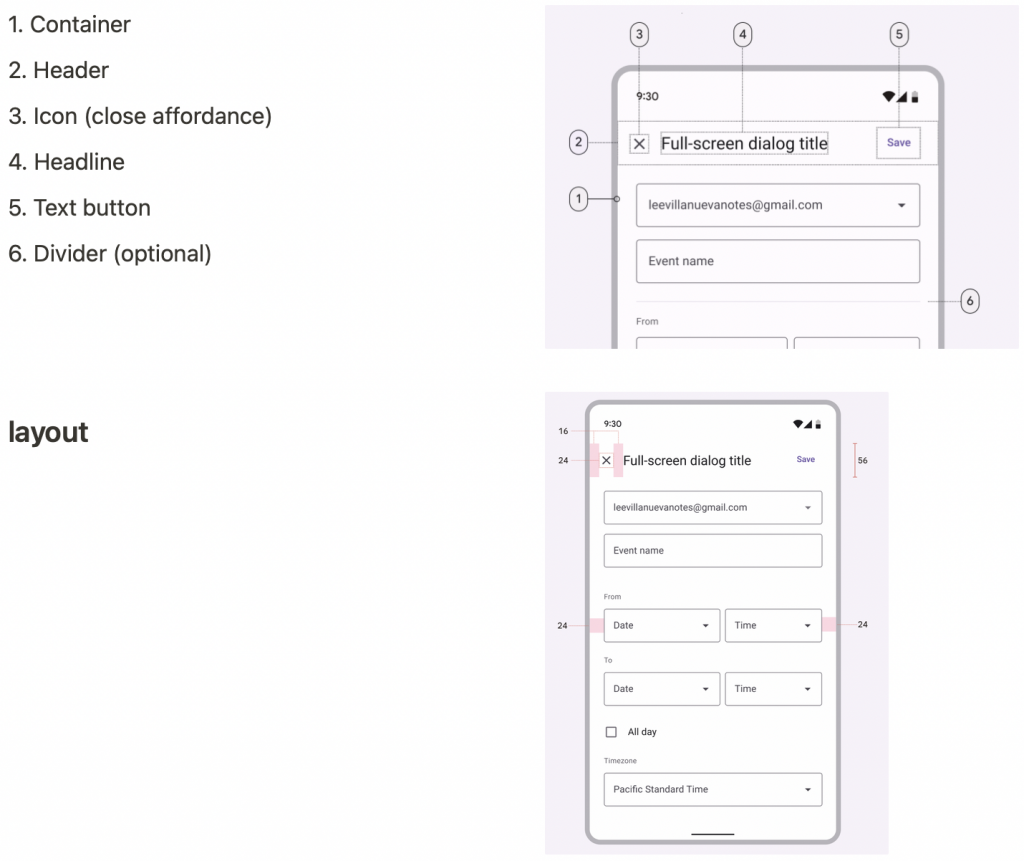
class CustomDialogFragment : DialogFragment() {

    override fun onCreateView(inflater: LayoutInflater,
								container: ViewGroup?,savedInstanceState: Bundle?): View {
        return inflater.inflate(R.layout.purchase_items, container, false)
    }

    /**在 creating 載入layout時才會呼叫此功能 */
    override fun onCreateDialog(savedInstanceState: Bundle): Dialog {

        val dialog = super.onCreateDialog(savedInstanceState)
        dialog.requestWindowFeature(Window.FEATURE_NO_TITLE)
        return dialog
    }
}
如何根據螢幕大小,顯示Basic dialog或Full-screen dialog
fun showDialog() {
    val fragmentManager = supportFragmentManager
    val newFragment = CustomDialogFragment()
    if (isLargeLayout) { // 判斷螢幕大小顯示不同種類型dialog
				// LargeLayout是Basic dialog
        newFragment.show(fragmentManager, "dialog")
    } else {
        // smallerLayout是秀Full-screen dialog
        val transaction = fragmentManager.beginTransaction()
        // 指定動畫效果
        transaction.setTransition(FragmentTransaction.TRANSIT_FRAGMENT_OPEN)
        // fullscreen, 使用 'content' root view 作為背景,因為root view 是activity
        transaction.add(**android.R.id.content**, newFragment)
                .addToBackStack(null)
                .commit()
    }
}
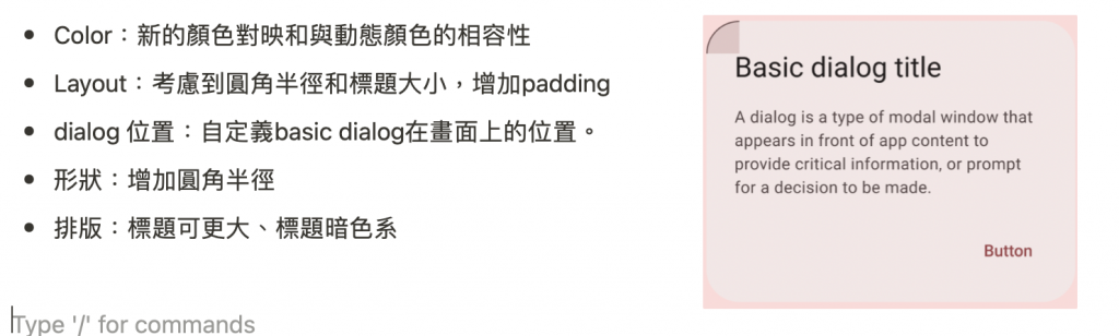
一般標題簡明扼要,如有必要可以換行,並被截斷。
但如果是 full-screen dialogs時,避免在全屏頂部應用程式欄(左圖1)中放置長標題,因為截斷的文字可能會導致誤解,所以找到縮短應用程式欄文字的方法,並在全屏對話方塊的內容區域(右圖1)中放置較長的標題。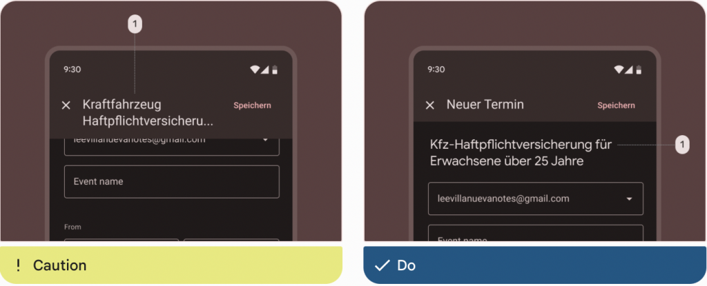
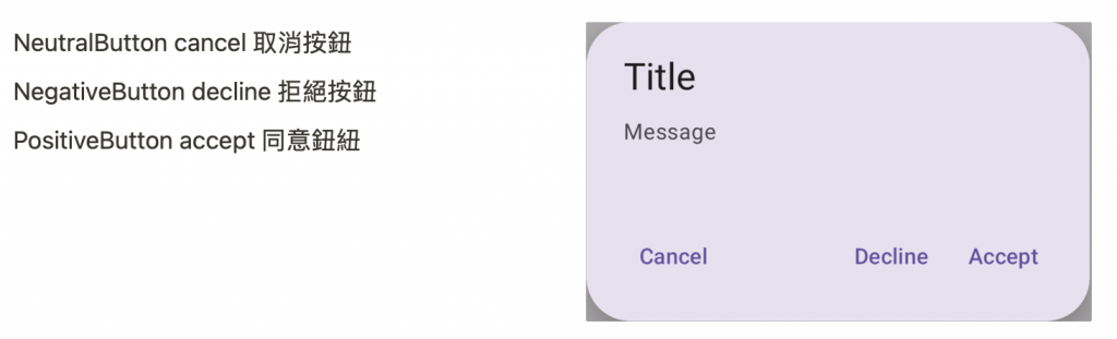
一般Dialog的操作按鈕,讓使用者確認某些內容或關閉。
按鈕位置會根據語言開頭方向,如是從左到右語言(右圖1),確認操作放在右邊,關閉操作放在左邊,從右到左的語言,這個位置是相反的。
使用禁止確認操作(左圖1),等使用者做出選擇後可以確認。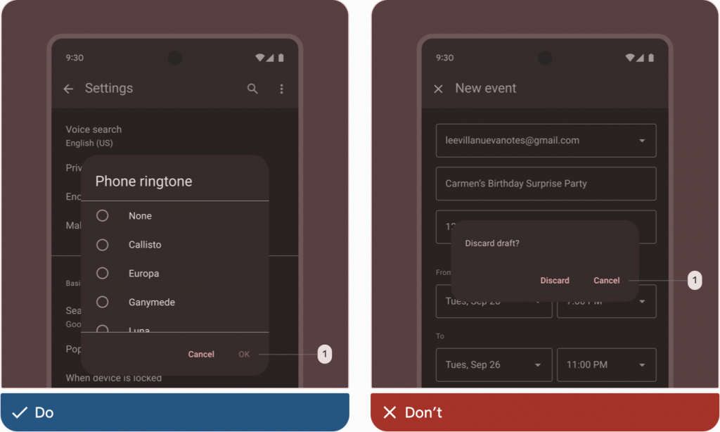
感謝看到這裡~~
參考網址:Material Design Component Dialogs


 看影片追技術