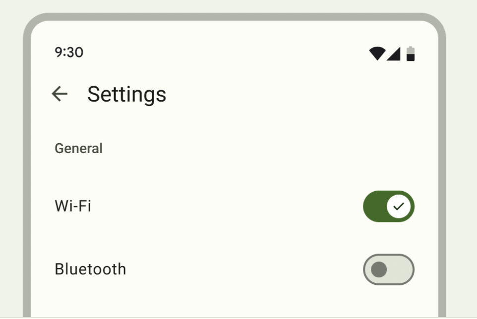
當需要開啟或關閉單一選項時,可使用Switch ,最常用於手機裝置,以啟用和禁用選項或是選單中的選項。
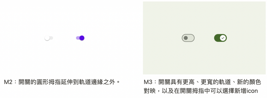
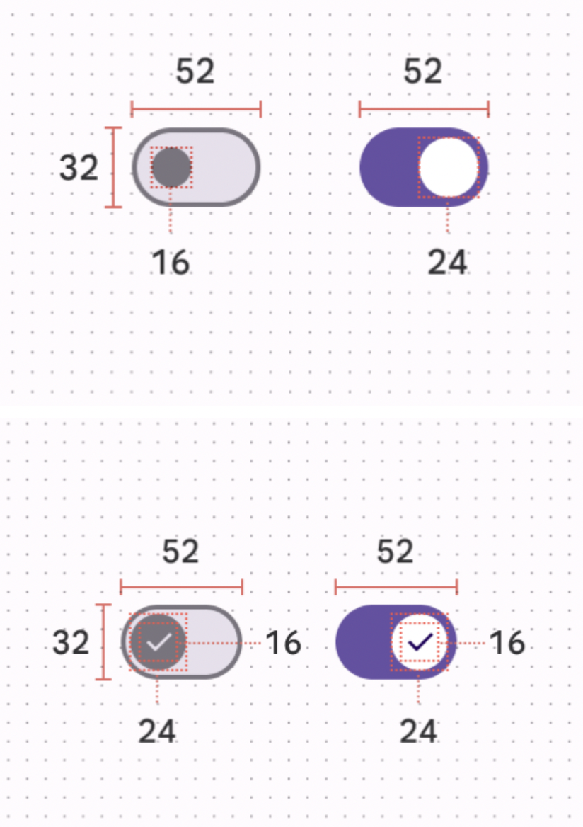
開啟和關閉表示一個具有兩種狀態的按鈕,開關由軌道和拇指組成,拇指沿著軌道移動以指示其 當前狀態。
<LinearLayout xmlns:android="http://schemas.android.com/apk/res/android"
android:layout_width="match_parent"
android:layout_height="match_parent"
android:orientation="vertical">
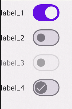
<!--checked="true"-->
<com.google.android.material.materialswitch.MaterialSwitch
android:layout_width="wrap_content"
android:layout_height="wrap_content"
android:checked="true"
android:text="label_1"/>
<!--沒有任何狀態-->
<com.google.android.material.materialswitch.MaterialSwitch
android:layout_width="wrap_content"
android:layout_height="wrap_content"
android:text="label_2"/>
<!--禁止開啟-->
<com.google.android.material.materialswitch.MaterialSwitch
android:layout_width="wrap_content"
android:layout_height="wrap_content"
android:enabled="false"
android:text="label_3"/>
<!--拇指開啟、關閉同一個icon -->
<com.google.android.material.materialswitch.MaterialSwitch
android:layout_width="wrap_content"
android:layout_height="wrap_content"
app:thumbIcon="@drawable/ic_check_24"
android:text="label_4"/>
</LinearLayout>
源碼:
public static interface OnCheckedChangeListener {
		/**
     * 狀態發生變化時調用
     * Params:
		 * 	buttonView - 狀態已更改的複合按鈕視圖
     *  isChecked – buttonView 的新檢查狀態
     */
		void onCheckedChanged(CompoundButton buttonView, boolean isChecked);
}
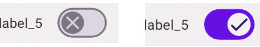
binding.materialSwitch5.setOnCheckedChangeListener{ _ , isChecked->
if (isChecked) {
				// 開啟時
        binding.materialSwitch5.thumbIconDrawable=
            AppCompatResources.getDrawable(this, R.drawable.ic_check_24)
    } else {
				// 關閉時
        binding.materialSwitch5.thumbIconDrawable=
            AppCompatResources.getDrawable(this, R.drawable.ic_close)
    }
}


Thumb attributes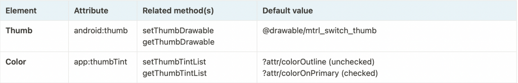
Icon attributes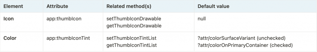
Track attributes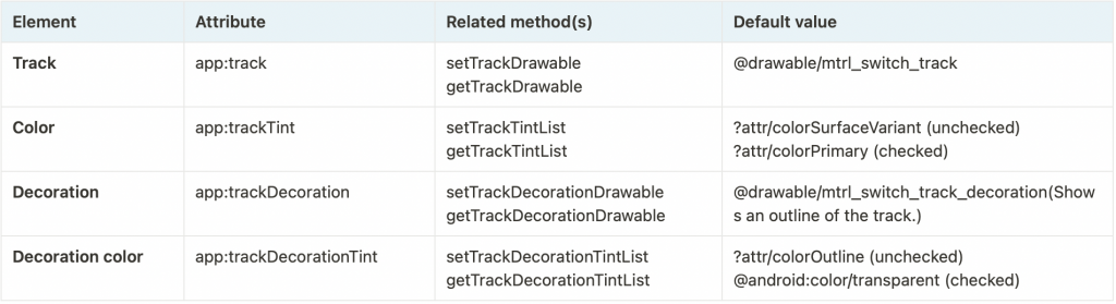
Text label attributes
感謝您看到這邊 


 看影片追技術