Card 在實作上是稱為 CardView,是一種 ViewGroup 繼承自 FrameLayout,所以在之間所放的元件,排版的方式會與 FrameLayout 一樣,所以如果元件上要做到比較複雜的配置,記得在裡面要加入額外的 ViewGroup
CardView 會隨著內部元件的大小改變,所以在 layout_height 要設置 wrap_content 或是固定的大小
 <com.google.android.material.card.MaterialCardView
                android:id="@+id/card"
                android:layout_width="match_parent"
                android:layout_height="wrap_content"
                android:layout_margin="8dp">
app:cardBackgroundColor: 設置 Card 的背景顏色app:cardForegroundColor: 設置 Card 的前景顏色app:cardCornerRadius:設置 card 的形狀圓角app:cardElevation: 設置 Card 的高度
當一張 Card 被選中時,會顯示一個選中的圖標並改變它的前景色。但在預設情況下,是沒有設置這些的。下面範例示範如何做到此功能
先將 Card 的 click、check、focus 都開啟設為 true,讓它可以被用戶點選
<com.google.android.material.card.MaterialCardView
    ...
    android:clickable="true"
    android:focusable="true"
    android:checkable="true">

    ...
</com.google.android.material.card.MaterialCardView>
透過長按壓的操作,改變 card 的 isChecked 為 true 就會觸發 checkable 狀態,右上方會出現 checkIcon 與改變 ripple 顏色
// let card can long click to show the check state
card.setOnLongClickListener {
    card.isChecked  = !card.isChecked
    true
}
如果不想使用預設的 checkIcon 或是想改變顏色或位置,也有屬性能調整
app:checkedIcon
app:checkedIconTint
app:checkedIconSize
app:checkedIconGravity
官方文檔這邊個人覺得寫得有點簡略,可能是覺得我們都會自己去翻文件吧。這邊我就簡單整理一下步驟
首先我們要自己創建一個 DraggableCoordinatorLayout,相關程式碼的部分請參考這邊的官方文檔,簡單說是要我們做一個 CustomView,細節的部分官方都幫我們做好了,基本上就是複製貼上就可。而 MotionEvent 的拖曳效果,官方建議使用 ViewDragHelper 來實現,這篇文章寫得蠻清楚的,想更加深入的可以看看,礙於篇幅這邊就不細講
程式碼的部分有點長,可以直接到我的 Github觀看
創建完後,就可以到 xml 當中去使用
<com.voss.ithomeironcontest.cardview.DraggableCoordinatorLayout
    xmlns:android="http://schemas.android.com/apk/res/android"
    android:id="@+id/draggable_coordinatorLayout"
    xmlns:app="http://schemas.android.com/apk/res-auto"
    android:layout_width="match_parent"
    android:layout_height="match_parent">
    ...
</com.voss.ithomeironcontest.cardview.DraggableCoordinatorLayout>
之後在裡面放入幾個 CardView,就能開始測試拖曳功能。由於拖曳功能的啟動會透過 MotionEvent 去判斷用戶是否有點擊此元件,所以在 card 的屬性上,記得要將 android:clickable 設為 true
基本上,只要把元件放入我們自定義的 ViewGroup,就能實現拖曳,但還有一點要注意,由於 CardView 在 elevation 設置上,特別在拖曳的狀態下去變換高度,預設情況下是 1dp 拖曳狀態下是 8dp。所以我們應該去覆寫 ViewDragListener 去監聽當拖曳時,去改變 card 的 drag 狀態
binding.draggableCoordinatorLayout.setViewDragListener(object :
        DraggableCoordinatorLayout.ViewDragListener {
        override fun onViewCaptured(view: View, id: Int) {
            if (view is MaterialCardView) {
                view.isDragged = true
            }
        }

        override fun onViewReleased(view: View, v: Float, v1: Float) {
            if (view is MaterialCardView) {
                view.isDragged = false
            }
        }
    })
如果大家已經實作完成會發現,拖曳元件的過程會超出邊界,那該怎麼避免此狀況呢?就要回頭去 DraggableCoordinatorLayout 在 clampViewPositionHorizontal、Vertical 中改寫邏輯,這兩個方法會限制 childView 在 ViewGroup 的 拖曳與移動的範圍
override fun clampViewPositionHorizontal(view: View, left: Int, dx: Int): Int {
            val leftBound = paddingLeft
            val rightBound = width - view.width - paddingRight
            val newLeft = min(max(left, leftBound), rightBound)
            return newLeft
        }

        override fun clampViewPositionVertical(view: View, top: Int, dy: Int): Int {
            val topBound = paddingTop
            val bottomBound = height - view.height - paddingBottom
            val newTop = min(max(top, topBound), bottomBound)
            return newTop
        }
預設上的 CardView 都會有 elevation 1dp,而在拖曳過程中會變為 8dp
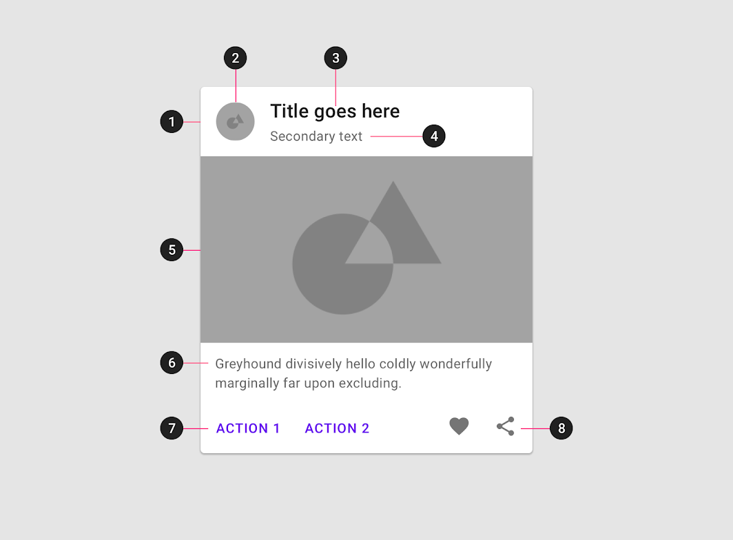
預設情況下,都是所謂的 Elevated card,在 Material Design 的設計下,將配置拆分為幾個區塊,分別有 Media、Title、Body、Action button。而這部分主要的概念在 Design 篇章有講到,是為了用戶體驗,若不太懂的可以回頭看
<com.google.android.material.card.MaterialCardView
    android:id="@+id/card"
    android:layout_width="match_parent"
    android:layout_height="wrap_content"
    android:layout_margin="8dp">

    <LinearLayout
        android:layout_width="match_parent"
        android:layout_height="wrap_content"
        android:orientation="vertical">

        <!-- Media -->
        <ImageView
            android:layout_width="match_parent"
            android:layout_height="194dp"
            app:srcCompat="@drawable/media"
            android:scaleType="centerCrop"
            android:contentDescription="@string/content_description_media"
            />

        <LinearLayout
            android:layout_width="match_parent"
            android:layout_height="wrap_content"
            android:orientation="vertical"
            android:padding="16dp">

            <!-- Title, secondary and supporting text -->
            <TextView
                android:layout_width="wrap_content"
                android:layout_height="wrap_content"
                android:text="@string/title"
                android:textAppearance="?attr/textAppearanceHeadline6"
                />
            <TextView
                android:layout_width="wrap_content"
                android:layout_height="wrap_content"
                android:layout_marginTop="8dp"
                android:text="@string/secondary_text"
                android:textAppearance="?attr/textAppearanceBody2"
                android:textColor="?android:attr/textColorSecondary"
                />
            <TextView
                android:layout_width="wrap_content"
                android:layout_height="wrap_content"
                android:layout_marginTop="16dp"
                android:text="@string/supporting_text"
                android:textAppearance="?attr/textAppearanceBody2"
                android:textColor="?android:attr/textColorSecondary"
                />

        </LinearLayout>

        <!-- Buttons -->
        <LinearLayout
            android:layout_width="wrap_content"
            android:layout_height="wrap_content"
            android:layout_margin="8dp"
            android:orientation="horizontal">
            <com.google.android.material.button.MaterialButton
                android:layout_width="wrap_content"
                android:layout_height="wrap_content"
                android:layout_marginEnd="8dp"
                android:text="@string/action_1"
                style="?attr/borderlessButtonStyle"
                />
            <com.google.android.material.button.MaterialButton
                android:layout_width="wrap_content"
                android:layout_height="wrap_content"
                android:text="@string/action_2"
                style="?attr/borderlessButtonStyle"
                />
        </LinearLayout>

    </LinearLayout>

</com.google.android.material.card.MaterialCardView>
設計排版與上述的 Elevated Card 相同,差異在於 elevation 與 outline stroke 上,是一個有外框線的設計。透過 stroke 呈現 card 的獨立性,也就不需要 elevation 的幫助了
<com.google.android.material.card.MaterialCardView
    ...
    app:strokeWidth="1dp"
    app:strokeColor="@color/stroke_color"
    app:cardElevation="0dp">
    ...
</com.google.android.material.card.MaterialCardView>
stroke 要使用 selector,因為會有 checked 與 unchecked 的狀態
<selector xmlns:android="http://schemas.android.com/apk/res/android">
    <item android:color="?attr/colorPrimary" android:state_checked="true"/>
    <item android:alpha="0.12" android:color="?attr/colorOnSurface" android:state_checked="false"/>
</selector>
官方建議我們在 cardView 中都應設置android:layout_margin="8dp"。若想要改變顏色或形狀,都必須使用 card 專屬的屬性,例如:為了設置背景色,修改 android:background,會將原本 CardView 在 Style 的預設給蓋過去,可能會讓一些屬性失效,這點務必注意


state 的 checked 與 dragged 都要透過動態編程方式去改變


魔改上,Card 能改動的不多,而且基本上都能透過屬性去修改,所以不用擔心像上一篇的 Dialog,非得要用 Style 才能去更動。這邊就簡單小改一下顏色與形狀,對應到的元件變化我也大概註解一下讓大家比較清楚知道
<style name="Widget.App.CardView" parent="Widget.MaterialComponents.CardView">
        <item name="materialThemeOverlay">@style/ThemeOverlay.App.Card</item>
        <item name="shapeAppearance">@style/ShapeAppearance.App.MediumComponent</item>
</style>

<style name="ThemeOverlay.App.Card" parent="">
        <!-- Using in checkBox-->
        <item name="colorPrimary">@color/lightYellow</item>
        <!-- Card background color-->
        <item name="colorSurface">@color/darkBlue</item>
        <!-- Card ripple color -->
        <item name="colorOnSurface">@color/lightBlue</item>
</style>

<style name="ShapeAppearance.App.MediumComponent" parent="ShapeAppearance.MaterialComponents.MediumComponent">
        <item name="cornerFamily">cut</item>
        <item name="cornerSize">8dp</item>
</style>

CardView 在實作上是一種很便利去設定各種不同形狀與顏色的 ViewGroup,讓我們可以快速地在一般圖層佈局上做裝飾與點綴。而當中的內容排版雖然元件上沒有限制我們應該怎麼使用,但也不代表可以隨意,應該把想要呈現的內容做分層與分區,例如:Media、Title、Body、Action 等等,圍繞在用戶的使用體驗為核心
若對實作還是有點不懂的,這邊提供我的 Github 方便大家參考
官方文檔中沒有特別提到 Card Transitions 如何實作,雖然在設計方面有介紹到,但相信大家也會想知道這些功能如何實作,由於我只有摸了一部分,這邊提供我寫過的文章還有參考過的資料,有興趣的可以看一下~


 看影片追技術