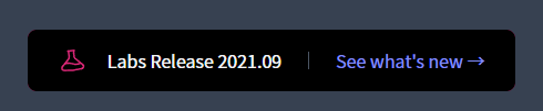
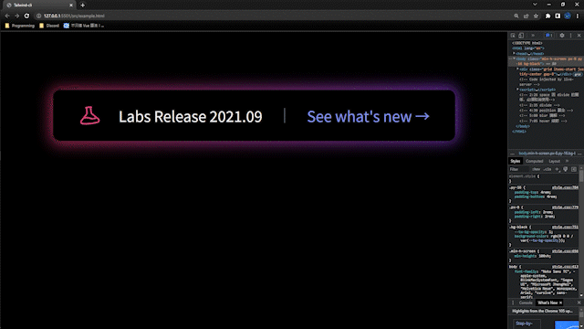
今天要實作的按鈕為~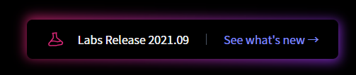
剛好看到有這麼炫砲的按鈕可以學習,就分享上來給大家~
首先,就影片作者而言,今天示範的方法只是其中一種,使用 blur 的方式達成此種按鈕的效果,所以並不是唯一方法哦!
建立基本架構
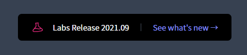
<body class="min-h-screen px-8 py-16 bg-gray-700">
    <div class="grid gap-8 items-start justify-center">
        <button type="button" class="px-7 py-4 bg-black rounded-lg leading-none flex items-center divide-x divide-gray-600">
        <span class="text-gray-100">Labs Release 2021.09</span>
        <span class="text-indigo-400">See what's new →</span>
        </button>
    </div>
</body>

加上燒瓶 icon (SVG)且修改其顏色,再加上 rotate
<body class="min-h-screen px-8 py-16 bg-gray-700">
    <div class="grid items-start justify-center gap-8">
      <button
        type="button"
        class="flex items-center py-4 leading-none bg-black divide-x divide-gray-600 rounded-lg px-7"
      >
        <span class="flex items-center space-x-5">
          <svg
            xmlns="http://www.w3.org/2000/svg"
            fill="none"
            viewBox="0 0 24 24"
            stroke-width="1.5"
            stroke="currentColor"
            class="w-6 h-6 text-pink-600 -rotate-6"
          >
            <path
              stroke-linecap="round"
              stroke-linejoin="round"
              d="M9.75 3.104v5.714a2.25 2.25 0 01-.659 1.591L5 14.5M9.75 3.104c-.251.023-.501.05-.75.082m.75-.082a24.301 24.301 0 014.5 0m0 0v5.714c0 .597.237 1.17.659 1.591L19.8 15.3M14.25 3.104c.251.023.501.05.75.082M19.8 15.3l-1.57.393A9.065 9.065 0 0112 15a9.065 9.065 0 00-6.23-.693L5 14.5m14.8.8l1.402 1.402c1.232 1.232.65 3.318-1.067 3.611A48.309 48.309 0 0112 21c-2.773 0-5.491-.235-8.135-.687-1.718-.293-2.3-2.379-1.067-3.61L5 14.5"
            />
          </svg>
          <span class="pr-6 text-gray-100">Labs Release 2021.09</span>
        </span>
        <span class="pl-6 text-indigo-400">See what's new →</span>
      </button>
    </div>
  </body>
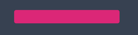
再來就是本篇的重頭戲了,我們需要創造出一區塊套用 blur,藉此做出 box-shadow 的效果
<body class="min-h-screen px-8 py-16 bg-gray-700">
    <div class="grid items-start justify-center gap-8">
      <div class="relative">
        <div class="absolute inset-0 bg-pink-600 rounded-lg"></div>
        <button
          type="button"
          class="flex items-center py-4 leading-none bg-black divide-x divide-gray-600 rounded-lg px-7"
        >
          <span class="flex items-center space-x-5">
            <svg
              xmlns="http://www.w3.org/2000/svg"
              fill="none"
              viewBox="0 0 24 24"
              stroke-width="1.5"
              stroke="currentColor"
              class="w-6 h-6 text-pink-600 -rotate-6"
            >
              <path
                stroke-linecap="round"
                stroke-linejoin="round"
                d="M9.75 3.104v5.714a2.25 2.25 0 01-.659 1.591L5 14.5M9.75 3.104c-.251.023-.501.05-.75.082m.75-.082a24.301 24.301 0 014.5 0m0 0v5.714c0 .597.237 1.17.659 1.591L19.8 15.3M14.25 3.104c.251.023.501.05.75.082M19.8 15.3l-1.57.393A9.065 9.065 0 0112 15a9.065 9.065 0 00-6.23-.693L5 14.5m14.8.8l1.402 1.402c1.232 1.232.65 3.318-1.067 3.611A48.309 48.309 0 0112 21c-2.773 0-5.491-.235-8.135-.687-1.718-.293-2.3-2.379-1.067-3.61L5 14.5"
              />
            </svg>
            <span class="pr-6 text-gray-100">Labs Release 2021.09</span>
          </span>
          <span class="pl-6 text-indigo-400">See what's new →</span>
        </button>
      </div>
    </div>
  </body>
避免 blur 區塊遮擋我們的按鈕,所以必須在按鈕加上 relative 讓他脫離 static
<body class="min-h-screen px-8 py-16 bg-gray-700">
    <div class="grid items-start justify-center gap-8">
      <div class="relative">
        <div class="absolute inset-0 bg-pink-600 rounded-lg"></div>
        <button
          type="button"
          class="relative flex items-center py-4 leading-none bg-black divide-x divide-gray-600 rounded-lg px-7"
        >
          <span class="flex items-center space-x-5">
            <svg
              xmlns="http://www.w3.org/2000/svg"
              fill="none"
              viewBox="0 0 24 24"
              stroke-width="1.5"
              stroke="currentColor"
              class="w-6 h-6 text-pink-600 -rotate-6"
            >
              <path
                stroke-linecap="round"
                stroke-linejoin="round"
                d="M9.75 3.104v5.714a2.25 2.25 0 01-.659 1.591L5 14.5M9.75 3.104c-.251.023-.501.05-.75.082m.75-.082a24.301 24.301 0 014.5 0m0 0v5.714c0 .597.237 1.17.659 1.591L19.8 15.3M14.25 3.104c.251.023.501.05.75.082M19.8 15.3l-1.57.393A9.065 9.065 0 0112 15a9.065 9.065 0 00-6.23-.693L5 14.5m14.8.8l1.402 1.402c1.232 1.232.65 3.318-1.067 3.611A48.309 48.309 0 0112 21c-2.773 0-5.491-.235-8.135-.687-1.718-.293-2.3-2.379-1.067-3.61L5 14.5"
              />
            </svg>
            <span class="pr-6 text-gray-100">Labs Release 2021.09</span>
          </span>
          <span class="pl-6 text-indigo-400">See what's new →</span>
        </button>
      </div>
    </div>
  </body>
將 body 的背景色改為黑色,且把 blur 區塊加上 blur 樣式
<body class="min-h-screen px-8 py-16 bg-black">
    <div class="grid items-start justify-center gap-8">
      <div class="relative">
        <div class="absolute inset-0 bg-pink-600 rounded-lg blur"></div>
        <button
          type="button"
          class="relative flex items-center py-4 leading-none bg-black divide-x divide-gray-600 rounded-lg px-7"
        >
          <span class="flex items-center space-x-5">
            <svg
              xmlns="http://www.w3.org/2000/svg"
              fill="none"
              viewBox="0 0 24 24"
              stroke-width="1.5"
              stroke="currentColor"
              class="w-6 h-6 text-pink-600 -rotate-6"
            >
              <path
                stroke-linecap="round"
                stroke-linejoin="round"
                d="M9.75 3.104v5.714a2.25 2.25 0 01-.659 1.591L5 14.5M9.75 3.104c-.251.023-.501.05-.75.082m.75-.082a24.301 24.301 0 014.5 0m0 0v5.714c0 .597.237 1.17.659 1.591L19.8 15.3M14.25 3.104c.251.023.501.05.75.082M19.8 15.3l-1.57.393A9.065 9.065 0 0112 15a9.065 9.065 0 00-6.23-.693L5 14.5m14.8.8l1.402 1.402c1.232 1.232.65 3.318-1.067 3.611A48.309 48.309 0 0112 21c-2.773 0-5.491-.235-8.135-.687-1.718-.293-2.3-2.379-1.067-3.61L5 14.5"
              />
            </svg>
            <span class="pr-6 text-gray-100">Labs Release 2021.09</span>
          </span>
          <span class="pl-6 text-indigo-400">See what's new →</span>
        </button>
      </div>
    </div>
  </body>
樣子已經有點出來囉 ~
將 blur 區塊 inset-0 改為 -inset-0.5 以及加上 opacity-75
<body class="min-h-screen px-8 py-16 bg-black">
    <div class="grid items-start justify-center gap-8">
      <div class="relative">
        <div
          class="absolute -inset-0.5 bg-pink-600 rounded-lg blur opacity-75"
        ></div>
        <button
          type="button"
          class="relative flex items-center py-4 leading-none bg-black divide-x divide-gray-600 rounded-lg px-7"
        >
          <span class="flex items-center space-x-5">
            <svg
              xmlns="http://www.w3.org/2000/svg"
              fill="none"
              viewBox="0 0 24 24"
              stroke-width="1.5"
              stroke="currentColor"
              class="w-6 h-6 text-pink-600 -rotate-6"
            >
              <path
                stroke-linecap="round"
                stroke-linejoin="round"
                d="M9.75 3.104v5.714a2.25 2.25 0 01-.659 1.591L5 14.5M9.75 3.104c-.251.023-.501.05-.75.082m.75-.082a24.301 24.301 0 014.5 0m0 0v5.714c0 .597.237 1.17.659 1.591L19.8 15.3M14.25 3.104c.251.023.501.05.75.082M19.8 15.3l-1.57.393A9.065 9.065 0 0112 15a9.065 9.065 0 00-6.23-.693L5 14.5m14.8.8l1.402 1.402c1.232 1.232.65 3.318-1.067 3.611A48.309 48.309 0 0112 21c-2.773 0-5.491-.235-8.135-.687-1.718-.293-2.3-2.379-1.067-3.61L5 14.5"
              />
            </svg>
            <span class="pr-6 text-gray-100">Labs Release 2021.09</span>
          </span>
          <span class="pl-6 text-indigo-400">See what's new →</span>
        </button>
      </div>
    </div>
  </body>
將 blur 區塊加上 gradient 效果
<body class="min-h-screen px-8 py-16 bg-black">
    <div class="grid items-start justify-center gap-8">
      <div class="relative">
        <div
          class="absolute -inset-0.5 bg-gradient-to-r from-pink-600 to-purple-600 rounded-lg blur opacity-75"
        ></div>
        <button
          type="button"
          class="relative flex items-center py-4 leading-none bg-black divide-x divide-gray-600 rounded-lg px-7"
        >
          <span class="flex items-center space-x-5">
            <svg
              xmlns="http://www.w3.org/2000/svg"
              fill="none"
              viewBox="0 0 24 24"
              stroke-width="1.5"
              stroke="currentColor"
              class="w-6 h-6 text-pink-600 -rotate-6"
            >
              <path
                stroke-linecap="round"
                stroke-linejoin="round"
                d="M9.75 3.104v5.714a2.25 2.25 0 01-.659 1.591L5 14.5M9.75 3.104c-.251.023-.501.05-.75.082m.75-.082a24.301 24.301 0 014.5 0m0 0v5.714c0 .597.237 1.17.659 1.591L19.8 15.3M14.25 3.104c.251.023.501.05.75.082M19.8 15.3l-1.57.393A9.065 9.065 0 0112 15a9.065 9.065 0 00-6.23-.693L5 14.5m14.8.8l1.402 1.402c1.232 1.232.65 3.318-1.067 3.611A48.309 48.309 0 0112 21c-2.773 0-5.491-.235-8.135-.687-1.718-.293-2.3-2.379-1.067-3.61L5 14.5"
              />
            </svg>
            <span class="pr-6 text-gray-100">Labs Release 2021.09</span>
          </span>
          <span class="pl-6 text-indigo-400">See what's new →</span>
        </button>
      </div>
    </div>
  </body>
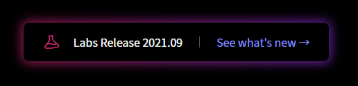
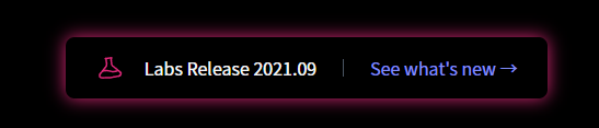
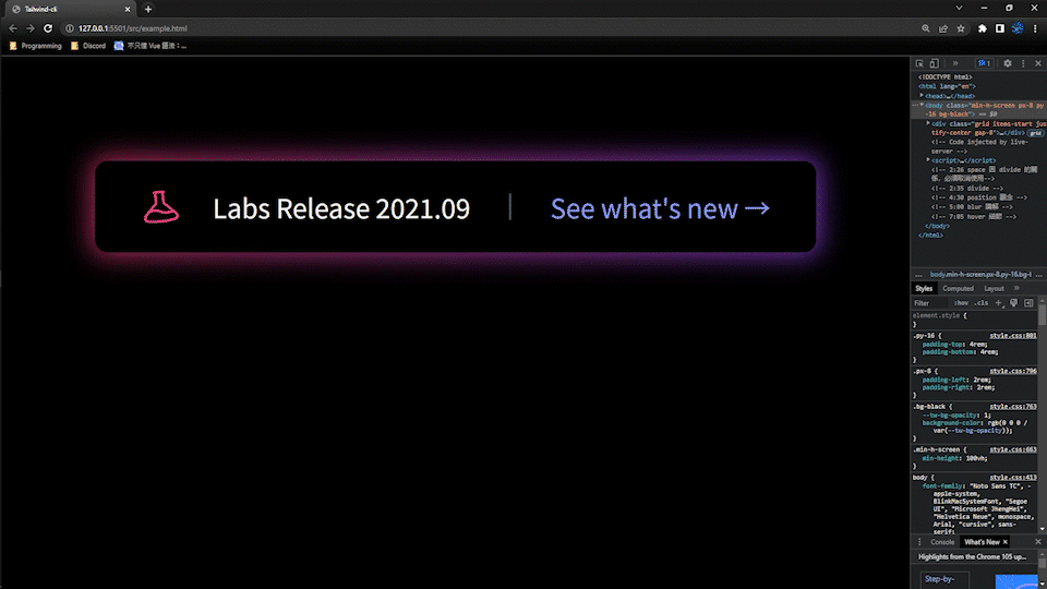
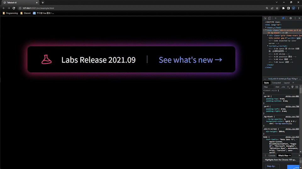
使用 group-hover,在 relative 這個外層容器加上 group,以及其他想要加上 group-hover 的元素
<body class="min-h-screen px-8 py-16 bg-black">
    <div class="grid items-start justify-center gap-8">
      <div class="relative group">
        <div
          class="absolute -inset-0.5 bg-gradient-to-r from-pink-600 to-purple-600 rounded-lg blur opacity-75 group-hover:opacity-100 transition duration-200"
        ></div>
        <button
          type="button"
          class="relative flex items-center py-4 leading-none bg-black divide-x divide-gray-600 rounded-lg px-7"
        >
          <span class="flex items-center space-x-5">
            <svg
              xmlns="http://www.w3.org/2000/svg"
              fill="none"
              viewBox="0 0 24 24"
              stroke-width="1.5"
              stroke="currentColor"
              class="w-6 h-6 text-pink-600 -rotate-6"
            >
              <path
                stroke-linecap="round"
                stroke-linejoin="round"
                d="M9.75 3.104v5.714a2.25 2.25 0 01-.659 1.591L5 14.5M9.75 3.104c-.251.023-.501.05-.75.082m.75-.082a24.301 24.301 0 014.5 0m0 0v5.714c0 .597.237 1.17.659 1.591L19.8 15.3M14.25 3.104c.251.023.501.05.75.082M19.8 15.3l-1.57.393A9.065 9.065 0 0112 15a9.065 9.065 0 00-6.23-.693L5 14.5m14.8.8l1.402 1.402c1.232 1.232.65 3.318-1.067 3.611A48.309 48.309 0 0112 21c-2.773 0-5.491-.235-8.135-.687-1.718-.293-2.3-2.379-1.067-3.61L5 14.5"
              />
            </svg>
            <span class="pr-6 text-gray-100">Labs Release 2021.09</span>
          </span>
          <span
            class="pl-6 text-indigo-400 transition duration-200 group-hover:text-gray-100"
            >See what's new →</span
          >
        </button>
      </div>
    </div>
  </body>

將 blur 區塊的 transition 效果延長,duration-200 => duration-1000
        <div
          class="absolute -inset-0.5 bg-gradient-to-r from-pink-600 to-purple-600 rounded-lg blur opacity-75 group-hover:opacity-100 transition duration-1000"
        ></div>
blur 區塊加上 group-hover:duration-200
        <div
          class="absolute -inset-0.5 bg-gradient-to-r from-pink-600 to-purple-600 rounded-lg blur opacity-75 group-hover:opacity-100 transition duration-1000 group-hover:duration-200"
        ></div>
animation 新增客製化
      animation: {
        tilt: "tilt 10s infinite linear",
      },
      keyframes: {
        tilt: {
          "0%, 50%, 100%": {
            transform: "rotate(0deg)",
          },
          "25%": {
            transform: "rotate(5deg)",
          },
          "75%": {
            transform: "rotate(-5deg)",
          },
        },
      },
最終 tilt 以 1 度展示
終於完成炫砲按鈕了~大家可以自己做練習哦!!
參考影片 - Glowing Background Gradient Effects with Tailwind CSS


 看影片追技術