接下來這個單元要開始來討論 Dashboard 排版製作的方法,因為這是很常見的排版方式,這個單元將會完成這個排版的樣子,會呈現一個左右兩側的排版方式:
一開始宣告 div 標籤:
<div class="">
  <div class="">
  </div>
  <div class="">
  </div>
</div>
標籤的宣告方式,就根據要多少的排版的樣式來決定,這裡因為希望可以兩排左右兩側排版,所以宣告兩個 div,再使用一個上層 div 包覆起來。
接下來宣告文字來顯示:
<div class="">
  <div class="">
    <p class="text-white">Left</p>
  </div>
  <div class="">
    <h1>Right</h1>
  </div>
</div>
使用 flex 可以維持水平排版,另外也加入背景顏色 bg-gray-800 與 bg-slate-100:
<div class="flex">
  <div class="bg-gray-800">
    <p class="text-white">Left</p>
  </div>
  <div class="bg-slate-100">
    <h1>Right</h1>
  </div>
</div>
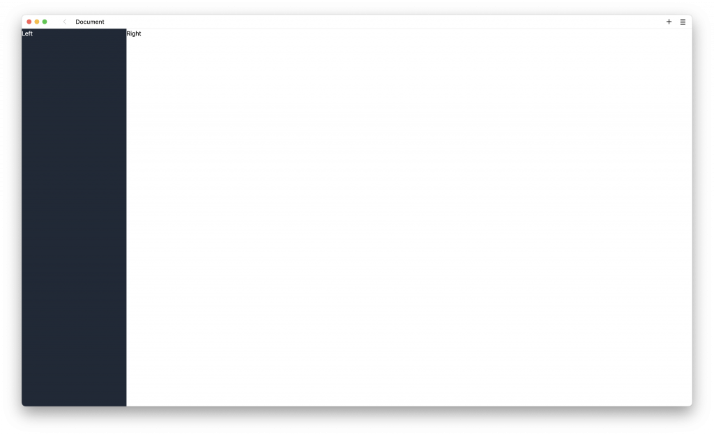
但因為要根據螢幕寬度來滿版顯示,所以使用 h-screen 高度滿版,w-full 寬度滿版:
<div class="flex h-screen">
  <div class="bg-gray-800 w-80">
    <p class="text-white">Left</p>
  </div>
  <div class="bg-slate-100 w-full">
    <h1>Right</h1>
  </div>
</div>
這個時候大致上可以完成整個排版了,但別忘記 RWD 的排版需要,加入關鍵的屬性 hidden 與 sm:flex:
<div class="flex h-screen">
  <div class="bg-gray-800 w-80 hidden sm:flex">
    <p class="text-white">Left</p>
  </div>
  <div class="bg-slate-100 w-full">
    <h1>Right</h1>
  </div>
</div>
屬性 hidden 與 sm:flex,表示當寬度大於 sm 時,使用 flex,小於 sm 則使用 hidden,可以隱藏。所以當寬度大於 sm 時,可以正常顯示,小於 sm 時,則會隱藏左側排版。
tailwindcss - 從零開始學 - Day13 [完]


 iThome鐵人賽
 看影片追技術