承接上一篇,本篇要繼續來介紹ggplot2套件,並使用他來繪製折線圖、散佈圖、盒鬚圖。
折線圖
# 資料
drinksGowth = data.frame(
                          month = c(1, 2, 3, 4, 5,
                                    6, 7 ,8, 9, 10,
                                    11, 12),
                          revenue = c(30, 31, 33, 40, 55,
                                      66, 70, 73, 72, 66,
                                      50, 42)
                         )

drinksGowth
   month revenue
1      1      30
2      2      31
3      3      33
4      4      40
5      5      55
6      6      66
7      7      70
8      8      73
9      9      72
10    10      66
11    11      50
12    12      42
# 畫圖
ggplot(drinksGowth, aes(x = month, y = revenue)) +
geom_line(color = "aquamarine4") + # 畫線並修改顏色
geom_point() + # 加入點
scale_x_continuous(breaks= pretty_breaks()) + # 讓y軸顯示的切點為整數
labs(x= "月份\n",y= "營收(萬)") # 加上X, Y 軸名稱
折線圖結果示意: 各月銷售量變化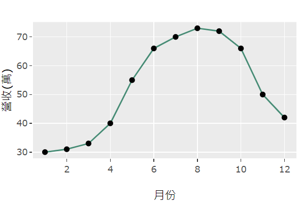
散佈圖
student = data.frame(
                    study_time = c(60, 65, 60, 70, 72,
                                   70, 73, 72, 75, 90,
                                   75, 72, 75, 80, 85,
                                   84, 87, 89, 90, 92),
                    class = c("A", "A", "A", "A", "A",
                              "A", "A", "A", "A", "A",
                              "B", "B", "B", "B", "B",
                              "B", "B", "B", "B", "B")
                    )

student
   study_time grade
1          20    90
2          25    98
3          23    92
4          22    93
5          20    95
6          22    85
7          21    80
        .
        .
        .
# 畫圖
ggplot(student, aes(x = study_time, y = grade)) +
geom_point(color = "aquamarine4") + # 加入點並修改顏色
scale_x_continuous(breaks= pretty_breaks()) + # 讓y軸顯示的切點為整數
labs(x= "唸書時間(小時)\n",y= "成績") # 加上X, Y 軸名稱
折線圖結果示意: 學生的唸書時數與考試分數關係,可以看出唸書時間越長,考試分數也會提升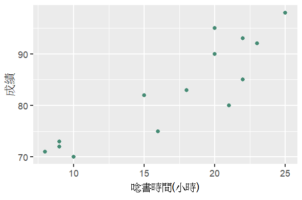
盒鬚圖
student = data.frame(
                    study_time = c(60, 65, 60, 70, 72,
                                   70, 73, 72, 75, 90,
                                   75, 72, 75, 80, 85,
                                   84, 87, 89, 90, 92),
                    class = c("A", "A", "A", "A", "A",
                              "A", "A", "A", "A", "A",
                              "B", "B", "B", "B", "B",
                              "B", "B", "B", "B", "B")
                    )

student
   study_time class
1          60     A
2          65     A
3          60     A
4          70     A
5          72     A
6          70     A
7          73     A
8          72     A
9          75     A
10         90     A
11         75     B
        .
        .
        .
# 畫圖
ggplot(student, aes(x = as.factor(class), y = study_time)) +
  geom_boxplot() + # 箱形圖
  labs(x= "班級",y= "學生分數分布") # 加上X, Y 軸名稱
盒鬚圖結果示意: 不同班級A, B,學生的成績分布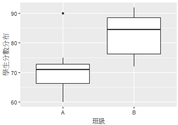
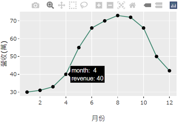
上方這些繪製出來的圖都是屬於靜態的,接著我們要來看一下如何生成互動式的圖表。
首先需要先載入plotly這個套件,接著,我們舉上方折線圖的例子,將它轉為互動式圖表,
library(plotly)
day18 = ggplot(drinksGowth, aes(x = month, y = revenue)) +
        geom_line(color = "aquamarine4") + # 畫線並修改顏色
        geom_point() + # 加入點
        scale_x_continuous(breaks= pretty_breaks()) + # 讓y軸顯示的切點為整數
        labs(x= "月份\n",y= "營收(萬)") # 加上X, Y 軸名稱
# 轉為互動式圖表
ggplotly(day18)
結果如下:
游標只要移動到特定的點上,就會顯示相關的資訊。