股市圖表的部分
包含每日價格走勢,k線圖等
其實HighChart都做的蠻詳細的
所以決定用它來呈現最重要的圖表
首先在官方網站
https://www.highcharts.com/blog/download/
找安裝在nuxt的npm指令
但...其實並沒有
個人認為是Nuxt是SSR
並沒有在client端做渲染的關係
所以沒有像createApp(App).use(HighchartsVue)的方式去做註冊
那怎麼辦?難道就要手刻了嗎?!
還好有款套件已經用HighChart的api寫好
可以直接在Nuxt上運用
nuxt-highcharts
https://github.com/richardeschloss/nuxt-highcharts
因為它是依賴在HighChart上
必須先安裝npm install highcharts --save
再來才是npm i nuxt-highcharts
再到config檔去新增設定
// nuxt.config.js
{
  modules: [
    // Simple usage
    'nuxt-highcharts',

    // With options
    ['nuxt-highcharts', { /* module options */ }]
  ],
  highcharts: {
    /* module options */
  }
}
之後開啟Nuxt就可以做使用了
範例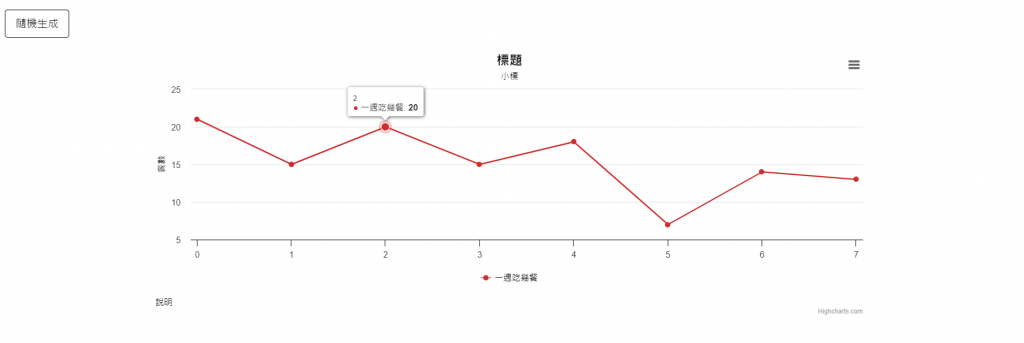
程式碼
<template>
  <div class="row">
    <div class="form-group m-4 w-60">
      <button class="btn btn-primary" @click="points.push(Math.random() * 10)">
        隨機生成
      </button>
    </div>
  </div>
  <highchart
      :options="chartOptions"
      :modules="['exporting']"
      :update="watchers"
      style="width:70%;"
      class="mx-auto"
    />
</template>

<script>
export default {
  data() {
    return {
      caption: '說明',
      title: '標題',
      subtitle: '小標',
      points: [21, 15, 20, 15, 18, 7, 14, 13],
      seriesColor: '#ce2d2d',
      animationDuration: 1000,
      chartType: '',
      colorInputIsSupported: null,
      chartTypes: [],
      durations: [0, 500, 1000, 2000],
      seriesName: '一週吃幾餐',
      yAxis: '餐數',
      watchers: ['options.title', 'options.series'],
      colors: [
        'Red',
        'Green',
        'Blue',
        'Pink',
        'Orange',
        'Brown',
        'Black',
        'Purple',
      ],
      lastPointClicked: {
        timestamp: '',
        x: '',
        y: '',
      },
      // 背景色
      sexy: false,
    }
  },
  computed: {
    chartOptions() {
      const ctx = this
      return {
        accessibility: { enabled: false },
        caption: {
          text: this.caption,
          style: {
            color: this.sexy ? this.invertedColor(0) : '#black',
          },
        },
        chart: {
          backgroundColor: this.sexy
            ? {
                linearGradient: { x1: 0, x2: 0, y1: 0, y2: 1 },
                stops: [
                  [0, this.seriesColor],
                  [0.5, '#2d30ce'],
                  [1, this.seriesColor],
                ],
              }
            : '#ffffff',
          className: 'my-chart',
          type: this.chartType.toLowerCase(),
        },
        plotOptions: {
          series: {
            cursor: 'pointer',
            point: {
              events: {
                click() {
                  ctx.$emit('pointClicked', this)
                },
              },
            },
          },
        },
        yAxis: [
          {
            title: {
              text: this.yAxis,
              style: {
                color: '#000000',
              },
            },
          },
        ],
        title: {
          style: {
            color: this.sexy ? this.invertedColor(0) : '#black',
          },
          text:
            `${this.title} ` +
            (this.lastPointClicked.timestamp !== ''
              ? `(Point clicked: ${this.lastPointClicked.timestamp})`
              : ''),
        },
        subtitle: {
          style: {
            color: this.sexy ? this.invertedColor(0) : '#black',
          },
          text: `${this.subtitle}`,
        },
        legend: {
          itemStyle: {
            color: this.sexy ? this.invertedColor(0) : '#red',
          },
        },
        series: [
          {
            type: 'line',
            name: this.seriesName,
            data: Array.from(this.points),
            color: this.seriesColor,
          },
        ],
      }
    },
  },
}
</script>

<style scoped></style>
這個範例我用簡單的折線圖比較好理解
圖生成的原理是
先把想要展現的資料設定完成
等到DOM節點生成好
就會抓取DOM並把資料推送進去
(執行chartOptions這個函式)
常用到的數據設定包括:
caption:左下的說明文字
chart:中間的圖
plotOptions:滑到資料點時的操作
yAxis:縱軸
title:標題
subtitle:次標題
legend:圖例
series:資料數據
小結:
因為SSR跟CSR的不同
造成套件實際安裝跟使用的差別
花了一點時間
但也多認識到一個坑
NICE!
參考來源:
https://github.com/richardeschloss/nuxt-highcharts